Being present on the network
Museums and the Web 2012 was the week before last. I presented two talks, this year, in between in having a grand old time.
The first was a paper that I co-authored and presented with Ryan Donahue, then of the George Eastman House and now of the Metropolitan Museum of Art. I've put a PDF version of the slides (20MB) online but we don't have presenters notes to go with it. At some point I'd like to go through the long series of email messages we exchanged at the very beginning where we tried to hash out our respective positions and post them as a sideways pre-amble to our paper. Our topic was Archiving Flickr and Other Sites of Interest to Museums and by the time we had submitted the paper Ryan and I had managed to arrive at a rough consensus but the debate and the discussion that got us there was (is) equally interesting. It's going to take a while to clean up that conversation since it quickly became an epic commmenting-ur-comments email thread.

The second paper I presented was about the building=yes project. It is very much a technical paper going over the nuts and bolts of extracting the data (from OpenStreetMap), indexing it and designing custom map tiles to help make sense of the sheer volume of data. Rather than try to cram all that information in to a 15 minute talk I instead talked about the overall value – the purpose – of creating these kinds of registries and tried to highlight the importance of being patient. It's not always clear what will come out of these kinds of projects but what is clear is that stable, linkable things that can hold hands with one another are the foundation on which all the interesting stuff will be built.
This is what I said:

Before we get started I'd like to mention that this is the only URL in this entire presentation. It points to an appendix of links for all of the stuff I'm going to talk about today and I'll show it again at the end of the talk.

Hello everyone. My name is Aaron and I am from the Internet.
For the last few months I have been a Man of Leisure enjoying some rest after a very long five years at Flickr and more recently a few years at Stamen Design in San Francisco. I'm actually about to end this self-imposed sabbitical soon but nothing official has been announced yet so I am still, technically, a bit of a layabout.
I've been spending quite a lot of my break thinking about and building parallel, or shadow copies, of some of the large social sharing sites including Flickr. That's not what I'm going to talk about today except to mention that what those efforts share with the project I am going to talk about is an interest in bespoke registries or catalogs of things.
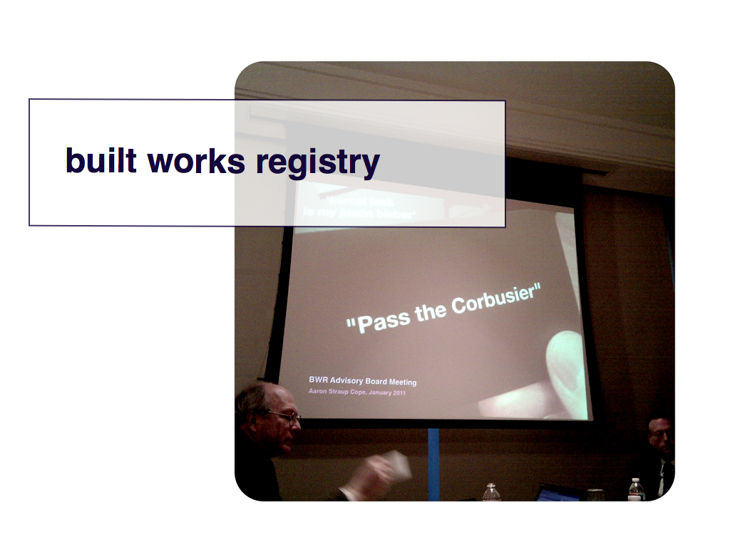
Today I'd like to talk about a project I started a little less than a year ago called building=yes (b=y). I mentioned it, in passing, last year during my talk at Museums and the Web but at the time it wasn't finished yet. This year's talk is sort of the nerdy cousin to last year's talk and just like last year it's not possible to talk about b=y without first mentioning the Built Works Registry (BWR).
The BWR is a joint project between the Avery Architecture Library, the Getty and Artstor to create a stable and open repository of unique identifiers for architecural works. Although much of the work is targeted specifically at art historians and scholars their mandate is also to think about and provide a means for non-experts to both and use and add their own contributions to the project.
I was invited to be a part of the advisory board for the BWR and in January of 2011 we had our first meeting.

One of the things that I thought was important for the BWR to understand in its work was the idea that there are already a number of bespoke registries out there already, especially bespoke registries of built works.
We may not think of the music sharing service Last.fm as a built works registry but they do have persistent and unique identifiers, historical event data and a web page for every venue that the artists they track have performed at. These days, most people think of a service called foursquare which allows its users to share their location – by checking in
to venues – with people.
foursquare boasts a database of over 25 million venues. If you're wondering where they got all those venues they some got some not-insignificant percentage of them from commercial vendors but the rest they got by simply asking peope to add them one at a time.
This is the landscape in which the BWR operates. Professionals may look at this and see so-called vernacular
places but what everyone else sees is an avenue and a means to participate.
Despite all the rhetoric around the Internet and cyberspace we all still very much live in the physical world and few of us are afforded to luxury of punching through mountains or cities with the cavalier abondon of the likes of Robert Moses. Tools like foursquare offer people a way to affect the geographies around them even if it's all a bit of a collective hallucination and often pretty silly. It is also a kind of super-power that people are never going to give back.
And that is important for projects like the BWR because it means that if the project is overly proscriptive or prohibitive in what, or how, it allows people to contibute to a registry of built works they will only be met with blank stares.
You can't invite someone to participate in your project and then tell them a building like Zeitgeist, in San Francisco's Mission District, shouldn't be included because it's not important
or notable
. All that's going to result from that interaction is a disgruntled user who will check in to Zeitgeist on foursquare (or whatever as it's not about foursquare, per se) a few hours later and start pounding the table when they realize the disconnect.
Part of the disconnect, I think, is confusing inclusion with notability. The two are no longer bound the way they might have been in the past. What's awesome and great about the Right Now-ish is that museums and archives have the luxury of inviting the inclusion of lots of things that may not seem important now but that, when properly flagged as such, can be left to co-exist peacefully with today's items of concern until they catch the light and spark an idea in someone's mind.
The point is that it's a kind of pre-emptive historical research, or at least a massing of background material, that we can afford because it's finally fast and cheap. Plenty of stuff will continue to fall through the cracks but that's the same as it ever was. What's new and exciting is all that stuff that won't fall through the cracks.

The other community-driven project that I mentioned during that first meeting is the OpenStreetMap (OSM).
When I returned home, after that meeting, I got to wondering: How many buildings have been cataloged in OSM? If you had asked me last year I would have told you the answer is 27 million. Since then I've corrected an error in the way I was counting things and the number is actually closer to 50 million.
And more are being added every day. Some members of the Humanitarian OSM group are busy doing a kind of preventative mapping in Indonesia in advance of the next presumed natural disaster and have added 100K new buildings to the map in the last six months, alone.
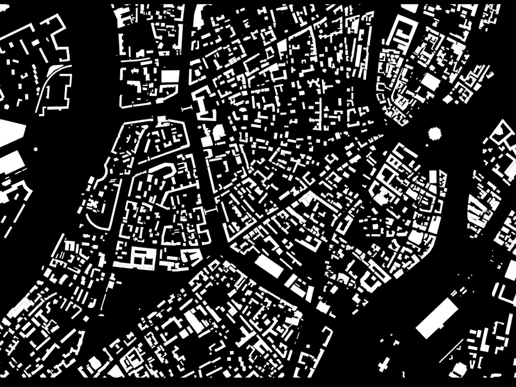
The coverage of those buildings is uneven. Lots of cities in the US, for example, only have a scattering of buildings. But this is what Moscow looks likes. Cities like Paris or Berlin or London (or even Boston) have an equivalent or superior coverage.
And while it is also true that the vast majority of the buildings in OSM don't have much in the way of meaningful metadata, like names or styles or architects, they all have accurate geographic tprints.
I want to stress again that this is a 100% community driven project that did not exist seven years ago. It's clear from looking at some of the data that there have been bulk imports or contributions most likely from government agencies like the city planning department.
But there's still an important lesson in all of that: Even if all these buildings weren't added by individual users one at a time there collective work created a space where those city agencies could contribute all the work records they have generated over the years..
Seven years ago there was no place, with the kind of breadth of community and outreach of OSM, to put this data even if you wanted to.

These last images I've been showing are from a project that I worked on last year, at Stamen, for MapQuest called map=yes. I'm not going to go in to the technical details of the project except to mention that this is what came out the other end. And to say that it probably wouldn't have turned out the same way without that first BWR meeting and the questioning how many buildings were in OSM.
Because once I realized how many buildings are in OSM I thought: What if there was a webpage, and a unique ID, for each one of those buildings that was publicly available on the Internet? What if each one of those buildings was a thing
that the rest of the Internet could talk to?
The OSM site itself already has a webpage for each of its geographic features and they are all assigned semi-permanent IDs but it is all tailored to larger project of creating a map of the world and not specific to buildings.
So, I made that website. It is called building=yes (b=y).
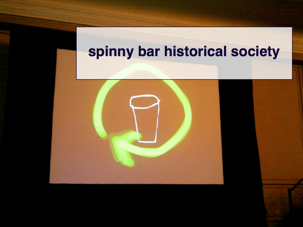
Since this is Museums and the Web let's talk about b=y using a concrete example that everyone here will understand: The Spinny Bar Historical Society (SBHS).

For those of you don't know the history of the Society its origins trace back to Indianapolis, during the 2009 Museums and the Web conference.
Not only did we discover the wonders of the spinny bar at the top of the Hyatt Regency Hotel, where the conference was held, but we were fortunate enough to both see the switch that controls the bar and also receive a guided tour of it inner workings.
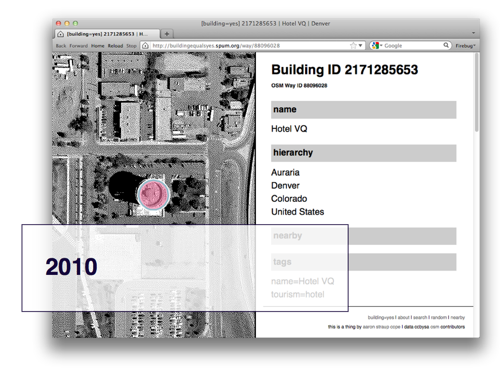
The Society was not officially founded until the following year during the 2010 Museums and the Web conference, in Denver when we met at the bar in the Hotel VQ, next to Mile High Stadium.
To our dismay we discovered that the bar at the top of the hotel is neither spinny nor entirely round having been halved some years back to make room for a kitchen.
That night we formed a non-profit organization dedicated to the promotion and preservation of spinny (or rotating) bars and restaurants all over the world and one day we hope to have a spinny bar listed as a Unesco World Heritage site.
The Hotel VQ was also added to OSM so it is part of the building=yes project.

In 2011 I returned to Denver to speak at the annual OpenStreetMap conference so I made a point of telling the story of the SBHS. I also updated the record for the Hotel VQ to indicate its lack of spin.
I am told that the correct nomenclature for this would be to tag the building as motion=static but I opted for the more poetic spinny=no.
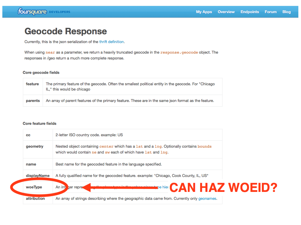
This is a screenshot of the OSM editing interface. As you can see a building is composed of some number of individual point (or "nodes") which are then grouped in to a single record (or "way"). Each of the points and the aggregate groupings are assigned a numeric ID and any one of those objects can be assigned zero or more tags.
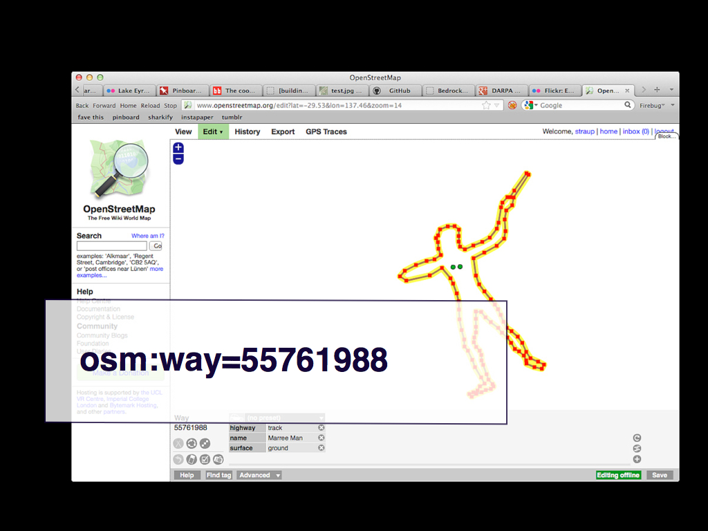
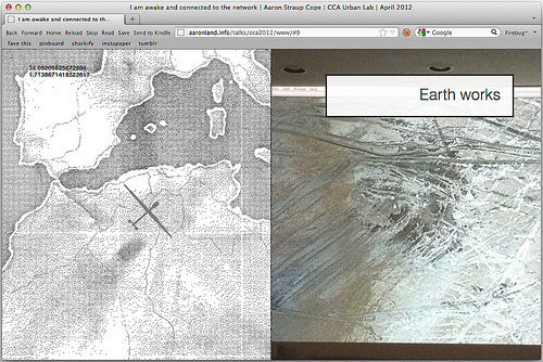
Here's another example that has nothing to do with buildings but should you give a good idea of how map elements are constructed.
It's the Marree Man in South Australia. The Marree Man is/was a giant earth work 2 miles long that was first discovered in 1998. No one knows who made the thing and it's gradually been disappearing as time and nature take their toll.
You probably can't see but down at the bottom of the screenshot it's been tagged with highway=track which seems like an odd choice at first until you remember that the thing was made with bulldozers.

So a big part of the b=y project has simply been to highlight these identifiers and to demonstrate that they can (and should) live on the Internet as first class citizens.
In addition to the IDs that OSM generates I am creating a new 64-bit ID for each building so that it can be slotted in to a hierarchy of place IDs, so that you can search for buildings parented by a particular neighbourhood or city without needing to perform a lot of expensive and complicated spatial queries.
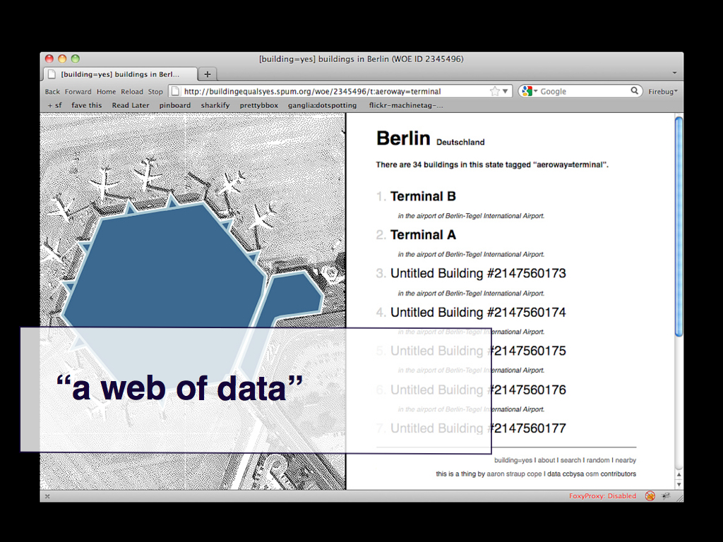
You can slice across the data by tag. For example there are 34 buildings in Berlin tagged aeroway=terminal but you could also ask for all the buildings with any aeroway tag.
A couple weeks ago foursquare released an open source geocoder that is powered by Geonames and the Flickr shapefiles, both open data sets. One of the really interesting features for me is that the geocoding results currently include the Where on Earth place type ID. That's interesting to me because I am using WOE's place IDs to construct the hierarchy of places in b=y.
I've gotten in touch with the developer and asked if they would also include the WOE place ID itself with the results. I think that might actually happen soon.
The designer Tom Coates has often talked about creating websites that are native to a web of data which is a lovely way to think about it. I like to think about creating websites that by their nature enable small bridges to be created between them.
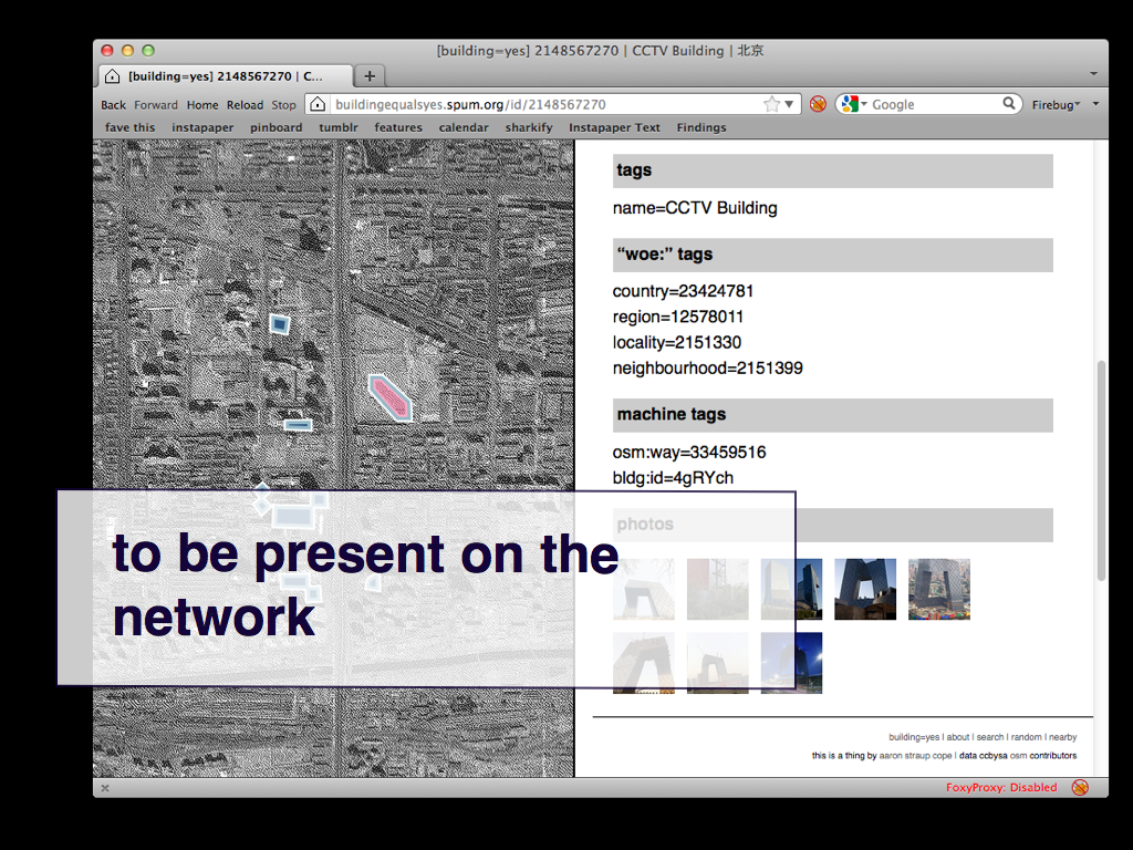
This is the listing for the CCTV building in Beijing and in addition to everything else I can pull in photos from Flickr because they are tagged with the relevant OSM identifier.
That isn't anything new in and of itself but it does highlight the promise of networked records. What might happen if people started to use the metadata from the b=y site itself.
The value is simply that these records are addressable and a part of – present on – the network.
The rest will take care of itself. It is unlikely to happen overnight but sometimes the most important thing is to tend to a project like this, to prevent and ensure that it does not die of neglect, until people realize what has been made available to them. Sometimes that takes a while. The willingness to be patient is just as much a part of the work as the building (sorry) itself.

This is a simple architectural diagram to explain how the site works. The guts of this slide are what the paper on the MW site is all about so I'm not going to say much more about it than this.

And the code and the data is all available as an open source package.
The code is available as-is under a BSD license on first principles and in the hopes that it can serve as an example or learning tool for other projects. Or maybe you just want to run a private copy of b=y. That's your business.

That's the project to date. It's been chugging along largely unattended since launch. Which means it's already a year out of date.
There are a bunch of things that I'd like to do but the most important is training the site to automatically track new or updated buildings as they are editing in OSM itself. There is some discussion of this in the paper but I've not been able to test it out, yet.
Once that's complete I'd also like to add the ability for people to update buildings in place and then send those changes back to OSM. Probably before all of that I will add a bare bones API since that will be easy and fast to do.
Thanks.
And if you're wondering: Zeitgeist is not yet in b=y because it was added to OSM after the site launched.
This blog post is full of links.
#mw2012I am awake and connected to the network

I had the pleasure of speaking at the CCA's Urban Lab last night as part a guest lecture about open source cartography. The event was organized by Alexander Dunkel who has been in San Francisco for the last year as part of his doctorate in landscape architecture and has been making lovely maps analyzing Flickr tag data in spacetime. Alexander presented his work as did German Aparicio and afterwards the always awesome Eric Fischer joined us on stage for an open discussion.
I agreed to speak before the wanderdrone was a thing so I ended up being that guy who does a completely different talk from whatever was set in print. I suppose it risked (risks) being a little bit of a stretch out in to left field but between the wanderdrone itself, and all the noodling people are doing with so-called second screens and a bunch of conversations and table-pounding about the Google Art Project, and digitization in general, at Museums and the Web this year I decided there was something worth exploring. Even if it's still a bit lumpy.
I also did something I try never to do: A presentation with live data, connected to the Internet. That was a little piece of crazy which rarely seems worth the trouble but since the alive-iness of the wanderdrone was core to my talk it seemed a bit shit talk about it with screenshots. Rather than get stuck trying to work out how to embed webpages in Keynote (or whatever) I chose instead to tweak the wanderdrone code and run it in a kind of split-screen with the slides on the right and the wanderdrone lumbering around on the left. Amazingly it worked.
The presentation itself is over here but I also took screenshots as a just-in-case backup which I've included below. Use the left and right arrow keys to advance and rewind the slides and be patient as the images travel across the Internets. This is why I pre-loaded all the images before I spoke and why presentations as webpages are still one of those yeah, but...
endeavours.
This is what I said, mostly. I forgot that the organizers had asked for a bio and that I have given them a wordy and breathless text to read aloud before I went on stage so my Instagram for cat photos
joke seemed like overkill and I skipped that whole section. This is why we have weblogs, right?
A couple of quick program notes.
First, I am about to do a presentation with live data and a network connection so I'd like to take a moment to acknowledge my hubris and folly. Second, I am going to be that guy who changes his presentation at the last minute.
Originally I was going to revisit a talk I did last fall on a panel about art and cartography at the annual meeting of the North American Cartographic Information Society (NACIS).
My presentation was titled gossip begets genealogy
and although I am going to touch on some of the same themes I'd like to instead talk about some more recent projects that I and others have done. I would encourage you to read the earlier talk because it is very much another facet of what I'll discuss tonight.

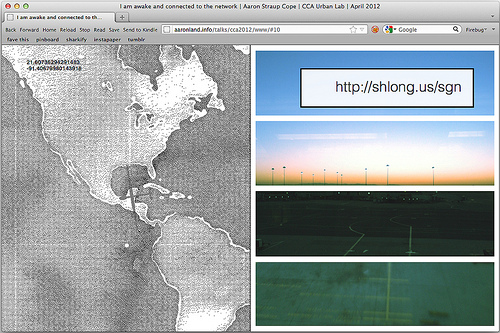
I've included a link to the NACIS talk as well as everything I'll mention here at this link. It's the only URL in the presentation and I will show it again at the end.
So, hello everyone. My name is Aaron and I am from the Internet. I had the opportunity to give a talk as part of the Urban Lab series in 2010 and it's a pleasure to be invited back.
A little bit of background: When I spoke here last I was part of a local design and technology studio called Stamen. The studio has built its reputation doing data visualization projects and working at the wobbly and exciting edge of maps for over a decade. I left the studio at the end of last year.
Before that I worked at Flickr for a thousand years (if anyone's not heard of Flickr it's like Instagram for cat photos) and was intimate with everything having to do with geotagging photos on the site, including the Flickr shapefiles which I talked about the last time I was here.
These days I am President and Chief General Layabout of Leisure Club (although that's about to change).
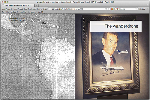
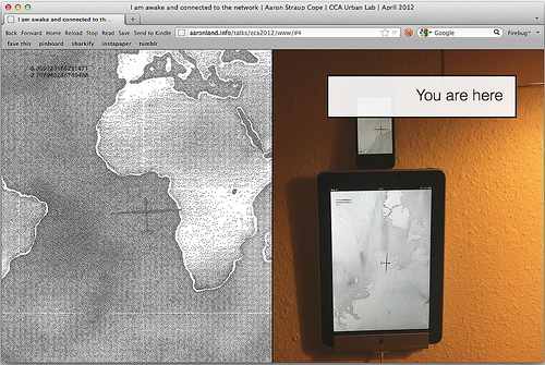
I want to start with a small project I did last month called the wanderdrone
. It's called that because there's a drone – over there in the middle – and it wanders around. If you look carefully you'll notice that this is not even a true statement. It's the map underneath the drone that's moving.
To make matters worse I am also not going to explain what the deal with the drones is. That's a much longer story and what little I have written about it I've included in the appendix I mentioned earlier.
Instead I am going to talk about going for dinner at my friend Ben's house.
Ben usually has his laptop plugged in to a projector that bathes the far wall with a copy of Google Earth set to drift idly across the globe somewhere between the altitude of a helicopter and a small propellor-driven airplane.
It's a lovely way to see the world and if you're interested in reading more about the subject I'd recommend William Fox's 2009 book titled Aereality
. Again, I've included a link in the appendix.
Google Earth is able to do this because it was programmed with the idea of momentum
so you can gently flick your fingers on the globe and treat the slow meandering across the globe as a kind of soundtrack music for whatever else it is you're doing.
And when I say the globe I really mean a tiny slice of it. We only just made it from one of the many inland empires of manufacturing in China to the coast over the course of an evening. It was a lovely reminder that the world is still big and a friendly device for slowing down and considering the details.
But I don't own a projector and Google Earth on the iPad lacks the momentum feature so I started thinking about building the functional equivalent as a plain-vanilla web application.
Which is the wanderdrone.
It's a deliberately simple application. It's a full screen slippy map and it moves in one of 8 directions for somewhere between 15 to 90 seconds and then tries something new. Occasionally it zooms in or out. It hangs on my wall and wanders around.
The drone owes a debt of imagination to James Bridle's A Ship Adrift project as a kind of actor for telling an imaginary, never-ending journey. But the drone is just that: a device, a crutch, around the idea of a journey when what's really happening is a head-on collision of the past and the future-present.
It's the old practice of pouring over a coffee-table sized atlas for the sheer joy of discovery and the art of representation but one that is no longer bound to a fixed size or page count, which really means a nearly infinite depth a field. On the face of it, that's not new. What I've just described is Google Maps in 2005 and beyond.
But it raises the question: Why have we never published maps like this (the wanderdrone) ? There have always been maps that move around but it's always been in the service of some other narrative rather than a way to focus on the map itself.
We have a tendency to treat maps with about as much consideration as we do our underwear, that way.
I've been working with maps on the Internet for a long time and it never occurred to me that something like this – something with the illusion of a life, not so much a personality, of its own – might be a better way to celebrate the art and craft of cartography. It didn't even occur to me when I first released the wanderdrone. I had to sit there and look at it for a few days before the thought presented itself.
The myth of the artist lingering in the museum or gallery considering the master works is a lovely one but it's also 100% pure lifestyle porn. It's a story we tell ourselves that seems like a kind of escapism because it is a reality that the rest of us, bound by time and responsibilities, can never entertain.
Maybe that's one of the reasons all the second screen stuff is so interesting: When they work they act as a kind of better-than-nothing or good-enough-is-perfect version of that idealized seeing
precisely because they are full of constant surprises that invite little brain arcs but in a polite and undemanding kind of way that don't need to steal the spotlight from the rest of your day.

The map tiles I am using for the wanderdrone are actually the recently released "Watercolor" tiles from Stamen, run through a dithering (or half-tone) filter. I'll talk about that again in a minute.
What you're seeing here in both cases is actually just data from OpenStreetMap. These are the Philippine Islands, on the right. What you're seeing is a subset of the data you'd normally see on the maps that OSM produces but it's exactly the same data.
There is some pretty sophisticated work going on behind the scenes to achieve the kind of visual effects that allow Stamen to mimic the qualities of a watercolour painting or rag paper but I want to focus on that act of choosing what and what not to include.
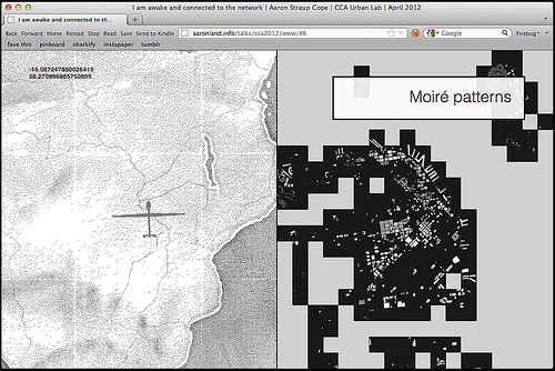
This is an early screenshot from a project I worked on, while I was still at Stamen, called map=yes.
There's not time to get in to the technical details of the project but what you're looking are two different views on the same data. The white shapes are buildings in San Francisco that have been added to the OpenStreetMap database.
The black squares indicate whether or not there are any buildings in that area. They are maps to denote the presence of information.
They are a kind of half-tone screen, like the ones that newspapers used to employ, to publish photographs before we had the magic mirror-printers we've all grown accustomed to today.
They are a kind of half-tone screen, like the ones that old computers used to employ to display images before we had monitors with more pixels than there are grains of sand.
They are a kind of sharpening of focus.
Maps, and map data, have always been pruned generally based on scale (or zoom level) but I think we're seeing something that's not necessarily new but maybe being played with a different tune or chord these days.
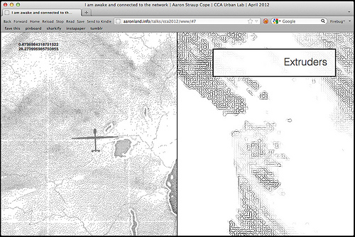
This is a project that my friend and former colleague Mike Migurski released the other day. It's a map of algorithmically generated hachure
marks – the marks that cartographers used to draw by hand to indicate slope and direction – produced with raw digital elevation data.
In the past I've talked about producing and treating maps the same way you might work with a bolt of fabric but maybe it's also like making pasta where the data (and the choice of data) acts as a kind of extruder shaping the noodles.
I don't really want to get lost in bad kitchen metaphors so I'm going to stop there and instead leave you with the image of the raw data acting as a kind of screen through which the squishy mass of history, of time and place, is passed to create a map.
Again, that's sort of been a truth we've always lived with but I think what's different is the volume and scale of the data that we have available to us and the kinds of filters that makes possible.
A couple weeks ago Google launched version 2 of the Google Art Project. If you've never heard of it it's a big catalog of images and metadata from a number of participating museums and cultural heritage institutions all wrapped up in the reality and illusion of Google's magic search tools and ability to make friends and influence people.
What Google is able to do that few others can right now is photograph the artworks using gigapixel cameras and generate reproductions with a terrifying resolution. Museums are also working to create their own high resolution imagery and though it will take them a while to catch up with the kinds of results that Google achieves I want to point out that they are both creating the same result: They are documenting works that don't exist. They are documenting works that have never existed. They are producing new works.
Does anyone want to guess what they're looking at here?
It's a painting by Manet. For some definition of a thing that could exist or be experienced divorced from its representation. Let's be honest: There are no three t brush strokes (and if you mention Franz Kline you will be sent to the penalty box for excessive pedantry) and no one ever sees these paintings this way, not even curators and scholars, if only because our little meat-y eyes aren't good enough to see this kind of detail, unmediated.
I happen to think this is beautiful and fascinating and I've spent a lot of time lately wondering what it would be like to have a wanderdrone for works of art. I would be delighted to see museums embrace these new things for what they are instead of the intellectual bear-trap they usually end up being.
I wanted to mention this in the context of maps and cartography and point out that this level of detail is a kind of weird and novel looking-glass screen that we're pushing works of art through.
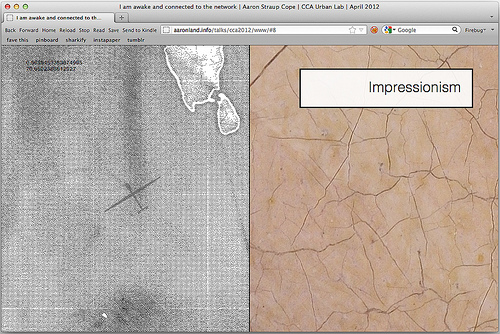
This is only a painting by some passing interpretation because what you're really seeing here are the cracks in the paint itself but you'd be forgiven for thinking that you were looking at an aerial view of the Australian outback.
Just as you'd be forgiven for thinking that this is a detail of a Jackson Pollock painting.
It's actually the Aral Sea, as seen in Google Earth. I'm going to pause now, for dramatic effect, so you can consider this image along side the dithered watercolor maps.
This is not a Mark Rothko painting.
There's a lot of excitement these days around the idea of purely data-driven maps that are generated and updated dynamically. I have my doubts about this stuff not because I don't think there are legitimate uses for it but because it smells too much like the thrill of something that was once hard and is now easy being mistakenly applied to everything in sight.
Short-term I expect we're going to see a lot whatever the mappy equivalent of an electric bread knife is.
I can live with that. Those things will become historical oddities and collector's items and are just the burden we'll have to bear as we figure out the tools that all this data – because it's really the data that is new and uncharted territory – will produce.
Thank you.
This blog post is full of links.
#connectedparallel-ogram
It took me a long time to warm up to Instagram. I would even go so far as to say that I haven't warmed up to Instagram. But I use it. I use it because it's a good mobile app and it invites you to keep poking at margins of what is possible, however slim those margins might be. I choose to believe that it is a testament to what people can do to make a lackluster tool sing that there's usually something new and wonderful from my friends when I dip my toes in.
I still do not believe the nonsense about snapshots and bad photos
and ephemera that gets tossed around when discussing so-called casual photo apps like Instagram. It is like some kind of weird and self-deprecating collective hallucination that I will not indulge people in. It's also a longer conversation than we have time for, right now.
One reason I've taken so long to get to know Instagram is that you put your photos in to their magic cloud-mobile-server-app and then... uh, yeah then... then, they get incomprehensible and unsearchable URLs if your photos are public or simply vanish in to the aether if they're not. I've noted with interest that lots of people simply assume their phones and the promise of a secondary backup on their computer or in some third-party storage service are enough of a future-proofing against Instagram suddenly vanishing one day. Maybe it is.
Frankly, most of my problems with Instagram center around the limits and the expectations that they set up for people about photo-sharing but that does not mean they are wrong to do so. It is still their party. And people seem to be having a pretty good time.
But I also don't believe that it's the casual (ephemeral
) flight of fancy it is so often made out to be. Not because of anything that Instagram says or does but simply because anything you do for any significant amount of time, no matter how dumb or trivial it seems at first, becomes a part of your history. Witness all the people now scratching their heads wondering how they create an archive of their time spent on Twitter. I am not here to fetishize artifacts and memorabilia. Sometimes it's fine to do a thing and let it drift out out to sea; to exist only in the re-telling. History has always been lossy but the fact that we have history at all I think demonstrates they we want and value concrete representations of the passage of time. Those representations change with the technologies at hand but the motivation doesn't.

So I made parallel-ogram. It's pretty much what it says on the tin: It's like Parallel Flickr, but for Instagram. If that phrase doesn't make any sense to you the best place to start is a talk I did at the Personal Digital Archiving conference, earlier this year, about cloning
Flickr.
parallel-ogram is a simple web application that uses the Instagram API to create a local backup of your photos and "likes" (and any associated metadata) and to make that archive a living, breathing website of its own. It is not a replacement for Instagram but a shadow copy running in... parallel. You can filter you photos by well, Instagram filters and your likes by filter as well as photographer. That's about it.
It doesn't have all the bells and whistles that Parallel Flickr does because it's still wet and new and because there's just not very much that comes back from the Instagram API that you can do anything with. One thing is does better than Parallel Flickr (for now) is allow you to limit who can use your copy of the app to backup their photos. This is done by requiring users to have a valid invite
code to register their account for archiving. People can submit their email address for an invite code and you (as the site operator) can approve them at will or generate new codes one at a time. I like that part.
The Instagram API does not currently expose any consistent indication of whether a person's photos are public or not-public. In the absence of that information parallel-ogram treats everything as private, meaning you're the only person who can see your photos. The exception to this rule is that you can see other people's photos that you've liked and vice versa. At some point in the near-future I would like to add the ability to mark photos in parallel-ogram as public or private, independent of any Instagram settings, but that's not possible right now.
The URL structure for the site is an amalgam of styles from Flickr and Foursquare (read: privatesquare) which is about as much as you can expect when you're cloning a thing that tries so hard not to exist on the web. Those weird /p/JIBBER-JABBER URLs that Instagram generates for public or shared
photos are supported where possible.

The thing I like the most is the layout for the photostream (or reverse chronological) view. Photos are arranged in a single row, three at a time. Because I like silly names I've taken to calling these haystack triptychs
. I love these because it's like each everything gets a new neighbour as photos are added over time. It's especially true when you're looking at photos you've liked
or are slicing through things by filter.
I've done a similar thing for individual photo pages, adding oversized bookend thumbnails for whatever comes before or after the photo you're currently viewing. I don't have a silly name for this yet so suggestions are welcome. None of this stuff has suitable mobile stylesheets so it will all look a bit wonky on your phone. Hopefully that will follow shortly (or I can just Jedi mindfuck Insam in to sending me a patch for all the nice work he did on flickrgram).
Somewhere in all of this there is a reply to Nolan's blog post about pagination but I'm going to save that for later. I disagree with a bunch of the details but it's a good post and you should read it if you haven't already. And it's all related. Somehow.

parallel-ogram is at about the same place Parallel Flickr was when it launched. It's a little bit prettier and with slightly better installation instructions (still no one-button setup tools yet) but, more than anything: It works. I'll probably put it down for a little while now and let it settle and then keep chipping away at it in small pieces. Having done this three times now (if you count privatesquare) I'm starting to have a better sense of what a one-button install tool might look like so maybe that's not too far off in the future.
In the meantime the code is available for poking at on Github:
This blog post is full of links.
#parallel-ogram