we need / MOAR dragons

Two weeks ago, I had the pleasure of speaking, alongside Josh Livni and Tim Sinnot, at the CCA (that's the California College of Art for Montrealers and archinerds, in the crowd).
I think the original topic I was asked to speak about was the future of real-time mapping
but I decided that I wanted to do a variation, or an update, to the original we need more dragons
talk that I did in Vancouver in 2009. I wanted to talk about how the exciting part of living and working in the now-ish is the fact that the tools for making and using maps have gotten so powerful and so (relatively) easy to use that we're in a good position to turn those same tool in on themselves and start finding our own use for them. I suppose that's also what I'd say about the future of real-time mapping.
I have had the luxury and the misfortune of never giving the same talk twice. There's certainly a thread that runs through the last few years of public speaking but if I've been able to slowly weave the past in to a coherent narrative the part where there's always something new to talk about means that everything risks (read: usually does) going off the rails by the end. Since giving the talk, I've been trying to corral togther the notes I did make beforehand along with the long list of things I meant to say (read: bonus slides from the FUTURE-PAST!) and it's turned into a monster all its own.
Here then are the slides and the notes (in their grueling entirety) for the talk I gave, the talk I tried to give and the talk I should have given:
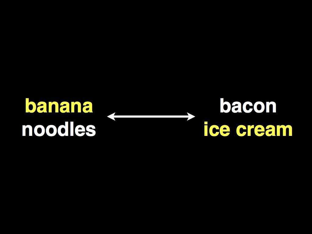
I'd like to start by sending up a pair of straw men to act as bookends -- as cautionary extremes -- for this talk. Both involve meals I had at restaurants in 2009.
The first was at a French "fusion" restaurant in Paris. We ordered the tasting menu and one of the courses was a banana noodle. It was a t long and 3/4 of an inch thick with the touch and consistency of pasta. Except that it tasted like a banana. For no other reason that I could make out beyond a celebration for the sake of celebration of the unexpected. In my mouth.
The second meal was dessert during a "whole hog" menu at a restaurant in Oakland: bacon ice cream. On the face of it (unless you're a vegetarian) bacon ice cream seems like it must be the best thing ever invented. Not only is it cold and full of sugar, but it also tastes like bacon! It turns out to be a lot like experiencing the uncanny valley. In your mouth.
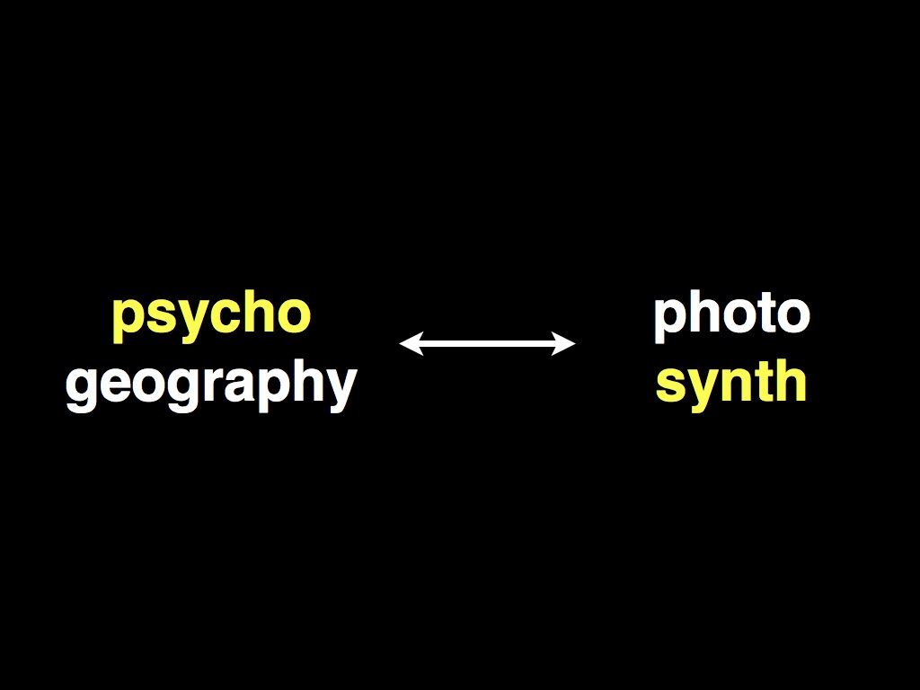
This is a talk about maps and the reason I mention these two meals is that I think you can see parallels in the world of geography.
Psychogeography is the banana-noodle. Photosynth and Google Earth and Street View -- really anything that could warrant Le Corbusier's designation of being a "voice from above" -- are the bacon ice cream. This isn't to discredit either of those ideas, out of hand. They are both important contributions in their own right but each has a habit of sucking the air out of any discussion, of reducing the idea of place to their own little hamster balls of reality.
The Situationists were a group of writers and artists in Paris during the 50s who were actively trying to imagine an urban environment not dictated by the imperatives of Work and Not-Work and a false duality created by always thinking about one's time in relation to economics. The trouble with the Situationists is that the really valuable thing they identified was an *idea* or an awareness that you internalized and carried with you in all things rather than any kind of prolonged dialectic. In the end it wasn't that the Situationists were wrong, it's just that they were boring.
At the same time, the world of traditional geographic information systems (GIS) has been on a 250-year tear in pursuit of relentless precision. This is understandable when you remember that "way finding" used to mean being guided by the stars, or the idea of North, and woe unto you if it were a cloudy day. The ability to (re)create immersive worlds or to pinpoint objects and people from satellites is astonishing and it is work that should be celebrated. We are better for the efforts of those who continue to keep looking for god in, literally, the details. But life is more than just a reference map or a series of selfish exigencies and for all our advances in cartographic truth-i-ness the magic and wonder of the map as an artifact and interpretive device have remained constant and in recent years, too often ignored. If photography was the medium that robbed painting of its role as an historical record it didn't take photographers very long to toss out the idea that this was all their medium could do (or that photography was an air-tight vehicle for recording "truth" at all).

One of the things that struck me the first time I went to Rome was how bad many of the Renaissance painters actually were. It turns that there were a lot of ceilings and walls to paint, back then, and in to this vacuum came scores of craftsmen armed with both technique and the philosophy of the moment. Still, despite the obvious skill of execution much of the work fails to inspire.
By contrast are the works of Caravaggio, scattered across Rome, no less versed in technique but whose inky black shadows consume the rooms in which they hang. What I enjoy about Caravaggio's work is that for all their realism and Renaissance "street cred" they depict a world that does not exist. Put simply: Light just doesn't do the sorts of things that happen in Caravaggio's painting out here in the real world.
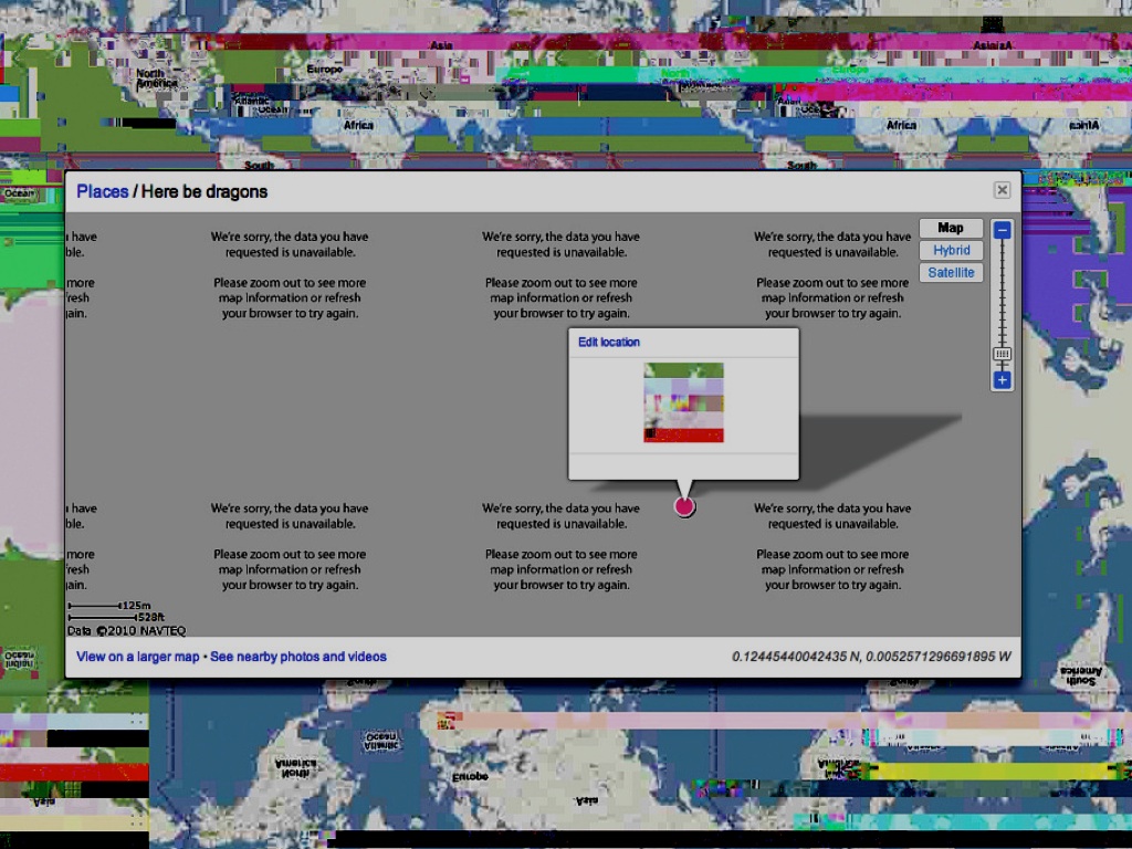
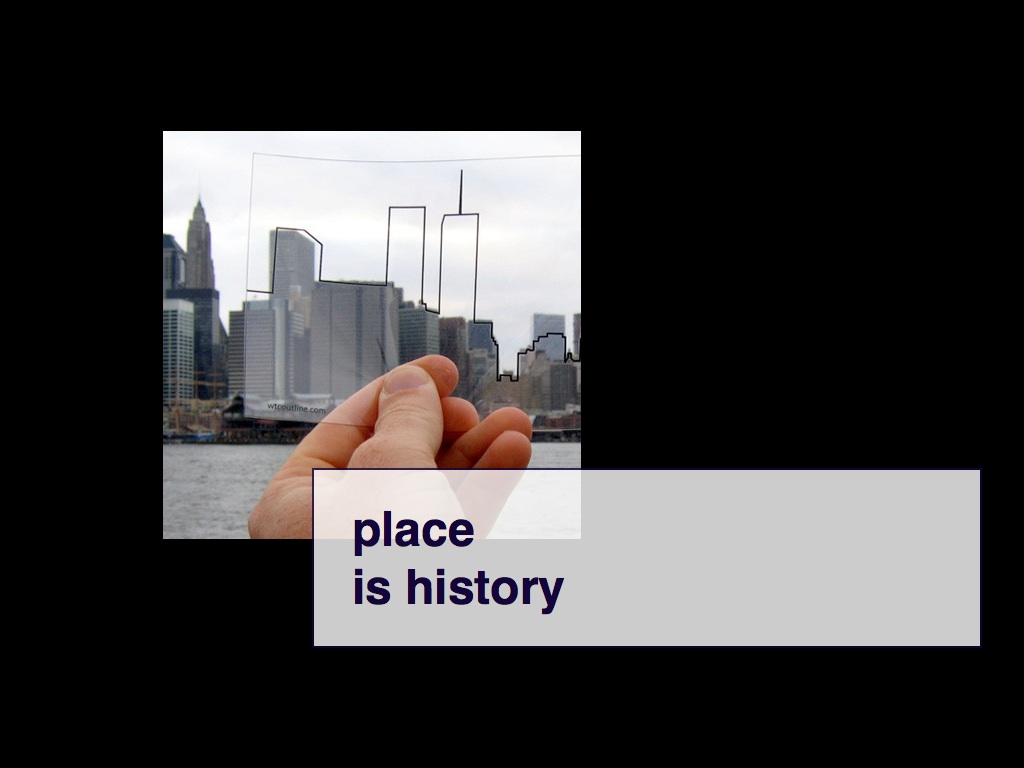
If you're not familiar with the phrase "here be dragons" it refers to the practice of marking unknown or uncharted territories on a map. It's a lovely expression because it admits what we do not know while at the same time encouraging (taunting, perhaps) further discovery. What keeps me interested in maps is wondering what it means to turn the phrase in on itself. What does it mean to use all these amazing tools we've created to chase away all the "dragons" as tools to actively look for new dragons, to be able to shine the light around and expose all those other places left uncharted.
The exciting part about working in the Now-ish is that the barriers to entry across disciplines are coming down with an almost frightening speed and opening themselves up beyond the history of their specializations. This is especially true in the world of geography where it remains an awkward space to be working in because the barrier was so high to start with that it's still too tall for a lot of people to feel comfortable approaching it. If this is a talk is about maps it is also a talk about tools because although it is early days what keeps me interested in maps is wondering how, we can do for maps with all our new abilities what Caravaggio did to light and shadows.
So, hello. My name is Aaron and I am from Stamen Design. We are a design and technology studio in San Francisco and my title is, suitably enough, that of "design technologist". I am also a recovering Flickr employee. I mention it because Flickr is still the prism through which I see most things. I mention it because while I was there I was involved in all of the mapping and geo-related projects and a lot of what I'm going to talk about here was born out of those experiences, both good and bad. I mention it because at the same time the studio (Stamen) was already deep in its own mapping-related projects and producing many of the tools that I found myself using to work through an idea or to build a prototype that wouldn't or couldn't fit in to Flickr's larger plans.
I went back to Flickr recently to talk to people about the hows and the whys of the way we built the geo/mapping tools, at the time. Before I went I tried to answer, for myself, the question: Why is geo even interesting for a website like Flickr?
One of the great advantages Flickr has had a "service" is that it traffics in photos. They are the objects that everyone has, that everyone shares with each other, that everyone affords a playfulness of interpretation we rarely allow anything else in our lives. It is in that context that Flickr gets to think about geography and of "place". Flickr does not need to worry about buildings or underground turbines or blasting mountains or making sure that bridges stay standing. Flickr gets to think about how the idea of a place compliments that way that people take pictures of, or gaze in wonder at, that place. That's pretty exciting as far as opportunities go.

For all of our successes with the geotagging project, at least while I was there, I still don't feel as though we really managed to live up to or make the most of that opportunity.
Some of it was practical: We were always a very small team trying to retrofit every new feature "in situ" 30, 000 feet in the air. Some of it was institutional: Making maps for the web is still a painful mix of issues around (data) coverage, licensing and production: A single tile set for the entire world is still measured in *terabytes* of data. This is, sadly, not a future that Yahoo! has ever been comfortable betting on. Both of these issues collided with another reality that no one was aware of, or wanted to admit, at the time: That Flickr needed at least two different kinds of map. Flickr needed -- still needs -- a map for geotagging photos and a map for sharing photos.
It is worth remembering just how giddy and punch drunk with excitement people were in 2005 when Google, honestly, blew the roof off of what it meant to think about maps and geography on the web. It is easy to understand how in a world where Google Maps was the thousand t chasm between a grudgingly adequate world we'd all been suffering though and a capital-F future of capital-P possibilities that everything should look and act like this new and shiny thing that was better in just about every way.

Of course, it wasn't. And isn't.
About a year after Flickr added geotagged photos I discovered ModestMaps, an open source Flash library for slippy maps written by Stamen. Tucked away in the corners there was also Python code written originally just to test the math. The interesting part about the Python code though was that it also let you create a single map image stitched together from lots of individual map tiles!

That meant it became possible to do all kinds of experiments on a much smaller, faster and cheaper scale. Which is to say: It made it easy to make things like this.

These last few black and white maps I've shown were made by applying a "dithering" filter to the same satellite imagery you see on Google or Yahoo maps. The algorithm is the same one that Bill Atkinson wrote for the original MacPaint program.
This is a talk not only about tools but about all the interesting ways these can be re-used. Why not take pictures FROM THE SKY and dress them up in the rich shadows and newspaper-y textures of a time when satellites were still novel?

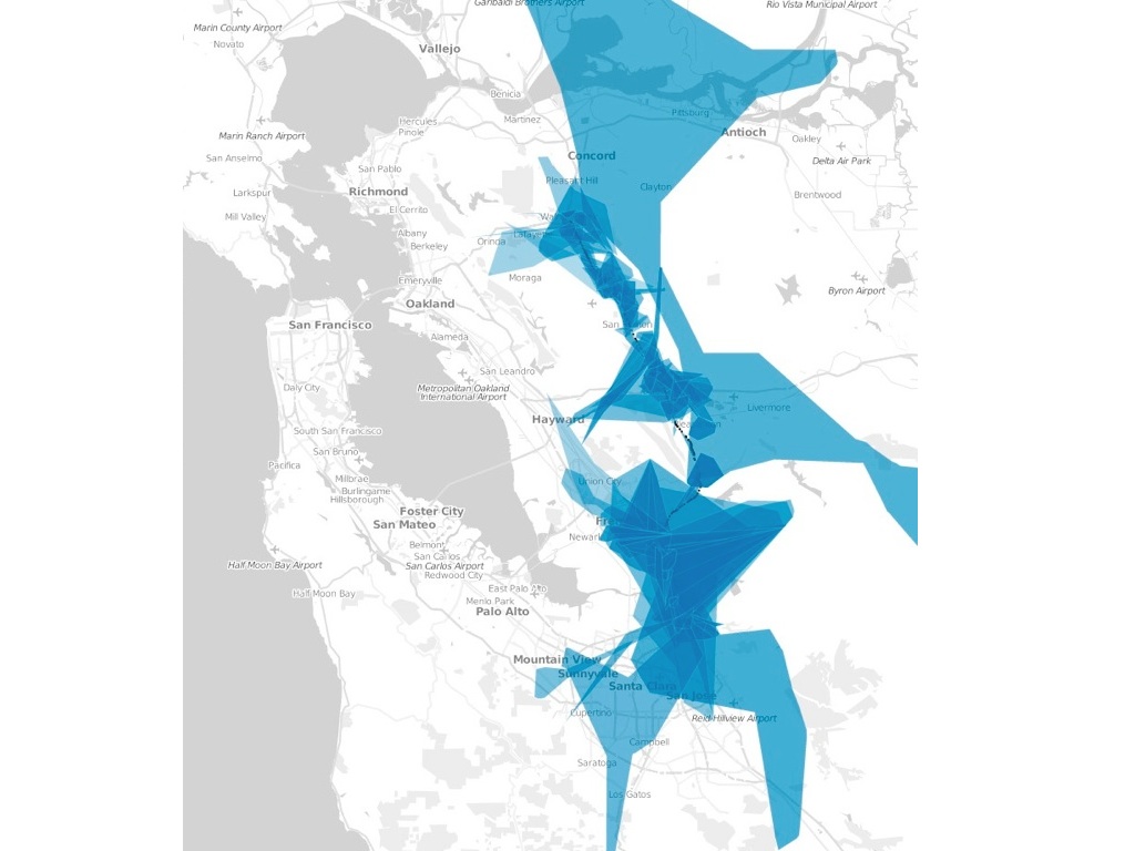
These are maps that Aaron Koblin made of flight patterns across the United States. There's no good reason in my mind why we didn't make these the default map tiles for people who geotagged their photos in airports or, even better, in planes 28, 000 feet somewhere over Ohio. That would have been not only more faithful to the photo but also more fun!

This is one of a series of experiments I did last winter plotting tagged photos in space, and trying to build up the map from from those shapes. These are the top 100 tags for photos already tagged "iphone" and geotagged in San Francisco. This may seem a bit silly (because it is) but it does demonstrate another way to talk *about* the geography of a photo without relying solely on streets or urban markers.

This is just a teaser. It's another experimental project that we did, in the spring, visualizing real estate data. Would this have ever made it out of the "lab", so to speak? Probably not but I include it because it's a good segue to talk about the idea of "anchor points".
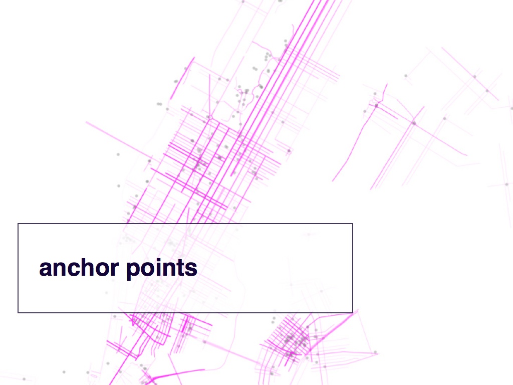
Around the same time, I started working on the idea of "pirate walk" maps. Pirate maps are loose, simplified short-hand maps rarely drawn to scale and instead emphasize the relationship between the vertices along a path: The distance depicting a 40 mile forward advance is less important than the need to turn left when you reach the large oak tree on the side of the road.
I've started calling these vertices, things like geotagged photos for example, "anchor points". These pirate walks maps were drawn by starting with a set of points, in this case my Flickr contacts photos in New York City. I iterated over each point and asked the GeoNames web service for all the nearby streets, filtering out those streets that were more than half a kilometer away. The remaining streets were drawn with a super low opacity so that gradually areas of activity start to appear while whole chunks of the city remain invisible.
This is a very simplistic approach that could be improved but it does allow the map to tell the viewer something about my experience of New York City: As it happens, no one I know there spends any time in the Upper West Side.

This is a map that my friend Anna Pickard kept while she lived in San Francisco. It's a plain old street map where she would mark off, with a pen, streets she'd walked during the two years she was here. I love this map because it's like a kind of tourist-of-one map and it is that singularity that makes it meaningful. It is an unwritten map of based on my relationship with a person. It is not a recommendation engine but instead a history of activity belonging to someone whose association and motive is left open to me and whose meaning I can "compute" faster than any algorithm or programatic guess-work.
Here's another "pirate walk" map. This time, I started with my friend Heather's Flickr photos from San Francisco and combined nearby streets with the shape of the neighbourhoods where the photos were taken. I'm using the same trick with the roads: The shape of a neighbourhood is drawn with a very low opacity and by drawing some of them over and over again you can start to make out a topography specific to that person.
One of the things I like about this image is that you can clearly see that Fort Funston, the place where she goes to walk her dogs, is part of Heather's San Francisco. You can see this not because of the roads on the beach; there are none. You can see this because the photos cause the neighbourhood around the beach to materialize.
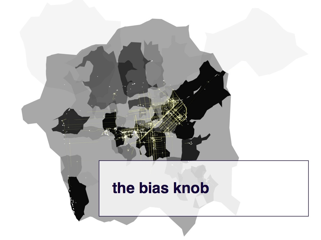
In a lot of generative art works, and in game design, there is the idea of a "physics knob" that you can use to adjust the relationships between different objects and the environment in which they exist. I've always tried to imagine what it would mean to have a "bias knob" that you could use to affect how cause and effect, or in this case maps, are displayed.

So, what are these "shapefiles" anyway?
For every geotagged photo Flickr stores up to six Where On Earth (WOE) IDs. These are unique numeric identifiers that correspond to the hierarchy of places where a photo was taken: the neighbourhood, the town, the county, and so on up to the continent. This process is usually referred to as "reverse-geocoding".
Which raises an interesting question: If you plotted all the geotagged photos associated with a particular WOE ID, on a map, would there be enough data to generate a mostly accurate contour of that place? Not a perfect representation, perhaps, but something more fine-grained than a bounding box. It turns there is although it also raises some interesting questions.
The larger pink shape in this slide is the shape of New York City, or rather the metropolitan area of New York. It was generated in 2009 and it highlights the perfect storm of bad assumptions on our part and bad data from our providers grafted on to the constantly changing assumptions of New Yorkers and their sense of the space they occupy.
The smaller white and red shapes are the generated from photos whose neighbourhoods are children of New York City. Here, the larger shape in the middle is a whole lot closer to what most people think of as New York, encompassing the five boroughs and even parts of New Jersey. This may not be the administrative reality but it does mirror facts on the ground.
And those other three smaller satellite shapes?
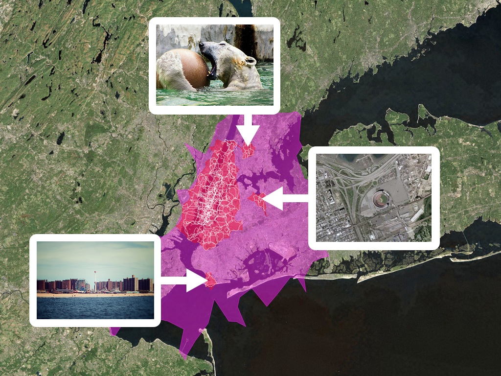
Shea Stadium, the Bronx Zoo and Coney Island. Any of which can lay a convincing claim to being as much a "part" of New York City as Brooklyn or Manhattan.
Most large-scale databases of "place" continue to be designed for and in the service of purely administrative uses whether it tax collection or business listings. That's not going to change but what is changing is that people are discovering that there is a need and a desire for richer and more expressive set of tools with which to talk about location.
This is the great opportunity that sites like Flickr, and more recently sites like Foursquare, have in the way they incorporate maps and the idea of "place" with their services.

One of the other things that we did was to start to treat airports as though they are cities. For technical reasons too dull to get in to here, we stored location information for all the photos against a fixed hierarchy of places rather than a free-form list of ancestors. This meant that for a long time if you took photos at SFO or London's Heathrow we'd tell you your photos were taken in places like "Milbrae" or "Surrey". Again, this makes sense for the purposes of deciding who's going to pay the water bills in those places but not for photos.
So we simply decided to treat airports as those they were their own "urban areas" not only because I have long read and admired the work of J.G. Ballard but because the realities of contemporary travel mean that airports have evolved from being simple gateways to captial-P places with their own culture, norms and gravity.
This is the shape of the Hong Kong International Airport defined in part by the place where you are asked to turn off your electric devices.
This is a screenshot of some early prototyping the studio did for a client visualizing cellular telephone towers, specifically the different cell towers that intersect a set of of driving directions. I mentioned that this talk was about tools and this is one example. The shapes of the cell towers themselves were generated using the same software that Flickr used to make its own shapefiles: An open source tool called Clustr.
I happen to love this example because it exposes the shape and the texture and the history of an infrastructure otherwise only understood in terms of dropped calls or abstract "bars" but it's just one example and the important thing is the practice seeing how the tools at hand can be used, or abused, in new and interesting contexts.

This is a map I saw one morning on my way in to the studio. I was so excited by it that when I arrived to work I told everyone I had just seen "the best map, ever!" I had no idea why a shop owner chose to make a map like this but I did not care.
I was completely enamored that someone had drawn the rough outlines of the Mission District and dropped their shop in the middle surrounded only by the street names at the edges. It was as though they were using their shop as an invitation for people to discover and explore the Mission: "Start the corner of 17th and Castro and head for Bernyl Heights. If you reach Cesar Chavez, turn around because you've gone too far!"
It was eventually pointed out to me that this is, in fact, just a map showing the far edges of where the shop will deliver to.

But maybe it's how we should have displayed geotagged photos on Flickr!
Maybe it would have been better to simply outline the photo in the "idea" of neighbourhood, as defined by the Flickr shapefiles for that area, and encircled again by the grid of the city or the texture of the landscape leaving breathing room for the photo itself to tell the story of that place.
That breathing room is an integral device in comic books, sometimes called the "gutter". It is the space between the panels on page where the reader is left to their imagination to fill in the actions between a series of events depicted. Why not do the same for maps? Or at least fail, trying.
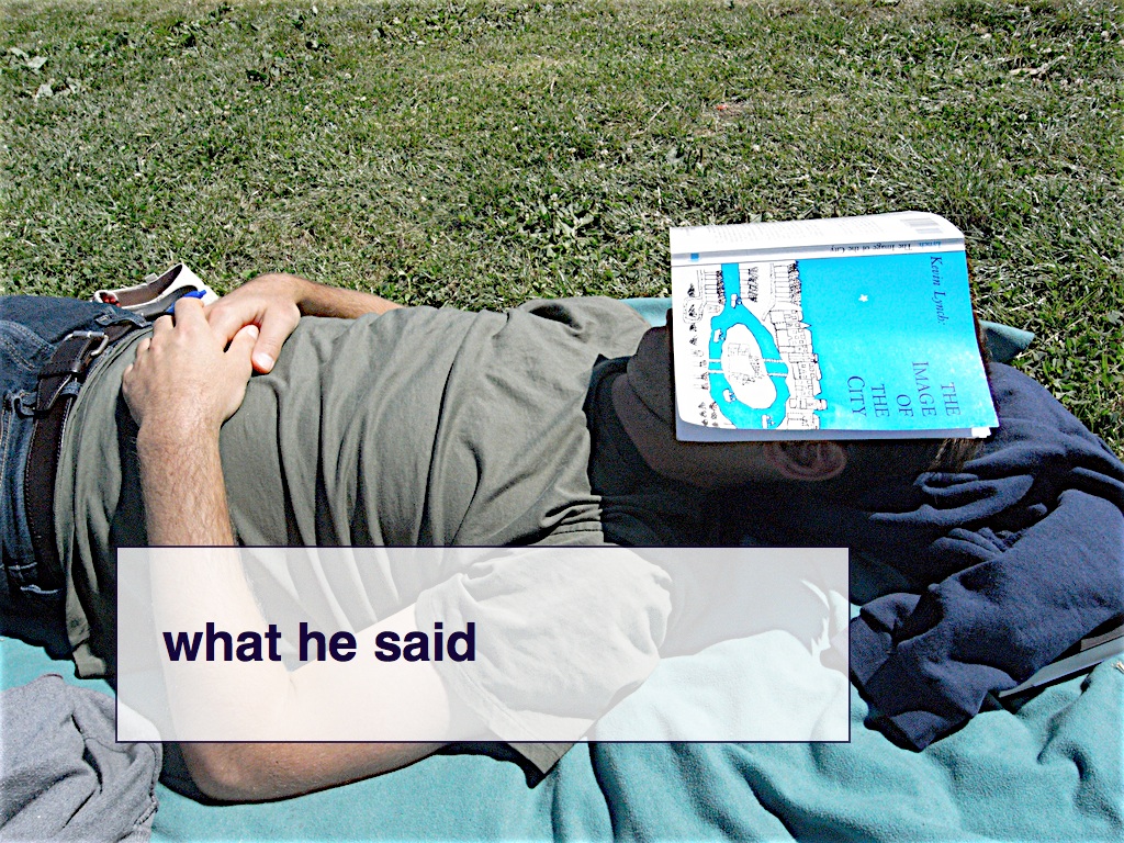
A brief public service announcement: If you've never read Kevin Lynch's "The Image of the City" go and do that now. We don't have time to talk about his ideas, here, but he was right then and he's still right now and it's an especially useful guide to help think about personal cartographies and networked places.

Since the new year, the studio has been working to develop a number of newopen source tools focused on the design, production and distribution of maps. Early in the year we started on a JavaScript port of the ModestMaps slippy map libraries which were originally written in Flash and Python.
This is a map of all the Flickr shapefiles displayed at once regardless of place type or zoom level, that uses the ModestMaps Javascript libraries. They're called, not surprisingly, "shapetiles".

The shapetiles were created using TileStache, a suite of libraries for generating, caching and serving map tiles, those little 256 by 256 pixel images that are the building blocks of slippy maps on the web.
TileStache can also be used to "seed" map tiles, which just means to pre-render them all in advance. This is really useful when you only need to render a limited number of map tiles and don't want to invest in the time and energy required to maintain a proper map server.
The shapetiles themselves take up about 5GB of disk space, spanning zoom levels 2 through 10, which seems like a lot but is really nothing compared to the terabytes required to tile the world down to street level.
All the tiles were rendered at once and then copied them to a server with a lot of disk space (Amazon's S3 service, specifically) and now the shapetiles map can run as easily as any other static website.

We've also released Polymaps which is a complete re-imagining of ModestMaps for JavaScript, written by Mike Bostock, built to take advantage of the functionality available in SVG-capable web browsers.
Aside from the speed and flexibility provided by SVG there are two things that I really like about Polymaps: 1) The ability to easily dynamically add and remove multiple tile layers to a map 2) The ability to send not only traditional raster-based tiles but also pure data tiles.
This is a screenshot of a map that a developer named Sean Gilles made to test some data he has been collecting for a project involving historical places, using Polymaps. The base tiles are the shapetiles I showed earlier while the blue boxes are being drawn dynamically by the browser.
That's actually a lot more important than it might seem at first. What happening here is that the only thing being sent to the browser are coordinates that are being rendered using SVG and CSS. That means itÕs super easy and quick to make design changes and to try new ideas. Even if you eventually need to render that data as static images the ability to quickly iterate, design-wise, over the data is a brand new world of awesome.

This was another experiment combining the Flickr shapefiles for neighbourhoods and cities with the "urban area" dataset from the Natural Earth project and layering them on top of a set of historic maps of New England from the New York Public Library's map collection.
I mentioned the term "urban areas" before because one of the glaring omissions in Flickr's original hierarchy of places was the metropolitan area: the South Bay, the Bay Area, Los Angeles in all its infinite big-ness, Paris as defined by the suburban train lines that ring the city rather than the walls of the old city.
The Natural Earth project is a community led collection of publicly licensed dataset for making maps. One of the most interesting datasets they offer are the shapes of "urban areas" which are generated by scanning satellite imagery of the Earth and clustering areas of "built environment". For those of you familiar with the work of the author William Gibson it should be clear in this slide that the oft-mentioned "Boston-Atlanta Metropolitan Axis" (or BAMA) already exists.
I wish that we had this data while I was at Flickr to serve as a visual echo of a place, to set the tone and be the soundtrack music the same way that cell paintings are used in animation.

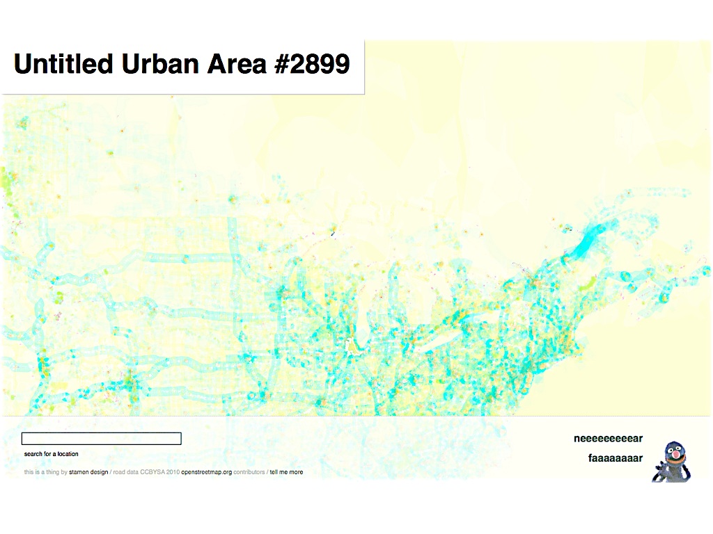
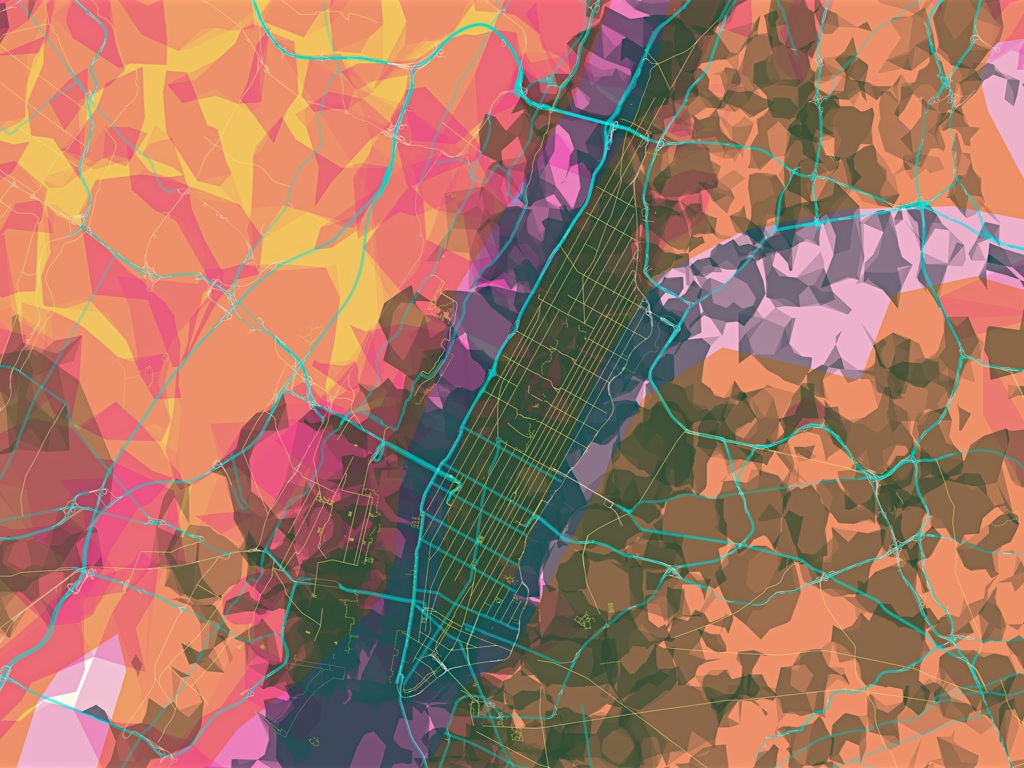
It's an experimental map that the studio released in August of this year. It takes everything I've shown you so far and tries to run as far out to left field as it can.

The goal was to try and generate map tiles that give you that same dizzy feeling you get when you look down at a city at night, from an airplane. We've spent so long fussing over the relentless details in cartography that we've sort of forgotten what things (should) look like at a distance.

The white ghost-like shapes represent all the places where Flickr users have taken photos; the blue and green lines are OpenStreetMap motorways and paths respectively; the orange shapes are urban areas as identified by Natural Earth. Unlike traditional maps most all of the data for a given layer is displayed, with only subtle variations in line width and other design considerations, regardless of zoom level.
.
This clustering effect offers a view of built environments around the world but also a visual representation of those places where no data has been recorded. This is most pronounced when you compare the density of coverage for Africa and South America with North America and Europe but you can see the same thing happening when you look at a map of the border between Canada and the United States.
At first glance, there seems to be much happening much beyond the fiftieth or fifty-first parallel, which pretty accurately reflects where most Canadians live, but if you look closely you can make out the traces of the the outline of all places where people have taken photos and uploaded them to Flickr.
It's also an interactive map. As you map over the the different elements in the map -- the roads, the shapes of towns -- the names of those places are displayed. Again, this is why the ability to send pure data tiles, separate from the look and feel of the map elements themselves, is so exciting.

Prettymaps operates very much at the edge of what the current crop of web browsers are comfortable doing. SVG support in most browsers is still a work in progress and not necessarily designed for displaying the volume of data that Prettymaps can sometimes load.
That any of this is possible at all is reason enough to celebrate and, we think, to investigate what is possible and where the rough edges remain.

One of the things you may have noticed about Prettymaps, by now, is that there are no residential streets. This was a deliberate decision and I'll come back to it in a minute.
Before I do, I'd like to talk about one of the problems that everyone is increasingly facing. It looks a bit like this.

Here's a more concrete example. This is an attempted visualization of a project that Josh Livni worked on: The Urban Forest Map. What you're seeing here are all 70, 000 trees displayed at once. Aside from the fact that web browsers are still not able to draw, or update, this many items at once it's not much of a visualization. There are trees in San Francisco, now what?
I show you this because this is increasingly what the future is going to look like for people. We are rapidly collecting and producing and emitting just as much data, each one of us, day after day.

Here's that same data set but collapsed into an aggregate space, using the Clustr program. This is only slightly more interesting than the dots but the point here is not to compare techniques for visualizing trees but to talk about ways -- and the need -- to treat all this data as a kind of soundtrack music rather than a million tiny little soapboxes competing for our attention.

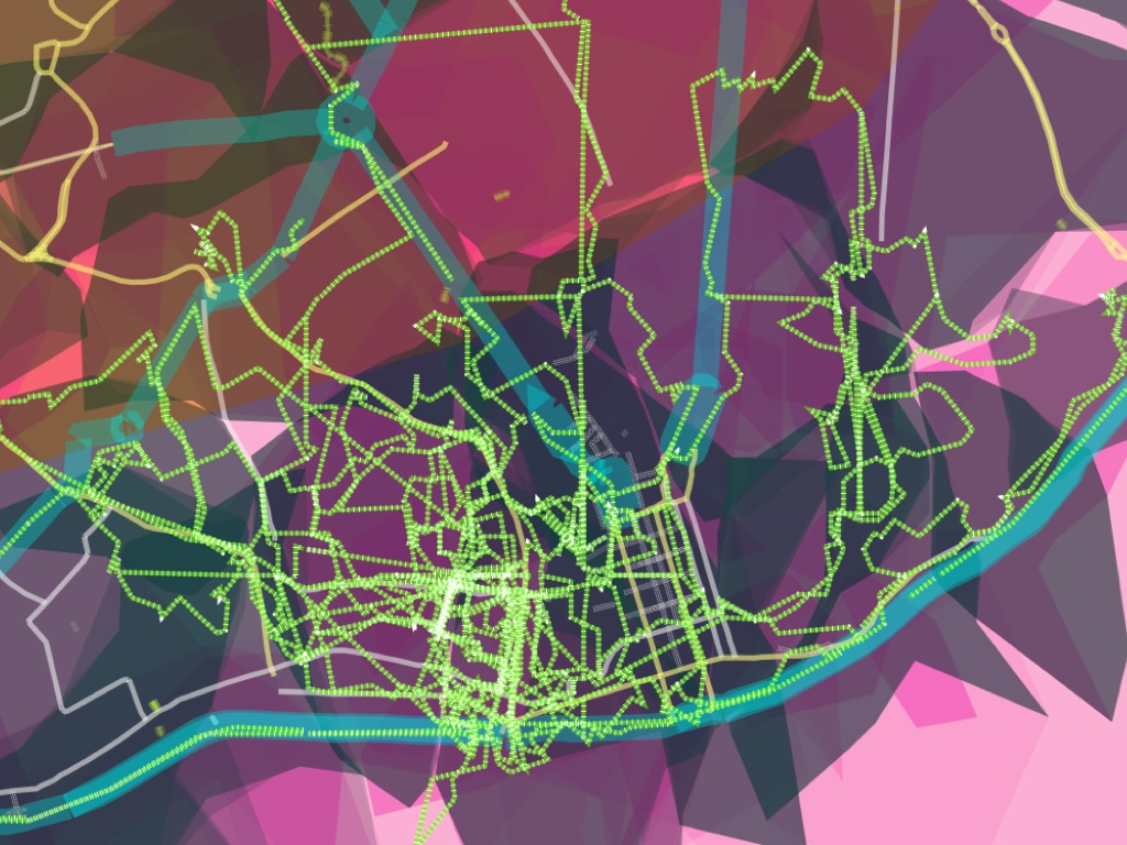
These are GPX trails that I collected riding a bike around Montreal for 10 days, this fall. I made a simple visualization, in Polymaps, to display the routes I covered along with some interactive elements that displays the speed and velocity of each point along the way.
I don't actually love this, as a finished project, but I do like the way that these sorts of personal trails (or "long anchor points") can be used to fill in the spaces in something like Prettymaps. One of the nicest things I've heard said about Prettymaps is that they are "basically incomprehensible until you find the place where you live and then they snap in to perfect clarity".
That's why residential roads were left out of Prettymaps, by the way: To leave enough space in which people might be able to make their own maps on top of, and within, it.
If that's the goal, the reality is still elusive I think. I recently went to Lisbon for two weeks and came back a few dozen GPX traces. The first thing I did was to see what they looked like in Prettymaps. It looks like this and it's pretty underwhelming, really. As much as it tells you the facts of our trip, it suggests none of the charm.

I recently discovered a lovely phrase at a digital humanities unconference, called THATCamp. It's an expression used by poets that: "gossip becomes genealogy". At its worst it's the idea that you can't know a author's work without knowing all the minutiae of their life. But somewhere between that and another extreme of cerebral precision I like to believe that it's an idea -- or rather a statement of bias -- we can apply to all of these enormous piles of data we are creating.
Since returning from Lisbon, I've been wondering if there's something to be done by applying the same technique we used to create the shapefiles at Flickr with GPX traces.
This is a very early proof-of-concept of the idea.
Here's another version, seen close-up.
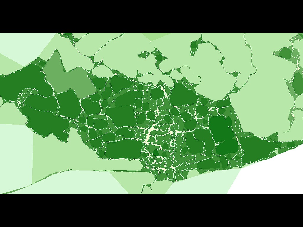
What you're seeing here are all of the points associated with all of those GPX files thrown into a single bag and then run through the Clustr program to create alpha shape (files). This is an image of five different shapes laid one on top of the other. The density and specificity of each shape is based on a configurable number passed to the software.
What you can start to see is the trip as a kind of echo chamber and a topography of movement. These are early early sketches so there's lot of work left to do including how to address the fact that those big dark green areas are actually parts of the city that we never actually went and not places where we spent a lot of time.

A similar technique to the alpha shapes produced by Clustr are Voronoi clusters.
This is a visualization that my colleague Mike Migurski did of crime reports in Oakland. Unlike alpha shapes, Voronoi clusters don't overlap which can be useful depending on on the information you're trying to display.
Voronoi clustering didn't make sense for Flickr because we were trying to account for the fact that, in people's minds and experience, all neighbourhoods (and most cities) overlap.
But, as you can see here the clustering is very effective for identifying both dense areas of activity as well delineating those parts of the map where nothing is happening (the lake and Piedmont).

Another example of some interesting work being done with Voronoi clusters is from a guy named Amit Patel who is using clusters of randomly generated points as a kind of starting yeast for growing 3D landscapes for video games.
I include this even though it gets dangerously close to heat map territory. I am not a fan of heat maps at all but it's interesting to look at the tools that Amit Patel has created and wonder what sorts of maps you might create if you used as input not a random set of coordinates but instead the anchor points of a person's life.

Mike Bostock, who wrote the Polymaps library, has also been experimenting with generating Voronoi clusters using JavaScript.
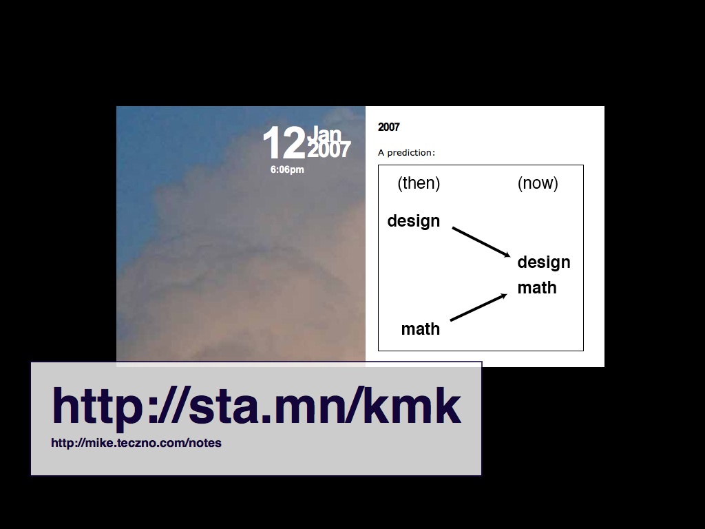
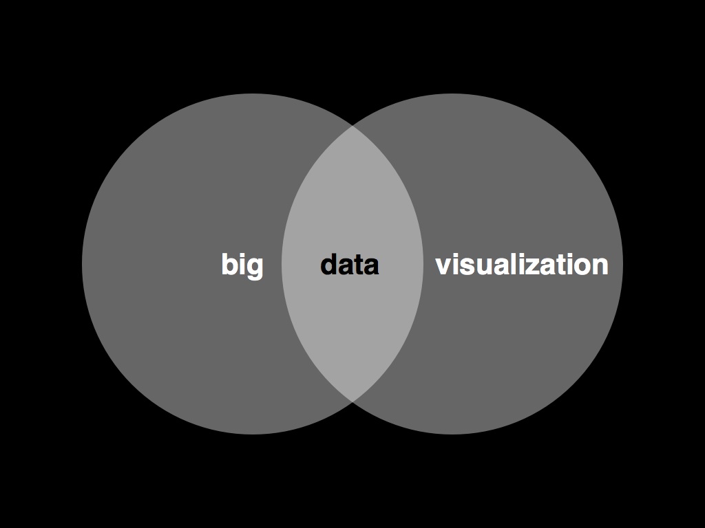
This is a diagram that Mike Migurski made a few years ago now and I think he's been largely correct in predicting the respective territories that design (or art) and math (or science) occupy are getting closer and closer, to the point where they can sometimes finish one another's sentences.
While it was being developed Prettymaps was coded-named "Isola" after the Finnish textile designer Maija Isola. At a time when the tools -- the math and the science -- for making custom maps and bespoke cartographies are becoming easier and more accessible it is nice to look back at her work and imagine the maps she might have made if she were alive today.

So, I'd like to finish up where we began, with painting and specifically the work of two Bay Area painters: Wayne Thiebaud and Richard Diebenkorn.
These two paintings hand side by side at the DeYoung gallery in San Francisco. Both are landscape paintings: San Francisco on the left and the Santa Monica area on the right. Neither of them depict an especially realistic view of either place except for the fact that if you visit either city the works here suddenly become more "photo realistic" than anything a camera could capture.
These are not maps to bomb your enemies by but they are maps to tell stories by. Kevin Slavin summed it up well nicely, a few years ago, by pointing out that: Google has facts, cities have secrets.
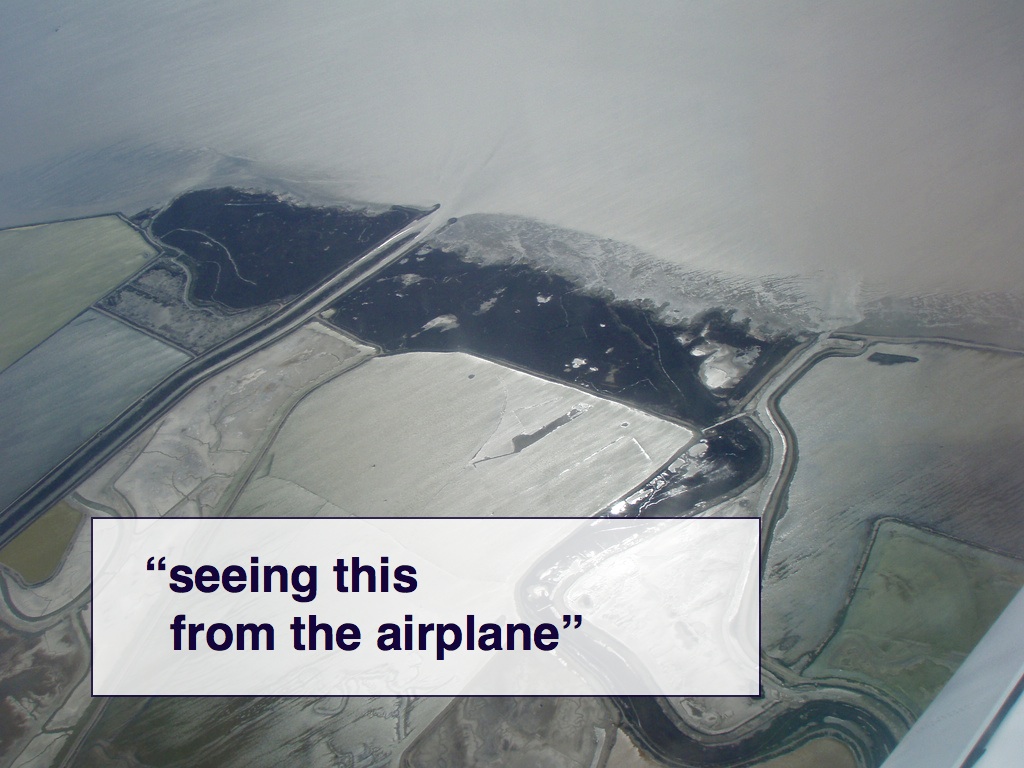
I'd like to finish up with this photo I found on Flickr as I was preparing these slides. The entire caption reads: Seeing this from the airplane convinced me that Diebenkorn was not making shit up.
Thank you.
This blog post is full of links.
#dragons