
Strategies against architecture: interactive media and transformative technology at Cooper Hewitt
The following was originally written in collaboration with Seb Chan and published as part of the 2015 Museums and the Web conference. Be warned that it's long. Like 13, 000 words long. If you can believe it this is still not the whole story. What can I say? It's been a long (not even) three years. The only-slightly shorter version is available over here.
Abstract
“Sometimes you have to create belief.” – Jack Schulze, 2013
Cooper Hewitt reopened at the end of 2014 with a transformed museum in a renovated heritage building, Andrew Carnegie's home on the Upper East Side of New York City. New galleries, a collection that was being rapidly digitized, a new brand, and a desire for new audiences drove the museum to rethink and reposition its role as a design museum. At the core of the new museum is a digital platform, built in-house, that connects collection and patron management systems to in-gallery and online experiences. These have allowed the museum to redesign everything from object labels and showcases to the fundamentals of a 'visit experience'. This paper explores in detail the process, the decisions made – and resulting tradeoffs - during each stage of the process. In so doing it reveals the challenges of collaborating with internal and external capacities; operating internationally with online collaboration tools; rapid prototyping; and the distinct differences between software and hardware design and production.
Strategies against architecture: interactive media and transformative technology at Cooper Hewitt
“Since 1976, the Smithsonian’s Cooper Hewitt museum in New York has been housed in one of the most glorious mansions from the city’s most glorious age of wealth and extravagance, the 1902 home of Andrew Carnegie. And the problem has always been: It’s the wrong kind of glory . . . The mansion was given to the Smithsonian by the Carnegie Corporation, the charitable organization established by the steel magnate, to house a collection of objects that has never quite seemed at home amidst the opulence and grandeur of the neo-Georgian stone and brick pile on Fifth Avenue. The mansion is locked in a particular past, full of wood paneling, stained glass, carved ceilings and even a themed room full of ornately detailed Indian teakwood. The collection, however, is an ongoing study in design evolution, spanning centuries, but fundamentally preoccupied with ideas of innovation and contemporary problem solving.” Phillip Kennicott, Washington Post, 2014.
Kennicott (2014) opens his review of the new Cooper Hewitt by zeroing in on the core problem that Cooper Hewitt’s reimagining has tried to resolve – the odd marriage of a building (Andrew Carnegie’s home), a collection (originally housed at the Cooper Union), and an increasingly outwardly and future-focussed mission. In this paper we explore the story behind the technology and interactive digital media that became part of an organizational transformation that has helped the museum reinvent itself.
This paper is divided into four distinct sections. The first is intended to provide an overview of context in which the concepts from Local Projects for interactive experiences at the museum were developed. The second explores the industrial design and product development involved in making ‘The Pen’ with Sistelnetworks, GE, Makesimply and Undercurrent. The third section details the ecosystem that needed to be created within the museum to implement The Pen. The final section provides early usage data and a conclusion. The intention of the paper overall, and in particular, the technically-focussed sections two and three, is to make visible the complexity of the project, its many interwoven elements and the challenges it presented.
Outside the scope of this paper are detailed discussions of exhibition design choices; curatorial and education department’s content development process for the new exhibitions; Local Projects’ design and development process for the interactive experiences; integration of Local Projects existing working model with the Cooper Hewitt API; the implementation and integration of a new ticketing system; detailed industrial design process for The Pen; and the detailed socialisation of The Pen with other museum departments. Despite this, the paper is intended to provide the back story that will allow those omissions to be discussed more effectively in the future.
Part one
No discussion of a museum’s technology, digital, or ‘experience’ makeover can be had without first addressing its physical context. Andrew Carnegie’s private residence creates a certain type of “threshold fear” (Gurian, 2005) that for Cooper Hewitt that has needed to be overcome through a combination of architectural and social interventions. Unlike the “threshold fear” invoked by the grand architectures of the 19th (and early 20th) century public buildings, Carnegie’s residence with its high fence was purpose-built to keep people out. Low visitation, for a museum in New York, was recognised and in response to an internal Smithsonian review of long term viability in 2007, the building expansion was announced to counter its reputation “[as] a sleepy institution hampered by its setting in the ornate turn-of-the-century Carnegie Mansion” (Pogrebin, 2007).
An expanded Cooper Hewitt would not only be able to have
more exhibition space and flexibility to show different
sizes and types of objects but its visitorship would
change. A new Cooper Hewitt would, if done right, able
to draw broader, more diverse audiences; have them spend
more time on campus; and come back more often as repeat
visitors.
Successfully fundraising for a major renovation began in the mid 2000s with Caroline Baumann, then Deputy Director (now Director) and a significant war chest had been raised by the time of the museum’s closure in mid 2011. In tandem with the closure of the main campus, moving the permanent collection to offsite storage in New Jersey, and the relocation of staff offices into the townhouses beside the Carnegie Mansion marked the end of the first phase.
With progress already underway to restore the historic features of the mansion, fundraising turned to the ‘exhibitions’ and, ultimately, ‘the experience’ – and what was initially conceived of as a two year, $64m renovation (Smithsonian, 2011) grew into three year, $91m project (Cooper Hewitt, 2014) enabling a much broader reimagining of the institution, with an optimistic intention that it would reopen during 2014.
Starting out digital
Cooper Hewitt’s Digital & Emerging Media (D&EM) formed as an independent department at the end of 2011 with the hiring of a Director of Digital & Emerging Media (Sebastian Chan). Over the next seven months the team expanded, its capacities rapidly grew and the Cooper Hewitt Labs emerged as an ‘online entity’, as a result the museum’s digital presence began to rapidly expand. By late 2012, the collection had been released under a Creative Commons Zero license. A bold public alpha version was released online and work was underway to decommission most of the museum’s “unnecessary” digital projects such as microsites and one-off apps in order to create space to think and work on a new future (Chan, 2013).
Shortly after Museums and the Web 2012, David Walsh,
Director of Tasmania’s Museum of Old and New Art
(MONA) was invited to speak to the museum leadership and
curatorial staff. Walsh spoke provocatively of how he
had abandoned object labels at MONA, and of the process
that led to his funding of the Art Processors and the
development of their mobile guide, The O (Lijinzaad
2012). Although Cooper Hewitt didn’t end up
signing up to implement a version of The O,
Walsh’s talk to the museum’s staff helped
crack open some of the internal thinking about the way
‘things should be’ and allowed the museum to
start to consider ‘what could be’.
Under Director Bill Moggridge’s leadership Diller,
Scofidio + Renfro (DS+R) were selected as exhibition
architects and Local Projects as media designers. Cooper
Hewitt was able to present the two teams with The O as
an option and give both firms the scope and permission
to push the museum further.
With Bill Moggridge’s unexpected death in August 2012, the museum committed to continuing his vision by opening as what Parry (2013) termed a ‘post-digital’ museum. In launching the new Cooper Hewitt collection online earlier that year, Chan (2012) wrote, “we need to not just be ‘on the web’ but we need to be ‘of the web’” and this philosophy became increasingly important in working with DS+R and Local Projects throughout the concept phase, and later in assessing and improving the ideas.
Basic principles for technology in the galleries
In early 2012 at the National Art Education Association conference at the Metropolitan Museum of Art a group of junior school children working with Queens Museum of Art got up on stage and presented their view of ‘what technology in a museum should be like’. The kids imagined and designed the sorts of technologies that they felt would make their visit to a museum better. None of their proposed technologies were unfeasible and they imagined a very familiar sounding museum. The best invention proposed was a tracking device that each child would wear, allowing them to roam freely in a geo-fenced museum like home-detention prisoners with ankle-shackles, whilst their teachers sat comfortably in the museum cafe watching them move as dots on a tablet. The children argued that such a device would allow them to roam the museum and see the parts of it they actually wanted to see, and the teachers would get to fulfil their desires of just “hanging out in the cafe chatting”.
Often it feels like museums make decisions about the appropriate use of technology based upon short term internal needs – the need to have something ‘newsworthy’, the need to have something to keep their funders happy, and occasionally to meet the assumed needs of a specific audience coming to a specific exhibition. Rarely is there an opportunity like the one at Cooper Hewitt, to consider the entire museum and purposely reconfigure its relationships with audiences, all in one go. Even rarer is the funding to make such a step change possible.
The D&EM team established a series of unwritten technology principles for the new galleries and experience that were reinforced throughout the concept design stages and then encoded into practice during development. At the heart of these was an commitment to ensure that whatever was designed for the galleries would give visitors a reason to physically visit – and that nothing would be artificially held back, content-wise, from the web. Technology, too, had to help and encourage the visitor against the architectural impositions of the building itself.
Complementing a strategic plan that envisioned the transformation of the museum into a ‘design resource’, and an increasing willingness to provide more open access to the collection, concepts for media and technology in the galleries was to –
- Give visitors explicit permission to
play
Play was seen as an important way of addressing threshold issues and architecture. Entering the Carnegie Mansion, the experience of crossing the threshold provided an opportunity to upend expectations – much like the lobby space of a hotel. Very early on in the design process, then-Director, Bill Moggridge enthused about the idea of concierges greeting visitors at the door, warmly welcoming them into the building and setting them at ease. Technological interventions – even symbolic ones – were expected to support this need to change every visitor’s perception of how they were ‘allowed to behave’ in the mansion.
- Make interactive experiences social and
multi-player and allow people to learn by
watching
The Cooper Hewitt, even in its expanded form, is a physically small museum. It has 16,000 sq ft of gallery space which is configured as a series of domestic spaces except for the open plan third floor, which was converted from offices into gallery space as part of the renovation. If interactive experiences were to support a transformed audience profile with more families and social groups visiting together, the museum would need experiences that worked well with multiple users, and provided points of social interaction. Immediately this suggested an ‘app-free’ approach even though Cooper Hewitt had been an early adopter of an iPod Touch media guide (2010) and iPad App (2011) in previous special exhibitions.
- Ensure a ‘look up’ experience
Again, because of the domestic spaces with narrow doorways, encouraging visitors to be constantly referring to their mobile devices was not desirable. There was a strong consensus amongst the staff and designers that the museum should provide a compelling enough experience for visitors to only need to use their mobile devices to take photos with.
- Be ubiquitous, a ‘default’ operating mode for
the institution
The biggest lesson from MONA was that for a technology experience to have the best chance of transforming how visitors interacted with the museum, and how staff considered it into the future, that technology had to be ubiquitous. An ‘optional guide’, an ‘optional app’, even a ‘suggested mobile website’ might meet the needs of some visitors but it was unlikely to achieve the large scale change we hoped for. Indeed, the experience of prior technologies at Cooper Hewitt had been considered disappointing by the museum with a 9% take up rate (Longo, 2011) for the iPad guide made for the (pre-closure) blockbuster exhibition Set In Style. Similarly, only having interactive experiences in ‘some galleries’ threatened to relegate certain experiences to ‘younger audiences’ – something that is common in science museums.
- Work in conjunction with the web and offer a
“persistence of visit”
We were also insistent from the start that whatever was designed, that it had to acknowledge the web, and that ‘post-visit’ diaries were to be considered. The museum was enamoured with MONA’s post-visit reports from The O, and similar initiatives that followed including MOMA’s Audio+ (2013) and others. This idea grew and the D&EM team began to build out a sizeable infrastructure over 2013, the desire to ensure that everything on exhibition in the museum would also be available online – without exception – became technically feasible. As the museum’s curatorial staff began to finalise object lists for the opening exhibitions, it became clear that beyond the technology layer, a new layer of policy changes would be required to realise this idea. New loan forms and new donor agreements were negotiated and by the time objects began to arrive for installation at the museum in 2014, all but a handful of lenders had agreed to have a metadata and image record of their object’s presence in the museum not only be online during the run of an exhibition, but permanently on the exhibition’s online catalogue.
Agreed concept designs
During the concept design phase the museum worked closely with Local Projects. By the end of 2012, a range of core designs for interactive media experiences had been settled upon and the next phase would start to implement them in parallel with exhibition design work undertaken by Diller Scofidio + Renfo and Thinc.
Collection browser
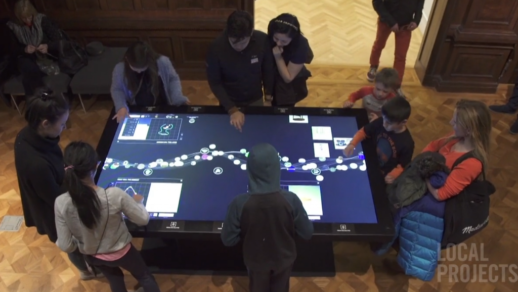
The Collection Browser was one of the first core experiences to be settled on. A highly visible way of exploring the breadth of the collection was to be deployed across the whole museum, rather than in one singular location (like Cleveland Museum of Art’s Gallery One). Content for this experience was to be drawn from the museum’s collection and delivered through the museum’s Application Programming Interface (API) which was already under rapid development. The interactive experience was to allow serendipitous discovery and saving, access to related media, and some means of exploring the processes through which objects were designed and made.
Because of the different physical sizes of the rooms in the museum it was also determined early on that this experience would need to function successfully at a variety of different resolutions, physical sizes and potentially on different devices. Interactive tables were specified and selected – 4K resolutions at 84 and 55 inches, and 1080p at 32 inches – the highest resolutions available at the time. The larger size tables were to be operable for either long edge, requiring a visual design and interface that supported multiple users in a variety of orientations, whilst the smallest 32 inch screen would only support a single user in a single orientation.
Vertically oriented collection browser screens were considered for integration into casework which would have enabled the display of born-digital works at the same scale and prominence as ‘physical objects’. These would have also afforded the museum the opportunity to show ‘similar works’ at 1:1 scale beside objects in cases too – an early concept had a scrollable selection of teacups from Cooper Hewitt’s collection alongside a vitrine of teacups. Unfortunately this concept was abandoned because of the inability to build a suitable physical case for the screen that managed heat, light and other conservation concerns.
Making apps
As a design museum, Local Projects felt strongly that Cooper Hewitt needed to have some experiences for visitors to design and create their own objects. Early versions of these concepts included the ability to make and print 3D replicas, and ‘test’ various designs. Neither of these made it through to the final versions, and one further omission would have allowed visitors to ‘trace’ objects using a ‘digital vellum’ overlay.
The final making apps, however, were integrated into the same experience as the Collection Browser rather than operating standalone. In these experiences visitors can draw a series of different 3D forms using a simple tool kit, selecting different materials, and creating a chair, building, hat, vase, lamp or freeform shape. These appear on relevant backdrops and can be saved by visitors.
For an institution like Cooper Hewitt, primarily grounded in art historical approaches and training (rather than a science museum), these making experiences were novel but also notoriously difficult to socialise amongst staff. Local Projects’ initial proposals were complex and during the build process they actively encouraged the museum staff to simplify and keep in mind the need to quickly engage and reward visitors instead of reproducing the functionality of professional tools, like Photoshop or 3DSMax.
People browser
Connected to the Collection Browser was a concept for a People Browser which would enable visitors to explore the relationships between the individuals responsible for the collection – either as designers, artists or as donors. This concept went through a number of iterations as it became clear that content in structured formats for this would be very difficult for the museum to produce with the limited curatorial resources available. The final version focussed on donor relationships in the early 20th century – drawing on research materials already produced for opening print publications – however it can also easily present contemporary designer relationships, should that research be undertaken.
Immersion room
Cooper Hewitt has one of the most significant collections of wallcoverings in North America but it has been a collection that has been difficult to effectively exhibit. The wallcoverings were identified, even before the appointment of Local Projects, as a key digital experience and staff were introduced to the work of Sarah Kenderdine and iCinema in early 2012. As the museum’s concept of an immersion room for this collection developed, Local Projects injected the idea of ‘drawing your own’ which greatly invigorated an otherwise very collection-centric experience. During the production stage, the choice of projection technologies oscillated wildly between a projection-mapped complex geometrical space with directly ‘writable walls’ before settling on a final flat-wall solution with a dual-user interactive table. This final solution with front projections has proven to be a hit with visitors and create a unique selfie-worthy moment in every visit.
Mansion history
The story of the Carnegie Mansion was conceived of as the simplest interactive experience initially to be mounted in two locations in the museum (currently deployed in only one). Using historical imagery users would be able to navigate a map and see the mansion as it once was. Although augmented reality was briefly considered along with ‘peepholes into the past’, the uneven access to historical photographs for each floor and room ended up taking this down a straightforward kiosk path. Somewhat ironically, for such simple content, this experience is not currently available online.
Process Lab Make it better
and Wild
ideas
The Process Lab is the museum’s new space where visitors can “brainstorm design solutions through hands-on and digital activities. The Process Lab emphasizes how design is a way of thinking, planning and problem solving, and provide a foundation for the rest of the design concepts on view in the museum” (Cooper Hewitt, 2015). To support the analogue activities in this space, two different digital experiences were developed. “Make It Better” is a digital suggestion box that asks visitors to improve a design of an existing everyday device with the need of a particular user in mind. These range from a backpack to a subway turnstile. Visitors draw and annotate their solutions and can vote on the proposals of others. “Wild ideas”, which is still in development, works as a brainstorming trigger where visitors are challenged to unite the properties of two radically different objects such as a bicycle and an artichoke.
Part Two
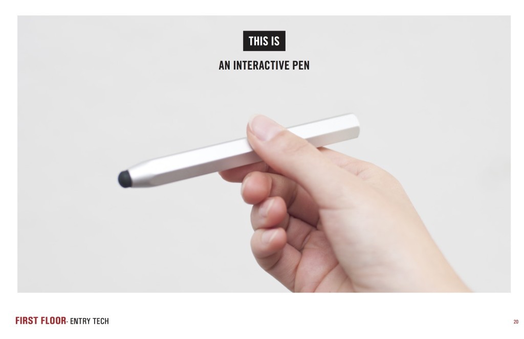
The Pen
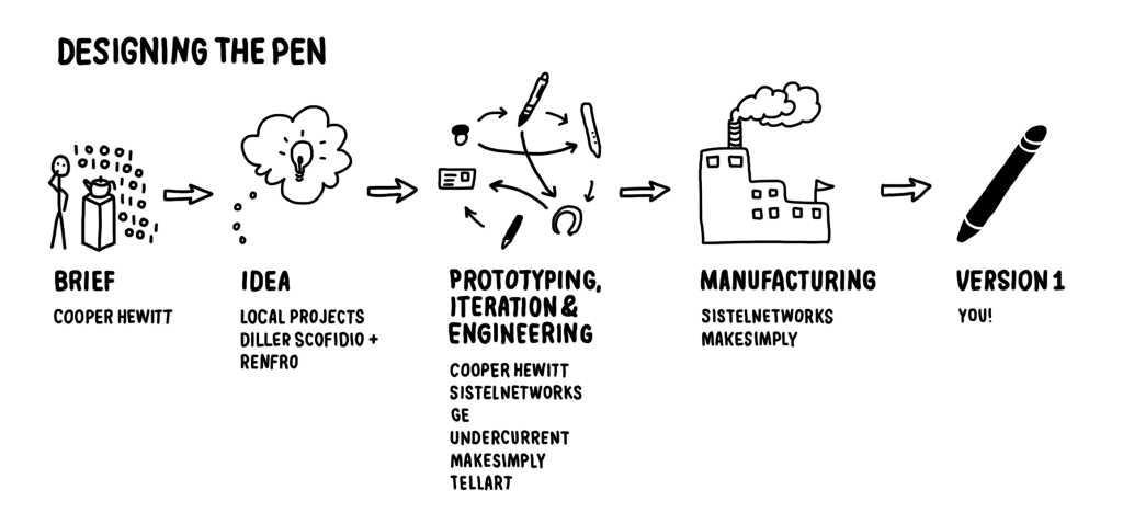
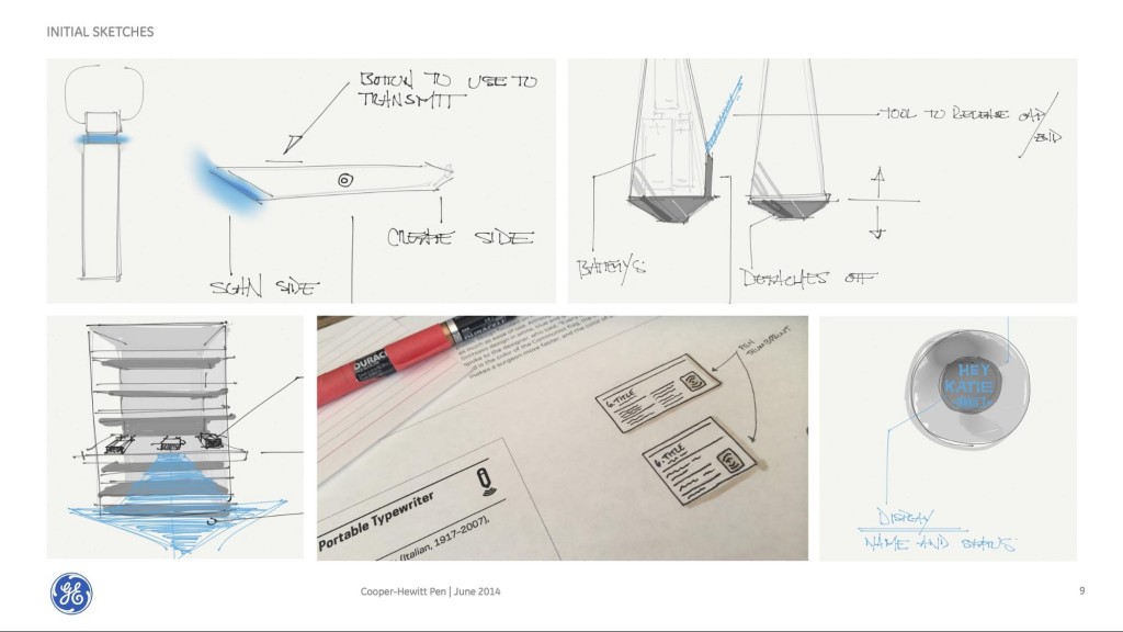
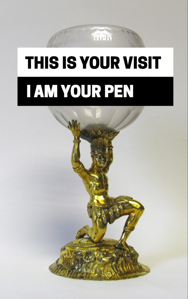
Uniting all these interactive experiences, and the galleries themselves, was The Pen. Local Projects’ final considered response to the museum’s challenge was a bold set of slides presented by Diller Scofidio & Renfro in August 2012 that suggested the museum give every visitor a Pen. This pen, in the language of the slides, would be “[part of a] system-wide platform, [be] your ticket, your identity throughout the museum, how you make purchases [in the shop], making you an active visitor, getting you away from your phone and closer to design” (Local Projects in Diller Scofidio & Renfro, 2012). This was immediately compelling for the museum even though it was also identified as a high risk item requiring considerable investment. Whilst Local Projects’ slide had provided the initial vision for The Pen it did little to reveal the complexity of the infrastructure and systems beneath it to make it work seamlessly.
Starting The Pen
Once the decision had been made to move forward with the concept of The Pen, Bloomberg Philanthropies was brought onboard as a financial backer through their Bloomberg Connects program. Bloomberg Connects agreed to funded the entire technology implementation – The Pen along with the interactive media, associated hardware, and the integration of a new ticketing system and relevant front-of-house staff. Chan has described this scale of investment as ‘venture philanthropy’ (Chan, 2015)
There was, then, a prolonged period where the museum along with DS+R and their audio-visual consultants, AV&C, explored the options for an off the shelf stylus with an NFC or RFID chip inserted into it. In order to keep progressing with the overall museum renovation timeline, Local Projects were directed to focus on the interactive media applications that The Pen would operate with – rather than stretching themselves thinner by also tackling a complex hardware challenge.
During this initial research period the intention was to find a stylus that had a unit cost of <$5 and could be easily modified. In this early scenario, each set of object labels in the museum would be individually powered and hold a Raspberry Pi microcomputer and NFC or RFID reader which would read the stylus when touched.
Hedging our bets
Local Projects’ initial design concept for The Pen assumed pre-existing or readily available hardware that could be purchased off-the-shelf and easily assembled using consumer-grade parts at a particular price-point. On the surface, scanning Fast Company and Kickstarter, one might assume the same. None of these assumptions proved to true.
Over the course of the re-opening the museum shifted its focus from an “active” pen to a “passive” pen and finally back to an “active” pen. The terms “active” and “passive” refer to where the smarts of the system reside in the overall infrastructure. A pen is considered “active” if it contains a built-in microcontroller for processing “passive” tags and on-board memory for storing them. A “passive” pen, in contrast, contains only an RFID tag while the labels and label rails house small computers attached to antennae for reading those tags.
Early design concepts assumed an “active” pen and “passive” tags that could be assigned arbitrary content. As the expected cost of this approach became prohibitive we investigated swapping the roles and embedding Raspberry Pi (RPI) computers in the label rails themselves. Because the scale and scope of this approach was daunting, the museum’s ability to rapidly build a working prototype was critical.
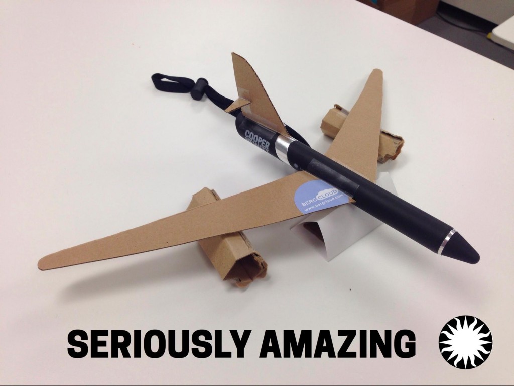
It would have been easy enough for the museum to let itself get overwhelmed by the number of moving pieces and the imagined weight of unknown factors but we were able to build a functional “pen” system in relatively short-order.
The first prototype consisted of an RFID tag taped to the top of a marker, a paper mock-up of an object label taped to an RFID reader connected to a RPI that was itself connected to the Internet, all of which were set next to an object (Henry Dreyfuss’ 1963 Model 500 telephone purchased from eBay and which the museum also holds in its collection). The RPI ran a small program that would listen for events on the RFID antenna and then pair and record The Pen ID and the object ID and use the museum’s API to store that information on the collections website. A user could pick up The Pen and touch an object and then turn around and immediately see proof of that interaction on the museum’s website.
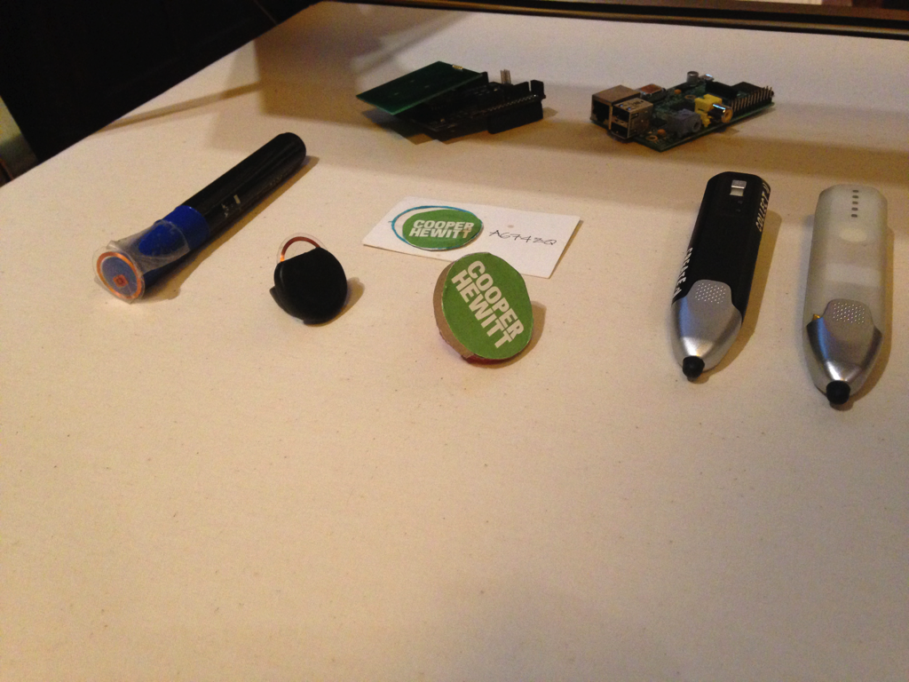
In building an internal physical prototype, the value of the project started to become more real to the rest of the museum; evidence of the things they had previously only seen in presentation slides actually working. Even though the prototype was clunky and rough around the edges it was enough to allow people to grasp the potential and to use that excitement to foster a willingness to embrace the remaining challenges.
At this stage the issue of whether we would manufacture even a “passive” pen remained an open question. RFID tags are fragile devices and it wasn’t entirely clear how they could be embedded in something like an injection-molded plastic or foam pen without damaging them. Further their size and the precision with which tags need to be positioned relative to an antenna meant that we weren’t confident we could design a pen that would even house the tags correctly.
One day in mid 2013, we asked ourselves: What if The Pen is too difficult to produce?
If all we had were rows of label rails containing banks of RFID antennae and RPI computers connected to the Internet how would a visitor “collect” objects on display? If we assumed that visitors could and would continue to use their fingers to perform tasks on the interactive tables then where and how would they carry an RFID tag to identify themselves and how would they “tap” with the antennae housed in the label rails?
Eventually, the idea a ring was suggested which struck people as just silly enough to try. Prototyping this involved going to the corner store and buying a couple bags of Ring Pops (oversized plastic rings where the gems are hard candy), removing the candy and fashioning different enclosures for RFID tags. Gradually those enclosures evolved in to a flat surface atop which a sticker containing an RFID tag could be affixed. This was an attractive solution because peelable stickers on museums tickets as proof-of-entry are a well-understood model and there appeared to be support for RFID-sticker-label stock from our ticketing system vendor (Tessitura).
The idea that all our visitors would wear over-sized “superhero” rings was dubious at best. Requiring visitors to “fist-bump” the wall labels would have been awkward and likely reduced the lifespan of many labels. However the idea of a ring also opened up the idea that we could develop a multiplicity of forms (a pocket-watch, a bracelet, or even abstract shapes) that users could carry with them through the galleries. The thinking was that as relatively simple plastic forms they would be cost-effective to manufacture and that their only requirement was a target area for a visitor to affix the RFID sticker tag from their ticket. They would have been cheap enough that visitors could take these forms with them as a memento of their visit.
Although this idea didn’t go far, we were able to create a working demonstration in an afternoon. For the first time, we were able to make decisions based upon an actual tangible working prototype rather than any one individual’s intuition or interpretation.
The museum also experimented with computer-vision technologies as a way to enable users to collect materials in-gallery. We developed an experimental web service, called the “Label Whisperer” (Cope, 2014). This allowed visitors to upload a photograph of a wall label and then use optical character recognition (OCR) to scan the text on the label.
The value of these rapid prototyping exercises, necessitated in the early days by a persistent and healthy uncertainty surrounding the viability of The Pen itself, was that they allowed the museum to sharpen its own understanding and intent of the overall project.
Reality check
Unfortunately by late 2013, a suitable stylus could not be found and those that were closest to meeting our criteria were not easily modified to hold an inserted chip. Complicating matters, the constraints of the historic building meant that there would be some areas of the museum unable to supply electricity to object labels. Powered object labels, whilst offering much in terms of future development – potential for future e-ink labels, a mesh network of sensors – were also considered to be too risky for conservation reasons, as well as committing the museum to a fixed object label infrastructure.
In late 2013 we switched tack to explore the option for a Pen with an embedded reader – an “active” pen – moving the NFC tags to the object label side.
Although this approach would incur significant additional development costs it enabled the museum to foster a technical and conceptual model allowing anything that can be stored in the museum’s collection management system to be tagged and recorded. Whilst only individual objects were considered, nothing would prevent the museum from allowing visitors to “collect” individual designers, entire exhibitions or even architectural elements from the building itself in the future.
With exhibition development well under way and DS+R occupied with the building itself, the museum needed to find a new way to move forward. Using its Board networks, the museum approached Undercurrent, a New York strategy firm to help manage the development process for a new ‘active’ Pen.
Undercurrent’s Jordan Husney had extensive experience
with RFID and NFC, and understood how small scale
manufacturing now operates. Husney also brought project
management focus to the hardware element of The Pen,
elevating it to its own ‘special project’ status. Within
the overall museum renovation, this gave The Pen
production project its own dedicated meetings, time and
resourcing to develop in.
In their research AV&C had found a Spanish firm,
Sistelnetworks, that had a device that met most of the
criteria for a NFC reader/stylus combination
product. However with the electronics now in The Pen
itself, the unit cost was going to be considerably
higher than $5. On the other hand, the cost of object
labels plummeted.
Sistelnetworks’ vWand was already on the market and met 80% of our required features. However its’ button-activated NFC scanning and lack of onboard memory meant it would not be suitable for museum use. Working directly with Sistelnetworks we were quickly able to receive a modified prototype that replaced Bluetooth pairing with onboard memory, an ‘always-on’ NFC reader mode, and then work began in earnest on getting bi-directional data transfer over NFC. This latter functionality allows The Pen to transfer its memory over NFC to a custom made reader board designed by Sistelnetworks that is embedded in the interactive tables and in portable stations around the museum.
An “always-on” NFC antenna also brought new challenges – notably power. Battery life is a limiting factor almost all consumer microelectronics these days and the Lithium Polymer (LiPo) solution of the original vWand was tested in this new configuration and barely reached one (museum) day of average usage.
Although the museum was making progress there were concerns about the aesthetics of The Pen and with its electronics already being modified we took the opportunity to rethink the industrial design. The chair of the Cooper Hewitt board, Beth Comstock, offered the services of GE’s Design Council to work in cooperation with Sistelnetworks to further transform the vWand.
Working closely in a short series of design sprints, the museum, GE, and Undercurrent developed a design that by June 2014 had coalesced into a series of detailed CAD drawings and design principles that would continue to inform the interaction design – light patterns and haptic feedback – and eventual socialisation of The Pen into the museum.
The design sprints confirmed and expanded a series of guiding design principles for The Pen itself. These were summarised in Bove, Crow, & Husney (2014);
- Not a barrier to entry – it just works
- Extension of the content – the exhibitions are the focus, not The Pen
- Belongs in the museum – The Pen experience is well designed, useful and beautiful.
- Encourages discovery – The Pen unlocks content about the exhibitions
- Part of an ecosystem – The Pen interaction is part of the larger museum experience
- Context of use – Pen interaction and use is location dependent
- Direct manipulation – The Pen enables new interactions with content
These guiding design principles reinforced many of the decisions that had already been made, and also gave guidance to the new partners on the project.
Following these sprints Sistelnetworks was introduced to manufacturing broker MakeSimply by Undercurrent. MakeSimply specialised in taking small to medium-scale projects to manufacture using a distributed network of factories in East Asia. In many ways the existence of a global network of suppliers able to fill short orders of under 5000 units is one of the main innovations that Cooper Hewitt was able to take advantage of to make The Pen.
MakeSimply, working with Sistelnetworks, then took the GE drawings (gifted to Cooper Hewitt), and went through a long series of iterations producing ‘Design For Manufacture’ (DFM) technical drawings and instructions for the factories to begin production.
It is important to stress the scale of changes and alterations that the DFM process brought to the final design of The Pen. As is the case in product design, many of the initial design features including materials and finishes are transformed as the realities of manufacturing different materials within a budget become apparent. At Sistelnetworks each change also required new rounds of antenna-testing and firmware modifications to adjust for battery life. GE’s team, too, continued to work with the museum throughout, offering input and feedback on design changes brought about during the DFM process.
The Pen had quickly become a reality and manufacturing had become a milestone that would be passed. Whilst the D&EM team continued to work closely with Undercurrent, Sistelnetworks, GE and MakeSimply, there was much more to do in the way of its integration into the museum itself.
Part Three
Integrating The Pen into the museum
In considering the technologies for The Pen and its integration into the museum itself, Cooper Hewitt evaluated how other institutions had previously attempted ‘card-based’ systems, including the Natural History Museum’s NaturePlus; Kin Design’s work for the Museum of Science of Industry (MOSI) in Manchester; and Google Creative Lab’s Chrome Web Lab card (2012) at the Science Museum. The oldest of these, NaturePlus, was an NFC-based solution but was limited to the Darwin Centre galleries and had challenges reaching a critical mass of usage, especially in comparison to the ubiquity of MONA’s The O.
Barry (2010) summarises the early take up of NaturePlus;
“Although the Museum had projected that 7.5% of visitors to the Darwin Centre Cocoon would register for NaturePlus, there has been a registration of 7000 in the first four months of opening, or 4.5%. However, take-up of scanning and bookmarking is high, with 65% of visitors bar-coding content.” (Barry, 2010)
Kin Design’s work for MOSI’s Revolution Manchester gallery used a barcoded card and reader system deployed in 2011, described as;
“Revolution Manchester gallery includes the very latest in cutting edge technology and design. Visitors start by swiping a barcode card to register. During registration their photograph is taken (if requested) and displayed on the digital sculpture (made up of 24 screens) and the media wall, which work in conjunction with each other. The visitor has a personal digital scrapbook, which includes photographs, scores from the interactive games surrounding collection items, and vox pops recorded in the gallery. When they return home they can log on to their scrapbook to download the images and find out more about other galleries and events at MOSI.” (Cowan, 2011)
The MOSI cards suffered from lower-than-expected usage and a number of mechanical challenges resulting in their removal from the museum in April 2014.
The Chrome Web Lab ran at the Science Museum from July 2012 to July 2013. Visitors to the exhibition would receive a thick card with a uniquely generated image/glyph on it which would then identify them to in-gallery interactives and also allow them to log in at home with their webcams. Interactive developers Tellart, described it as;
“Every visitor to the exhibition, online and in the museum, is represented by a “Lab Tag”: a visual code that can be scanned at each experiment to let users keep track of their activity. Each Lab Tag is unique, and museum visitors are all given a high-quality card with their code printed on it. They can scan their Lab Tag at home to access their artifacts and visit the exhibition again and again, allowing them to interact with and share each experience with the Lab.” (Tellart, 2013)
Patten (2013), elaborates;
“This is a card with a unique graphic tag (the visitor’s Web Lab identity), a machine-readable code (which can be read by each experiment and at home via a webcam), a numeric code (in case the visitor has no webcam at home) and some instructions on how to use the Lab Tag.” (Patten, 2013)
We knew that in order to make the process as simple for visitors as possible – and get as close to the 85%+ uptake rate that MONA had achieved – we needed to attempt to give every visitor a device. In order to avoid the low in-gallery usage of NaturePlus and the mechanical difficulties of MOSI’s cards we needed to ensure that the device could be used ‘everywhere’ within the museum and with minimal moving parts. Front-of-house and security staff would need to be trained to have the ability to offer quick remedial help for visitors, and also model the best ways of using The Pen.

With early in-house pen prototypes underway, late in 2013, D&EM produced a short in-house video to help socialise the idea of The Pen across the museum. This video was an ‘idealised customer journey’ and was invaluable in highlighting and isolating various ‘pain points’ that the museum would need to address to have a successful rollout. The video was eventually used as a storyboard for the final ‘how-to’ video that runs on a continuous loop in the museum’s entrance hall and online. (Chan, 2015)
The museum separated the components of The Pen ecosystem into the following;
- Ticketing and Pen distribution
- In-gallery Pen object collection
- In-gallery Pen usage with interactives
- Pen collection on exit
- Post-visit Pen experience
Hardware ecosystem and unexpected turns
Beyond The Pen itself, the museum has had to manage significant new hardware. In order to deliver the best possible interactive experience for visitors, Cooper Hewitt worked with Ideum to have a suite of interactive tables custom built. Already pushing at the limits of what was possible in late 2013, Ideum was asked to deliver 84” and 55” tables running at 4K resolution (3840×2160) and 32” tables at 1920×1080. The 84” 4K size had never been attempted before with a capacitive touch overlay and all of these tables were complicated by the need to include custom NFC reader hardware to read The Pen as seamlessly as possible.
With The Pen still in early prototyping, the museum had to commit to a table design before the final antenna designs for either the table readers or The Pen were complete. This created a complicated situation for all parties with three parallel production processes (table, pen and NFC reader boards) happening without all the final designs available for each.
Looking at this from the perspective of each vendor it becomes possible to see where inevitable risks emerged and had to be dealt with. The challenge was in managing these risks effectively – as their elimination was not possible if the museum was going to re-open in 2014.
Throughout 2014 Ideum was working hard to deliver a robust interactive table experience but was not able to test a final Pen unit until after they had completed their table designs in July and glass manufacturing was well underway. And Sistelnetworks had to deliver NFC reader boards to the museum in July in order to meet the deadlines for the tables. Because of changes in the DFM process, this ended up being before the final Pen until was engineered. In turn, this affected the lead time available to Local Projects and Tellart in developing software to run the boards.
The interactive tables arrived completed at Cooper Hewitt from Ideum in October 2014. They were well suited to the experiences that Local Projects were developing on them and the performance of the multitouch interface surpassed all our expectations. However, the reader boards had been installed and tested with an earlier version of The Pen – before a series of critical DFM changes that reduced the sensitivity of the antenna as a trade-off for size and battery life – and the performance of the boards through the capacitive glass was unexpectedly degraded. Addressing this issue, Ideum and Cooper Hewitt worked with Sistelnetworks to tweak the reader boards through firmware and, and an eventual sticker-based solution that both protected the table surface and improved reader performance.
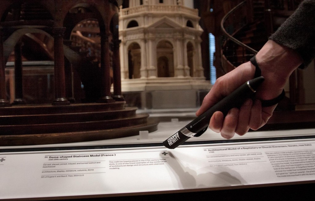
This complex interplay of materials was again repeated when the museum approved the decision to fabricate its label rails using the same heavy steel chosen for its new display cases. All radio frequencies are sensitive to, and affected by, any metal objects in their proximity and this is especially true of RFID technologies of which NFC is a subset. NFC tags attached to objects labels and placed on the label rails could not be read by The Pen because of the interference and distortion created by the metal in the rails. This decision and its impact came at an inopportune time in the process. Had the museum not been able to locate a vendor who already manufactured and sold an adhesive ferrite shielding that was placed between the metal rails and the NFC tags on the labels (to dampen the interference) it would have been forced into the awkward position of redesigning the label rails very close to opening. These complexities cannot be overstated – even sub-millimetre changes in shielding, and the thickness and shape of NFC tags had unexpected downstream effects on performance.
In order to prepare The Pens for use in the galleries and to retrieve data collected during a visit the museum also had to design, build and implement bespoke “stations” for interacting with The Pens, independent of the Ideum tables.
The interaction model for these stations consists, principally, of three actions:
- pairing – Associating a pen with a visit identified by the shortcode included on a ticket via the Cooper Hewitt API. issuing a pen may also involve first “returning” it if any pre-existing data is found on it (for example if The Pen was not previously “returned”) before it is paired to a new visit.
- transferring – Reading any visit activity (objects collected) recorded on The Pen and processing them via the Cooper Hewitt API.
- returning – The same as “transferring” but as a final step all data on The Pen is erased.
There are two type of stations:
- registration stations – Used by visitor services staff to perform the “pairing” and “returning” of pens
- transfer stations – Used by visitors to quickly transfer the contents of their pen before they leave the museum or if they want to look at their visit collection online during their visit. Transfer stations perform the same task as ‘connecting’ a Pen with any of the Ideum tables.
Based on observational data, since the re-opening, we are deploying a third type of station to the galleries, a modified version of the transfer station that performs a “returning” action. This is aimed only at visitors who have finished their visit and are leaving the museum and the goal is to cut down the amount of time it would subsequently take for that same pen to be “paired” with another visit.
Even with this approach the “pairing” stations still need to read the contents of a pen to ensure that there is no data that needs to be processed. However a single read of a zero-length record – a Pen that has no data on it – is an acceptable and unavoidable time and interaction penalty. (The alternative is to assume that every pen has been successfully transferred by every visitor before they leave the museum, which is unrealistic. It also invites the chance that we will inadvertently lose a member’s visit data by overwriting with a new visit which is possibly the worst experience we could offer visitors.)
Registration stations
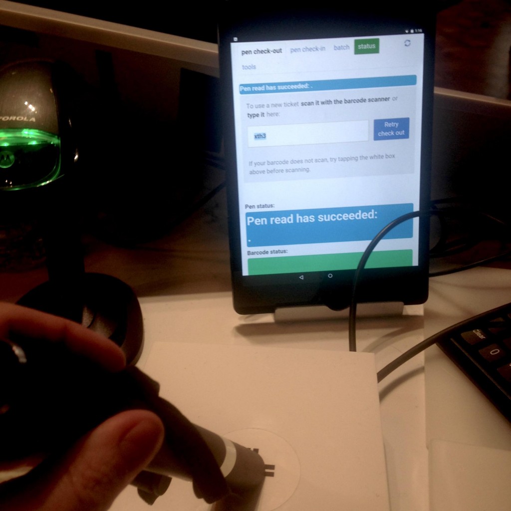
The museum has worked extensively with Tellart, an experience design and engineering studio located in Rhode Island, to develop the electronics and software for these stations. The electronics consist of Raspberry Pi (RPI) computers with custom software to manage the communications between peripherals: A “gateway” board for brokering communications with The Pens and, in the case of the registration stations, a barcode reader for scanning tickets. The software then performs all administrative actions via the Cooper Hewitt API.
The original design brief for the stations imagined a
pair of seamless or near-seamless “objects” that would
communicate transparently with little or no direct
involvement from staff or visitors. The only feedback
would be to indicate success or failure. In many
respects the transfer stations have achieved this
goal.
With the registrations stations it quickly became clear
that we would need to revisit most of our basic
assumptions – new software and hardware had to be
designed and built to allow ticket staff to see what was
going on during the transaction.
Visitor services staff need to be able to see the overall shape of the communications chain between The Pen and the gateway board and the software running on the RPI and the API. In order to assist front of house with problems the D&EM staff need to be able to see the precise details of those communications and to assume that some sort of historical audit log would be present so that problems could be diagnosed after the fact.
The user interface component of the registration station was decoupled from the main body of the software that controls The Pen-related hardware and communicates with the Cooper Hewitt API. The user interface is now a simple web application, accessed via a tablet computer, that communicates with the registration station by passing messages back and forth. Additionally the UI component is now responsibility of the D&EM team specifically so that we can respond to requests and error reports from visitor services staff and deploy changes faster, often happening multiple times during the museum’s opening hours.
The casework for the registration stations is not meant to be public-facing the way the transfer stations are but must still satisfy a series of overlapping, sometimes conflicting, requirements:
- They need to house both a RPI and a “gateway” board used to communicate with pens as well all the associate cabling (network, power, USB connectors) in such a way that individual components can be accessed and replaced, when necessary, quickly and easily.
- They need to be portable so that if the number of visitors exceeds the capacity of the admissions desk, staff can be deployed to other locations with a collection of pens, one or more registration stations and an equal number of tablet computers to continue pairing visitor tickets with pens.
- They need to ensure physical security to prevent the stations, in whole or in part, from being stolen or tampered with.
- They need to be able to integrated with the admissions desk itself in such a way that a visitor can be encourage to “pair” their own pen (by pressing a sticker with the museum’s “collect” icon affixed to the desk and positioned above the registration station’s gateway board).
- This last requirement may, over time, prove unnecessary if the museum determines it is more effective and efficient for staff to “pair” a visitor’s pen for them but even then the requirement for a registration station to “integrate” with the admissions desk can be understood simply as taking up as little space as possible on an already over-crowded counter-top.
Transfer stations
The transfer stations are a waist-high metal construction with a weighted-base, to prevent it from being knocked over accidentally, and a 3D-printed “head” that houses the electronics used to communicate with visitor’s pens. The head consists of two surfaces shaped like a pair of open palms. One surface is where visitors tap their pens to transfer data and the other surface is available for instructional text and graphics. As of this writing the museum continues to test the language and visual elements included on the stands. There is a full-time visitor services staff member stationed near the transfer stations at the exits to encourage visitors to transfer (or “dump”) the data collected on their pens before leaving the museum.

The API
At a time when the museum was still being secretive and mysterious about the re-opening and was not speaking publicly about The Pen we used to say two things to people. First, that when they looked at the collections website they should understand that “all the work being done was, fundamentally, in the service of the re-opening itself.” Second, that when the museum re-opened “the building itself would be the single largest consumer of the museum’s Application Programming Interface (API).”
The API predates all of the gallery work and has its roots in the release of the first Collection Alpha in September 2012 (Chan, 2012).
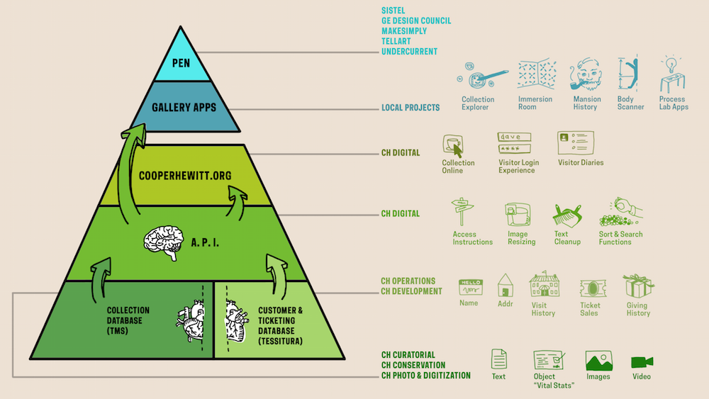
The design of the API is heavily influenced by and modeled after the photo-sharing website Flickr’s API, first released in 2005. The Cooper Hewitt API uses OAuth2 to create and manage access tokens which create a contract between a given application and a user, specifying the scope of permissions and the duration of that contract. This kind of “delegated” authentication is an important aspect of the API. It means that the museum has a way to securely maintain user accounts across a variety of applications and websites that are developed separately from one another. This means the main brand website – built on WordPress (see Walter, 2014) – and the collections, ticketing and account management websites.
This services oriented architecture (SOA) allows the museum to develop smaller more nimble applications instead of managing and scheduling an increasingly complex set of features and requirements in a single monolithic tool. The benefits of the SOA model were perhaps best articulated in Steve Yegge’s 2012 internal memo titled “Stevey’s Google Platforms Rant” that was accidentally published to the public Internet:
So one day Jeff Bezos issued a mandate. He’s doing that all the time, of course, and people scramble like ants being pounded with a rubber mallet whenever it happens. But on one occasion — back around 2002 I think, plus or minus a year — he issued a mandate that was so out there, so huge and eye-bulgingly ponderous, that it made all of his other mandates look like unsolicited peer bonuses.
His Big Mandate went something along these lines:
- All teams will henceforth expose their data and functionality through service interfaces.
- Teams must communicate with each other through these interfaces.
- There will be no other form of interprocess communication allowed: no direct linking, no direct reads of another team’s data store, no shared-memory model, no back-doors whatsoever. The only communication allowed is via service interface calls over the network.
- It doesn’t matter what technology they use. HTTP, Corba, Pubsub, custom protocols — doesn’t matter. Bezos doesn’t care.
- All service interfaces, without exception, must be designed from the ground up to be externalizable. That is to say, the team must plan and design to be able to expose the interface to developers in the outside world. No exceptions.
- Anyone who doesn’t do this will be fired.
- Thank you; have a nice day! (Yegge, 2012)
This is essentially what the Cooper Hewitt told everyone working on the project – internally and externally. Chan (2014) has described it as an “API tax” imposed on third-party developers in the short-term but that the museum believes will repay itself many times over in the long-term.
The core philosophy behind the design of the Cooper Hewitt API is two-fold:
- To define a model where it is simple (to the point of trivial in some cases) to implement a client in any programming language: HTTP has become the lingua franca of the Internet and support libraries are now part of every programming language’s default distribution. Additionally the ability to investigate and debug individual API requests from a web browser or the command-line was seen as a core requirement.
- To define a model where the museum can easily add additional output formats as requested by developers. The museum strives to remain agnostic about how a consumer chooses to have data returned to their application. If someone has working code that demands data returned from the API be formatted in a specific way and we can accomplish this simply by adding a template to modify our underlying data structures then we will.
The collections website and the API are, in fact, the same ‘website’. Although each has a unique URL they share the same codebase. This is deliberate – specifically the idea that the website most people interact with and the API are discrete instances – or scaffoldings around – the core libraries that make up the collections database. We do not believe that the API is at the center of the technical infrastructure but rather that it is only one of at least four possible avenues available for interacting with the data:
- The public-facing website itself
- The API
- Command-line tools
- Offline-tasks
Although each of these endpoints accept many of the same parameters and return much of the same data we believe they are fundamentally different. More specifically, the details around parameter checking, error-handling and other dispatch requirements are all unique to the use-case. Therefore the emphasis is placed on writing and maintaining libraries that could easily be used in any of the scenarios described above. While this sometimes adds to the overall development time it is often only in the initial learning curve for a particular set of code libraries and means that the details of any one piece of “scaffolding” don’t get confused with any others or with the underlying functionality in question.
An equally important decision was that TMS would remain the museum’s canonical source of “truth” for all collections metadata. TMS enjoys an institutional muscle-memory and an often derided complexity that fell entirely outside the scope of the project. A re-imagining of TMS is as much an interaction design problem as it is organizing and structuring data and the scale of the task would only have been a distraction to the museum’s goals for the re-opening. Instead the D&EM team developed a suite of tools, called tms-tools (Cope, 2013) for extracting data from TMS on a regular basis and used it to seed a user-facing and user-focused collections website.
A detailed technical discussion of Parallel-TMS is outside the scope of this paper. A high-level overview of the way the collections website operates in the day-to-day life of the museum looks like this:
- Export from TMS
- Re-index and import into MySQL
- Index in ElasticSearch (previously Solr)
- Sketch and polish in code
- Export metadata to GitHub
- Repeat
At the time of this writing we have seen three main drawbacks to this approach. The first is the time to re-index the website. The second is what we refer to as “data deploys” versus “code deploys”. The third and arguably the most frustrating still is the inability to quickly and easily re-index and update any single record independent of the entire collection. These are all so-called “known knowns” (Rumsfeld, 2002) that are deemed acceptable costs of operation, given what the overall system has allowed us to accomplish to date.
The Holodeck
An important tool in this regard has been the “visit holodeck” a single-page Javascript application hosted on the collections website that was developed internally to test the visit-related API methods and functionality for use by Local Projects and other external contractors. This tool allows the museum to quickly work through questions about how data related to a visit needs to be stored and accessed in concrete terms, by calling its own API, rather than an abstract specification document. In effect, we wrote our own minimalist in-gallery client and use it to define, and sometimes re-define, the needs and specifications for the project in-situ while leaving the interactive and user experience to Local Projects. It has also served as a reference implementation for contractors and a useful tool for debugging error reports and disputes.
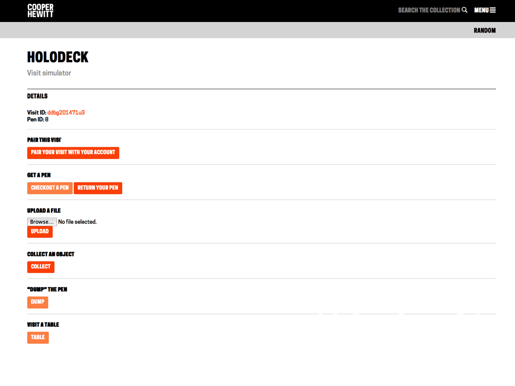
The holodeck has allowed the museum to develop external API methods, user-facing visit pages, visit-related administrative tools and the underlying libraries for working with visit data simultaneously and to use the demands presented by each scenario to influence the others. An important measure of success, internally, was how simple this process proved to be, and how quickly it could be done while still maintaining a working system.
Any time spent improving the online collection also improves the API, and vice versa. Similarly, continued improvements to the API also make possible new in-gallery experiences in the future. A continued measure of success is ensuring that any time and resources committed to the online collection was time and resource spent improving the API and, downstream, in-gallery possibilities.
In doing so we have been able to build our own early versions or imaginings of the ideas and concepts presented to us by designers and contractors and to work through the technical costs and challenges before they became too late. The museum is able to operate outside of and in parallel to the schedules of its contractors which allows it to question assumptions made on both sides of a project before it becomes too late to find anything but an unpalatable solution.
A scaffolding for managing absence
The collections website has always been seen as a way for the museum to demonstrate its commitment to be, in Tom Coates’ words, “native to the web” (Coates, 2005). The museum sees the web, rather than any one hardware or vendor platform, as central to its mandate of providing access to its materials to the public.
Even in 2015, few museum collections have been completely digitized nor has the metadata for those collections been fully vetted. Ancillary materials, such as essays or exhibition publications, remain silo-ed from the main collections records whether that means a separate bespoke database or an individual contributor’s personal computer or simply in the oral history of an institution. The reality of nearly all museum collection websites, then, is that they are exercises in managing absence. Therefore the collections website has always served two distinct but complementary and reinforcing purposes.
The first purpose is to provide a technical scaffolding on top of which we might start to gradually integrate past materials as well as new work produced for the re-opening. The most important of these steps was giving every “first-class” object (for example: constituents, materials, exhibitions, objects) in our collection a stable and permanent ID and URL on the web. Everything has been given a URL regardless of the quality of thoroughness of its metadata on the grounds that the metadata can always be improved in the future. Absence of a simple, flexible and reliable means to refer to an object though those efforts would remain invisible and rendered largely moot.
The second purpose has been to use that same scaffolding as a means to develop alternative ways to investigate the collection. When the Cooper Hewitt collections website was launched only 7% of the collection had been photographed and of those only half were deemed to be able to be displayed publicly. This combined with the paucity of the metadata for many object records means that we have been forced to consider novel interfaces and means through in which visitors might approach our collection.
What distinguishes the range of experimental projects developed in Cooper Hewitt Labs is that they were designed and developed in short periods of time without requiring a dedicated calendar or disrupting on-going work. Because we control the deploy cycle for the entire collections website these sometimes experimental, sometimes silly projects can be proven or disproven quickly in real-life circumstance. Search by colour, for example, has quickly become one of the most popular ways that people navigate the collection.
This same approach is applied to the post-visit web pages on the collections website. These pages will provide stable and permanent URLs for every object that a visitor has collected or the items they have created during their visit to the museum. Every action will have a permalink which will be private to that visitor by default but which may be made public and sharable with friends and family.
By giving every instance of collecting or creating an object a permalink we have the near-infinite space of everything that can be appended to the URL to work with. It might mean making the ten-thousand word essay about an object or an exhibition (that no one will ever read in the galleries) available from every collection permalink. It might mean allowing users to upload their own photos that they took of an object during their visit. It might mean linking to other instances of the same object that in other museum collections.

What if we designed things in a way that made it easy and intuitive for a visitor to revisit their time spent in the galleries at some later date? We need to not only accept the idea that a person may go months at a time without looking at their visit pages but to convey to those people that we will still be here just as ready and willing and eager when the moment to return strikes them. That we have the confidence and enthusiasm in our collection, as well as the institutional capacity, to accommodate the many varied schedules of our visitors. In short, we do not expect every visitor to want to come back to their visit diaries immediately, nor should we – and success metrics need to be adjusted accordingly.
Ticketing, Privacy and Identity
One of the changes The Pen has forced is a collapsing of all the different identity-related databases, inside the museum. Like many museums before the reopening the Cooper Hewitt had separate databases for members, donors, patrons, benefactors and so on. One consequence of the way The Pen works is that everyone is a visitor regardless of their financial relationship with the museum. A visitor might be also be a long-standing member, and over the course of their history with the museum also be a patron one year and not another, until maybe one year they forego their membership entirely. What connects all those different roles now is precisely that they are now roles or aspects of a single persistent user account centered around multiple and ongoing visits to the museum.
Whilst a detailed exploration of the choice of a
ticketing system is the concern of another paper, the
museum selected Tessitura. Tessitura now runs the
museum’s ticketing needs for general admission as well
as events. It also maintains ‘constituent records’
uniting all the members, donors and visitors under one
system.
The temptation to require ‘user accounts’ for all
visitors – at least by an email address –
was very strong. Even Local Projects recommended that we
collect email addresses on the interactive tables based
on their experience with other clients and this
preference is visible in the internal UX video produced
in late 2013 (see Chan, 2015). However the D&EM team
argued persistently for a default of
‘anonymity’. Visitors – even museum members
– should be able to use the museum and its
technological augmentations without identifying
themselves if they wished.
By default all visits to the museum are anonymous and identified only by their shortcode. If a visitor buys a ticket to the museum online then it remains possible to correlate a visit shortcode with the user account stored in Tessitura used to purchase that ticket. Even in the case of online purchases visits are not automatically associated with user accounts. While this may become possible in the future it presents a number of user interface and interaction challenges.
If an individual purchases multiple tickets both for themselves and others how should the museum prevent all those visits from being automatically paired with a single user? If the user is presented additional steps to perform (for example, choosing which ticket to associate with their user account) will that dissuade them from completing the purchase or serve only to leave a person with the impression that every part of their visit will be equally complicated? How does a visitor remember which ticket is associated with their Cooper Hewitt account?
These are all important interaction questions that the museum should address going forward. However, given the complexity of the work necessary just to launch The Pen they were determined to be best left for a future release.
Similarly all the objects or creations collected during the course of a visit are private by default. Once a visitor has paired their visit with a Cooper Hewitt account then those items may be made public and “shared” using the URL or any number of social tools.
As with most aspects of The Pen the opportunity to create increasingly complex and nuanced applications or interactions around identity has been actively resisted in the interest of first affording a visitor the ability to spend time in the museum with a measure and ease of recall, after the fact, for reasons unique to that visitor. We believe that visitors find their own meaning and import in the objects they collect or create not just in the 90 minutes they spend in the galleries but in the days, months and years that follow their visit and on their own schedule. We believe that the first and best thing the museum can do is to provide better tools to help visitors manage that recall. There are many opportunities this simple idea makes possible but the first step is to ensure that we do it well, both from the perspective of the visitor and the operational demands it places on the museum, and only then to build on that foundation.

Part Four
The first weeks
The museum opened to the public on December 12, 2014. Manufacturing issues delayed the arrival of The Pen, which, in hindsight was an entirely desirable result. The delays enabled the museum to figure out how its new ticketing system worked along with visitor flows throughout the newly designed spaces. The delays also meant that the museum had a trial run of an inevitable future where The Pen may need to ‘gracefully fail’.
In the first weeks of the opened museum all of the interactive media experiences were operational and their user interface simply did not present visitors the option to ‘save’ their own designs, and did not prompt to connect their Pens. Although there was some public disappointment, it was muted, and in some regards built a greater expectation for the time when The Pen would be deployed. The reviews of the reinvigorated museum were upbeat, positive, and even without The Pen, reviewers were impressed by the interactivity and the way in which it had been interwoven into the museum.
The Pen finally arrived and went live to the public on March 10, 2015.
In the three weeks since then, 11,668 ticketed visitors have used 8,976 pens. Excluding the This distribution rate of 76% includes visitors who would not be offered a pen – children under 6, and during the initial weeks, school groups and visitors arriving during the museum’s Pay-What-You-Wish Saturday evenings.
More interestingly, and surprising to the museum, has been the usage of those 8,976 pens. Those pens have collected objects 222,572 times, and been used to save 7,071 visitor-made designs. Visitors have collected over 2,500 distinct objects which, considering that there are only approximately 700 objects on display in the galleries, is a good indication that the stated goal for the Collection Browser to encourage “exploring the breadth of the collection … across the whole museum” has been successful.
The museum now has pseudo-anonymous data on which
objects are collected and their sequence which can
easily be mapped against their locations in the
building; and it also has a good estimation of daily
average dwell times calculated as the time between pen
distribution (at ticketing) and final dock (at
exit). Average dwell times now far exceed anecdotal data
from the former museum – over 2 hours versus 45
minutes previously.
We are also tracking post-visit online usage using a
combination of standard web analytics tools. Of the
8,976 pens paired with tickets, so far, 2,443 (27%) have
already returned to explore their collections online
viewing an average of 8.4 pages.
Considerably more research is required along with more robust and statistically valid methods of data analysis, but for the first time Cooper Hewitt can begin to examine how its visitors behave in its spaces, and use that to design better, more impactful exhibitions and programs.
Sustainability, or, is Cooper Hewitt “done”?
A common question in the cultural heritage sector is how projects like ours can be made ‘sustainable’ by an institution. In this sense, ‘sustainability’ is often understood as a smooth march from a one-off innovation to a commodity – ideally one which can be bought cheaper from a third party supplier. Most technology eventually follows this arc – disk storage begins as an expensive bespoke product, and now is offered as an almost zero-cost service; the same for finance systems, collection management systems, and the like. Even a museum website in its most basic marketing brochureware form has gone from requiring bespoke code authoring and design, to being available in a ‘good enough’ template form from zero-code providers like Squarespace.
In terms of exhibition technology and ‘visitor-facing technology innovation’ in museums this is traditionally the preserve of third-party exhibition design firms and audio visual integrators. These firms – Local Projects, AV&C, Diller Scofidio + Renfo (DS+R) included – offer design and build services, and perhaps a ‘service and support contract’ for 12-18 months after deployment.
It is important to recognize the problems with this model when it comes to services-based projects like The Pen and its ‘museum-wide’ system:
- Support contracts are typically for projects whose value diminishes over time (because on-going development of a project stops at launch) and so the cost of that contract, in effect, increases year over year with fewer and fewer returns.
- With support contracts very often no institutional knowledge about the project or how it might serve as a platform for future projects is gained. Sometimes the only tangible skill an institution learns, or passes on, is how to manage contracts for service providers.
- A support contract is only valid for past work. Any additional changes or improvements incur additional non-trivial costs because third-party contractors not only need to complete the work but require time to familiarize themselves with a pre-existing code base.
- Support contracts represent money that leaves the institution and never comes back.
These overall costs are likely to be much more than it would cost to hire and maintain permanent creative technical staff in a museum when intangibles like institutional knowledge and the ability to build on the value – technologies, learnings, especially created by past work – are factored in.
As a sector we have spent a couple of decades making excuses for why “digital” can’t be made core to staffing requirements and the results have ranged from unsatisfying to dismal.
The shift to a ‘post-digital’ museum where “digital [is] being naturalized within museums’ visions and articulations of themselves” (Parry, 2013) will require a significant realignment of priorities and an investment in people. The museum sector is not alone in this – private media organisations and tech companies face exactly the same challenge. Despite ‘digital people’ and ‘engineers’ being in high demand, they should not be considered an ‘overpriced indulgence’ but rather than as an integral part of the already multidisciplinary teams required to run a museum, or any other cultural institution.
The flow of digital talent from private companies to new types of public service organizations such as the Government Digital Service (UK), 18F (inside GSA) and US Digital Service, proves that there are ways, beyond salaries, to attract and retain the specialist staff required to build the types of products and services required to transform museums. In fact, we argue that museums (and other cultural institutions) offer significant intrinsic benefits and social capital that are natural talent attractors that other types of non-profits and public sector agencies lack. The barriers to changing the museum workforce in this way are not primarily financial but internal, structural and kept in place by a strong institutional inertia.
Next?
If the Cooper Hewitt has succeeded in challenging the expectations or requirements of a museum’s digital footprint it is important to recognize that this is not simply about The Pen. That the museum was able to design and manufacture its own bespoke hardware may be an impressive accomplishment but The Pen can only be seen as successful in so far as it enables the museum and its visitors to do more with our collection. And despite the torrent of publicity it has brought, The Pen was not just as a marketing device for the re-opening but a means to change the museum’s relationship with its visitors.
Product design and hardware manufacturing are not a museum’s core competency and we would not have succeeded without the generosity and efforts of our partners. The Pen was a massive undertaking and nearly “broke” the museum on any number of occasions. Where it didn’t “break” the museum, the requirements demanded by The Pen and Pen-related infrastructures impacted every layer of the museum’s staff, its physical plant, its budgeting process and its day-to-day operations. Whilst some of this was predictable and could have, with time and resourcing, been mitigated against, there has also been a benefit in having the institution grapple with the complexities of running a new customer-facing infrastructure. Over time it will – as it must – build new institutional muscles to take on and adapt to its new form.
Likewise the project introduced, and in some cases exposed, new ways for the museum to understand its technology infrastructure and its relationships with third-party contractors and vendors.
Cooper Hewitt had been able to make a significant public-facing step change only by making those vendors and internal Smithsonian-wide stakeholders believe in the scale and ambition of a project. The museum was able to prove it was genuine in its ambitions through its prototyping and ongoing commitment. With the right investment in staffing, this new platform could conceivably be used to make viable interactive applications (and just as importantly serve as an internal prototyping tool for testing and validating future third-party work) for another decade.
“At a time when so many museums seem intent on new spaces for new design and new art (like the Whitney, Upper East Side deserter), it’s a relief that the Cooper Hewitt finally spent the time and the money to make their 1902 Carnegie Mansion sing. Rather than being a straightjacket, the mansion’s ornate rooms and halls now form a rich and idiosyncratic frame for design objects of all ages.” – Lange (2014)
“[The work] is an investment in a particular idea of cultural democracy. It’s a view where imperfect speech can always—and will always, and should always—be augmented by further speech. It trusts in the discourse over the perfection of the original work.” – Meyer (2015)
Thank you
This ambitious project is the work of many individuals, teams and organisations. It would not have been possible without the generous donations and support of Bloomberg Philanthropies, GE Design, Undercurrent, and the Board of Trustees; the hard work of Local Projects, Diller Scofidio + Renfro, Sistelnetworks, Tellart, and Makesimply; and the ongoing hard work of colleagues, interns and volunteers inside both Cooper Hewitt and the Smithsonian at large.
References
Barry, A., 2010, “NaturePlus – Developing a Personalised Visitor Experience Across the Museum’s Virtual and Physical Environments” in Archives & Museum Informatics: Museums and the Web 2010, http://www.archimuse.com/mw2010/papers/barry/barry.html
Bove, J; Crow, A; Husney, J, 2014 “The Pen Process” in Design Journal November 2014, published by Cooper Hewitt.
Chan, S., 2012, “First look at our new online collection (public alpha)”, Cooper Hewitt Labs blog post September 2012, http://labs.cooperhewitt.org/2012/online-collection-alpha/
Chan, S., 2013, Opening Keynote, MuseumNext, Amsterdam, slides available at http://www.slideshare.net/sebsnarl/museumnext-opening-keynote
Chan, S., 2014 “The API at the center of the museum”, Cooper Hewitt Labsl blog post November 2014, http://labs.cooperhewitt.org/2014/the-api-at-the-center-of-the-museum/
Chan, S, 2015, “From concept to video prototype: the early form of The Pen”, http://labs.cooperhewitt.org/2015/from-concept-to-video-prototype-the-early-form-of-the-pen/
Coates, T, 2005 “Native to a Web of Data”, https://archive.org/details/NativeToAWebOfData
Cooper Hewitt, 2014, December Opening Media Fact Sheet, https://www.cooperhewitt.org/wp-content/uploads/2014/12/CH_Cooper_Hewitt_Fact_Sheet_20141209.pdf
Cope, A. and Henderson C., 2012 “Flamework Design Philosophy – Statement(s) of Bias”, April 2012 https://github.com/exflickr/flamework/blob/master/docs/philosophy.md
Cope, A., 2012 “Parallel-TMS”, Museums and Computer Networks 2012 presentation November 2012, http://www.aaronland.info/weblog/2012/11/09/jello/#parallel-tms
Cope, A., 2013 “Albers Boxes”, http://labs.cooperhewitt.org/2013/albers-boxes/
Cope, A., 2013, “tms-tools”, http://labs.cooperhewitt.org/2013/tms-tools-this-is-a-blog-post-about-code/
Cope, A., “Label Whisperer”, Cooper Hewitt Labs blog post, January 2014 http://labs.cooperhewitt.org/2014/label-whisperer/
Cowan, K, 2011, “Brian Cox starts the Revolution at MOSI”, http://www.creativeboom.co.uk/brian-cox-starts-the-revolution-at-mosi/
Creative Commons Zero License, https://creativecommons.org/about/cc0
GE Design Council, 2014, Cooper Hewitt + GE board presentation slides, (internal document)
Gurian, E., 2005, “Threshold Fear”, in Macleod, S. (ed), Reshaping Museum Space: Architecture, Design, Exhibitions, London, Routledge
Henderson C., 2008, “Why I Hate Django”, https://www.youtube.com/watch?v=i6Fr65PFqfk
Lange, A., December 2014, “The New Cooper Hewitt”, http://www.newyorker.com/culture/culture-desk/new-cooper-hewitt
Local Projects (in Diller Scofidio & Renfro), 2012, Masterplan Presentation August 14 2012, Cooper Hewitt (internal document).
Eric Longo Consulting, 2011, “Museum Mobile Guides: Maximizing Opportunities”, Smithsonian (Internal report).
Lijinzaad, M, “No Intrusions, MONA and The O” at Museums and the Web 2012, http://www.museumsandtheweb.com/mw2012/programs/no_intrusions_mona_the_o_and_some_great_hand.html
Meyer, R., 2015, “The Museum of the Future is Here”, http://www.theatlantic.com/technology/archive/2015/01/how-to-build-the-museum-of-the-future/384646/
Parry, R, 2013, “The End of the Beginning: Normativity in the Postdigital Museum”, in Museum Worlds: Advances in Research, Volume 1, Number 1, 2013, pp. 24-39(16), Berghahn Journals.
Patten, D, 2013, “Web Lab – bridging the divide between the online and in-museum experience”, http://mw2013.museumsandtheweb.com/paper/web-lab-bridging-the-divide-between-the-online-and-in-museum-experience/
Pogrebin, R, 2007 “Cooper-Hewitt Is Determined to Expand, Despite a Host of Critics”, New York Times, April 28 2007, online at http://www.nytimes.com/2007/04/28/arts/design/28coop.html
Rumsfeld, D, “Department of Defense News Briefing – Secretary Rumsfeld and General Myers”, February 2002, online at http://www.defense.gov/transcripts/transcript.aspx?transcriptid=2636
Sakai, R, 2013, “Interns React to MOMA Audio+”, http://labs.cooperhewitt.org/2013/interns-react-to-momas-audio/
Schulze, J, 2013 “Media Lab Conversations Series: Jack Schulze in conversation with Kevin Slavin”, http://www.media.mit.edu/events/2013/08/01/media-lab-conversations-series-jack-schulze
Smithsonian Newsdesk, 2011, “Cooper-Hewitt Exhibition Galleries to Close July 4 for Two-Year Renovation”, http://newsdesk.si.edu/releases/cooper-hewitt-exhibition-galleries-close-july-4-two-year-renovation
Tellart, 2013, “Chrome Web Lab”, http://tellart.com/projects/chrome-web-lab/
Walter, M., 2013, “Curatorial Poetry”, Cooper Hewitt Labs blog post, http://labs.cooperhewitt.org/2013/curatorial-poetry/
Walter, M, 2014, “Downgrading your website”, http://labs.cooperhewitt.org/2014/downgrading-your-website-or-why-we-are-moving-to-wordpress/
Yegge, S, 2012 , “Stevey’s Google Platforms Rant”, https://plus.google.com/app/basic/stream/z12ld3fwhlnexv5b004cjv0oapmuflzrezc0k
This blog post is full of links.
#mw2015