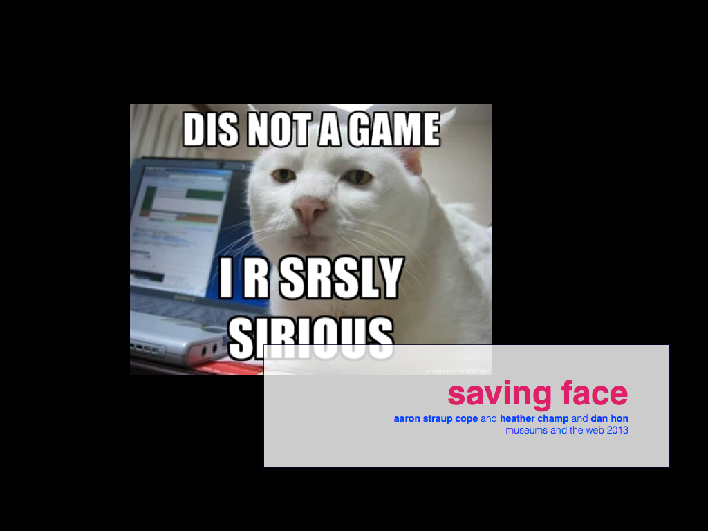
saving face
Museums and the Web 2013 wrapped up a couple weeks ago. The Cooper-Hewitt won an award for the work we've done on the collections website this year, which was nice. I was also part of a panel about Humour as an Institutional Voice. The panel was originally pitched by Erika Taylor who was not able to attend MW in the end, which is too bad because I was really looking forward to where she would take things.
In the end, I asked a couple people from outside the museum world to join me.
I asked Heather Champ to join me to talk about the subject because aside from having thought about creating and nuturing community based projects for a long time and having been the public face of Flickr she is also the person responsible for enshringing the words Don't be creepy
in a legal document.
Piotr Adamczyk is technically ex-still-sorta museum people having spent years at the Met and is now managing the data side of things for the Google Art Project. The reason I asked Piotr is that I had the pleasure of seeing him speak at the National Digital Forum in New Zealand, last year, where he compared the Art Project to a Rachel Whiteread sculpture. Google, he said, can show you the shape of the inside of your institution.
Which is a fascinating way to think about what Google does and yet it is so rare that we ever hear big companies speak about themselves that way. Which is why I thought it would be good to have people from business
on the panel to talk about the tensions of putting forward a public face. Piotr had to pull out just before the conference and Dan Hon was gracious enough to fill in at the last minute.
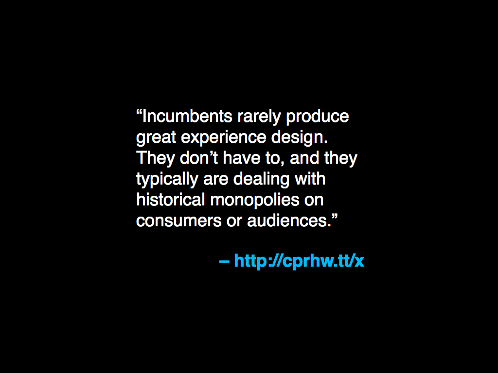
Over breakfast the morning of the panel, Dan described some of the work that they do at Wieden+Kennedy as helping organizations form an opinion about themselves
which nicely sums up quite a lot of the issues latent in the panel's subject. Dan also wrote the quote above and, more recently, a proper good essay on the tyranny of digital advertising. Most of the panel was a discussion between the three of us and the audience but I did a short talk to try and frame some of the issues around the idea of humour and institutional voice.
The talk itself is a re-telling and a stretching-out of a duet that Seb and I did in March at the ArtsTech Meetup in New York City.
At the time that we were putting together the slides for that talk I imagined somehow working in a piece I had just written about digital public spaces and measures of success for the Future Everything conference in Manchester. I still think about doing that some day and it's still better that I've not tried but I've included the full text of that essay below if you're interested.
This is what I said, instead:
I'd like to start with a quote that was highlighted by John Allspaw, who is the head of operations at Etsy, from a book about safety and human factors by Sydney Dekker:
Progress on safety coincides with learning from failure. This makes punishment and learning two mutually exclusive activities: Organizations can either learn from an accident or punish the individuals involved in it, but hardly do both at the same time. The reason is that punishment of individuals can protect false beliefs about basically safe systems, where humans are the least reliable components. Learning challenges and potentially changes the belief about what creates safety. Moreover, punishment emphasizes that failures are deviant, that they do not naturally belong in the organization.
Hold on to that idea for the rest of the talk. I will return to it at the end but, for now, I'm going to start by talking about the Cooper-Hewitt collections website and use it as a kind of prism to talk about the idea humour and institutional voice. The collections website was re-launched in September 2012 and is meant to be tangible evidence of the direction the museum as a whole is heading in.
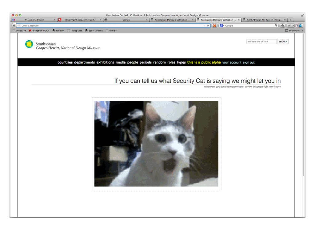
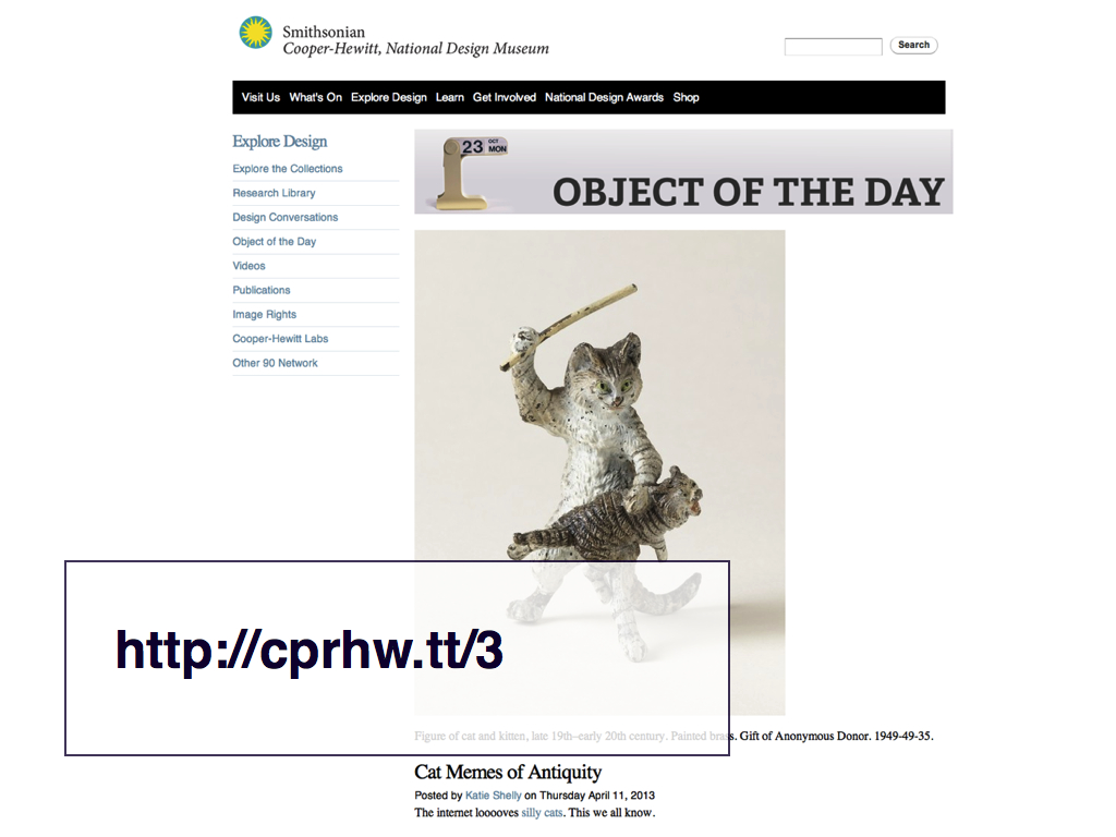
The Cooper-Hewitt gets mentioned a lot these days whenever the subject of institutional voice comes up because of stuff like Security Cat. Because I think there is the sense that we are getting away with something that other institutions aren't or can't or won't.
Honestly, I don't think we're "getting away" with anything because I don't think we're doing anything particularly subversive or even unusual. I also don't really want to talk about humour, at least not the funny-ha-ha kind. Or rather I think that when we're talking about humour we're really talking about something much larger that everyone senses is out there happening but which we haven't found a good way to talk about yet.
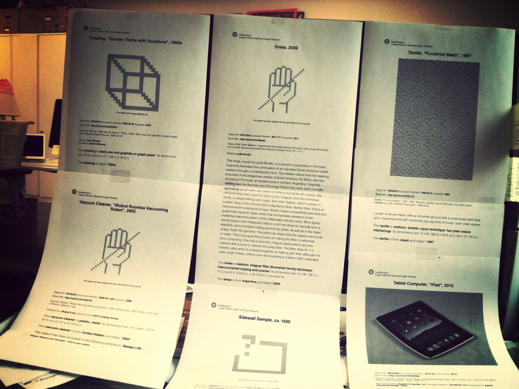
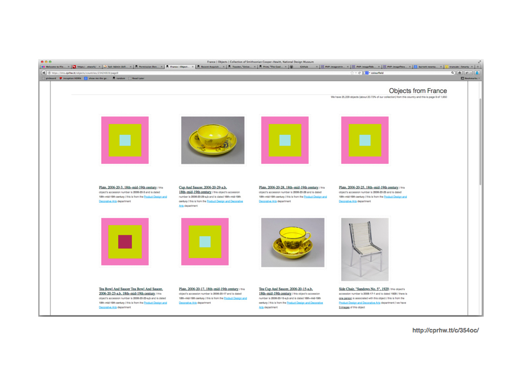
For example, this. We have about two hundred thousand objects in the collection, of which 127, 000 are publicly available online. Of those only about 18, 000 have been both digitized and been cleared for image rights. This is one of them.
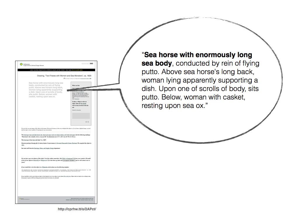
That leaves just under a hundred thousand objects without images. Some of those have descriptions with aren't narrative descriptions the way most vistors would expect. The descriptions we've got are basically way-finding tools. They identify enough of the qualities about an object so that you might find it in the archival stacks.
For those objects without images but with a description possible we use some code magic to fill in the area normally reserved for a photo with the description associated with that object. Sometimes we end up with stuff like this. But as strange as this text is it's actually really important because it's often the only meaningful metadata we have about an object.
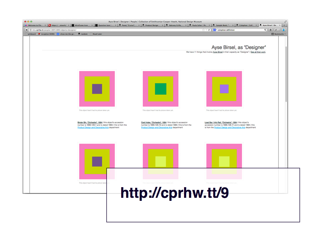
We only recently added the ability to view "list" results with thumbnails precisely because so many of the objects online don't have images. This is true of most museums and historically it's an interface problem that has been solved by displaying page after page of "image not available" clip-art icons.
It is an interface solution that can only generously be described as shit.
Not least because everyone always seems to choose a old-skool film reel waiting to be spooled on to a projector because, you know, that's a kind of imagery that really has anything to do with our collections. We didn't want to do that and held off long enough to have a think about it while we did everything else.
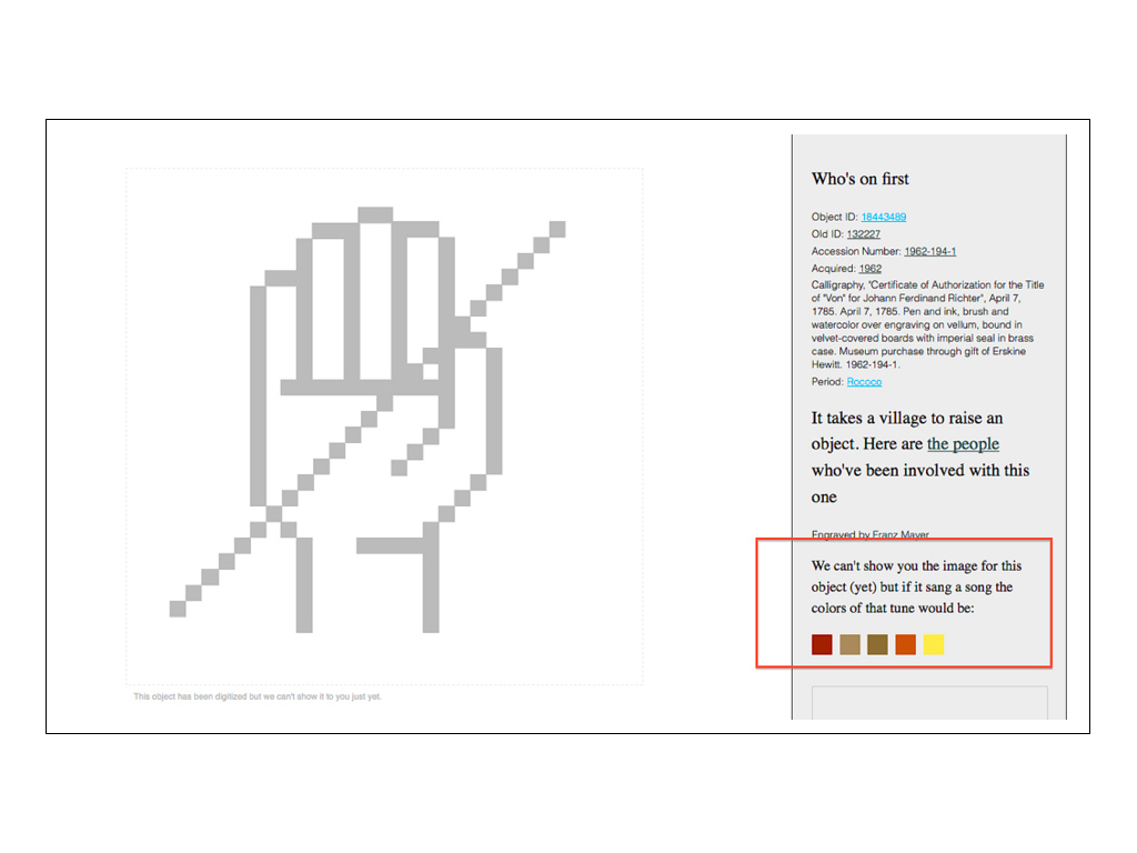
This is the icon for an image that should be there because there's a record of the object having been digitized but, uh... we can't find it. That's not supposed to happen but it does and I think it's important to call that out. It's important that we see it and know that other people are seeing it too.
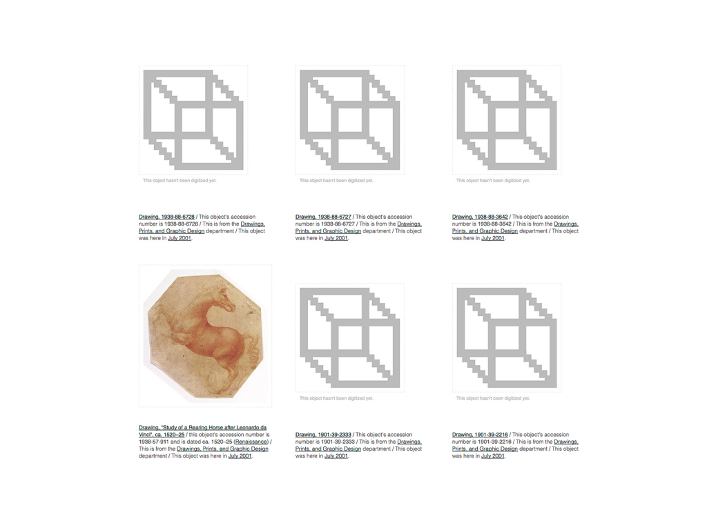
It's also not the same as all the other images that have not been digitized yet which is what this pixelated box icon represents. Obfuscating those differences doesn't do our collections any favours.
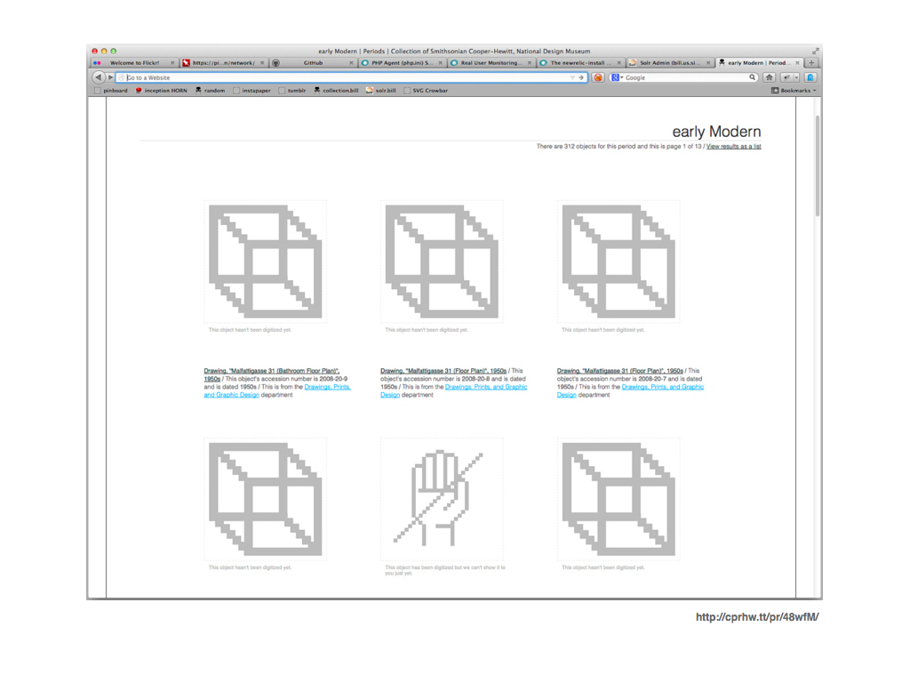
When we finally added thumbnail views we launched it with distinct "file not found" and the "image not digitized" icons. But there's also a necessary third icon that no one in the museum world ever seems eager to talk about: An icon for images that have been digitized but that can't be shown because they haven't been licensed or some equally insane restriction.
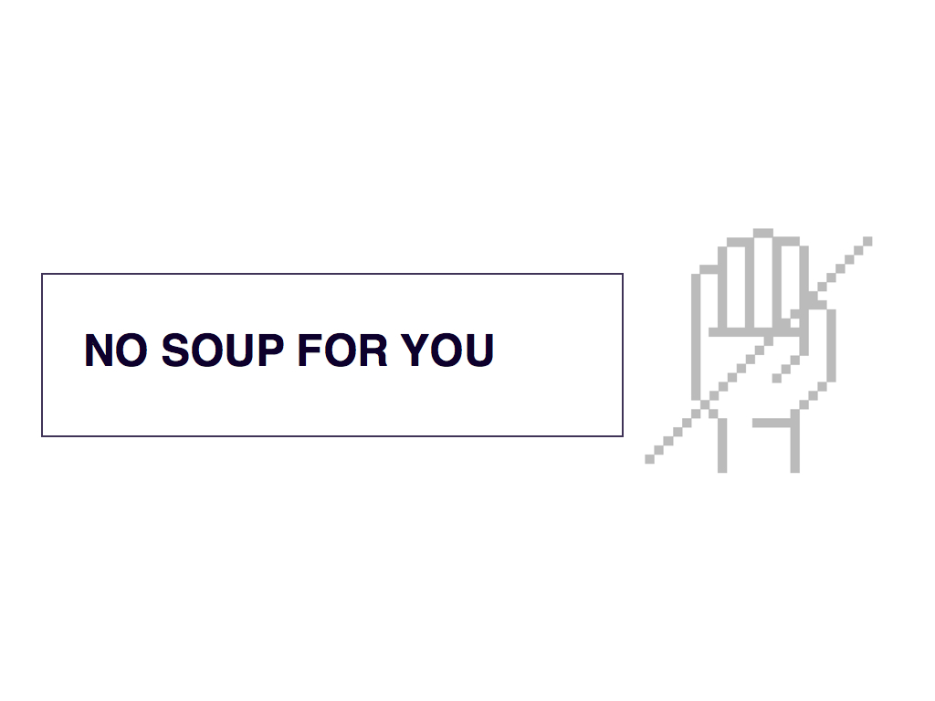
That's what the talk to the hand
icon represents. Because this is all people see. So maybe we can't show you the image but we can show you that we can't show you the image.
Part of this is an exercise to develop a visual language to allow visitors to browse or scan the collection and to help make sense, even if it's just shades of grey, of the gaps in our collection. It's also developing a sensibility about how we approach the language we use to discuss the collection. To quote Erika Hall, from a presentation she did in 2008: Copy is interface.
It's an interaction model that tries to account for the shift from the exhibition being the principle the unit of currency for an institution to the entire collection being that measure. That's not a shift that I think everyone has acknowledged or is necessarily happy about but it's hard to deny that it's happening.
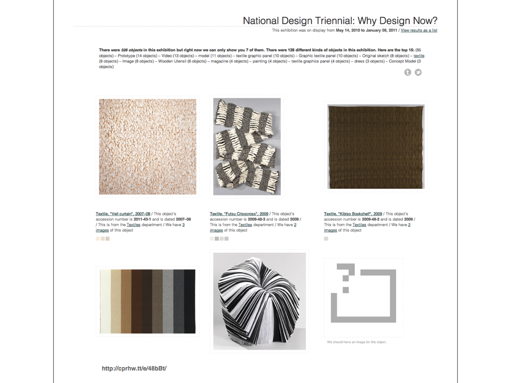
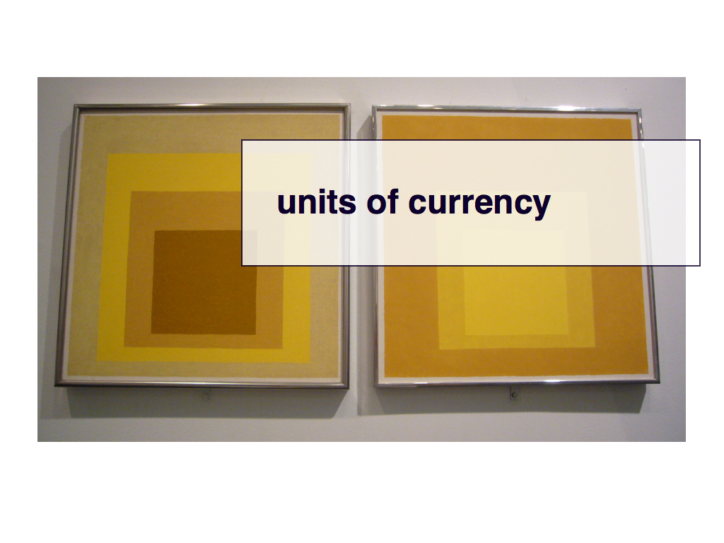
We also have an experimental mode for making sense of objects lacking images. It's called "Albers mode" or "Albers boxes" after the artist Joseph Alber's work on the interaction of colour.
We are borrowing a trick that the social travel website Dopplr developed: Each ring in these square represents a different property associated with an object. The outer ring of an Albers box represents the department that an object belongs to; the middle ring represents the period that an object is part of; the inner ring denotes the type of object. Each property is then used to generate a unique colour for its correspinding ring.
These six objects are all from the same department and period but there are four different types of things. Albers boxes might seem a bit confusing to people at first but we also think that their value and use will become apparent over time.
Again, we are trying to find a way through the problem of developing a shorthand - a language – by which people can explore the collection in the absence of pristine records.
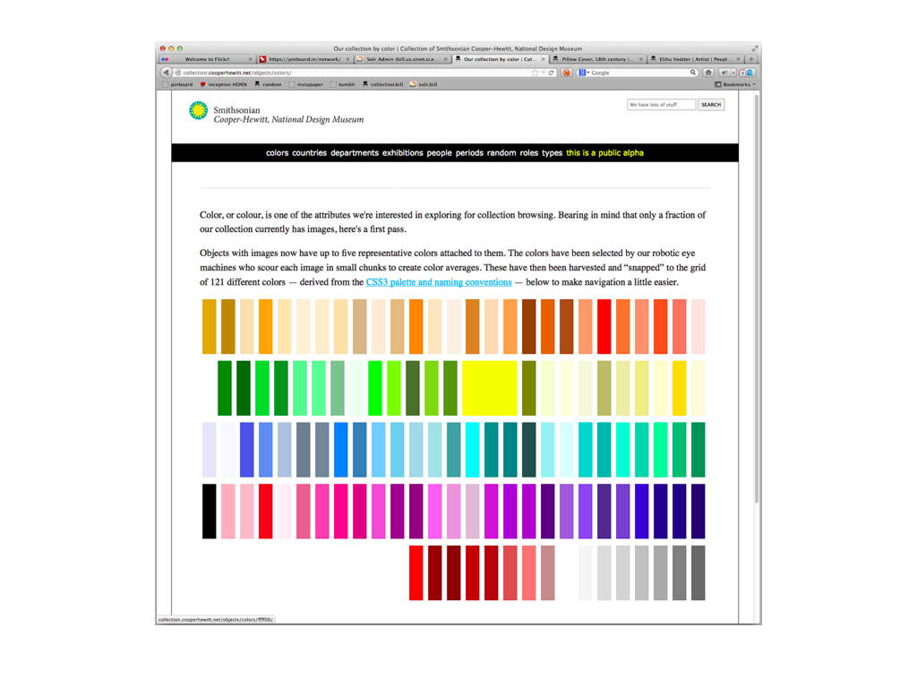
About a month ago we added the ability to search the collection by colour. Aside from being a fun way to discover objects it means we can also find new ways to talk about - or at least around - objects that are trapped in the soup of image rights.
Which is important because no one outside of the business cares about those details. They just think we look stupid for not having pictures of the things we tell them are important enough to hold and to cherish as part of our shared cultural heritage.
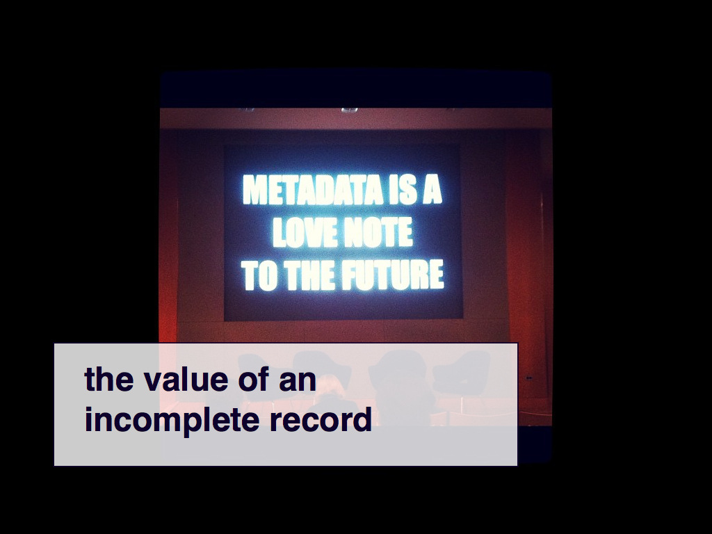
It's important to remember that we – and I mean all of us in the business – have gotten as far as we have on the back of all this crap data. We have accomplished some pretty remarkable stuff and we are not morons. At the same time all of this highlights the fact that in the aggregate there is still very real data in an otherwise incomplete record.
I would actually argue that the aggregate in all its incompleteness is more valuable than a finite set of perfect records. The aggregate provides larger surface area for people to understand and explore our collection and that is important. It also means that as each record is completed the value of the whole grows not-quite exponentially but exponentially-enough.
It's also important to understand that everything I've shown you today has been built incrementally and not as part of a master-plan. We did not actively set out to show you the colours of the objects whose image rights we are still sorting out but that turned out to be a happy coincedence; the by-product of otherwise unrelated work.
What we have done is to try and foster an internal environment, both technically and socially, that allows us do something tangible when those opportunities present themselves. To be able to move quickly because museum-time
is a farce that we indulge ourselves in and one we can no longer afford (and an entirely other talk).
Sometimes it is barely even a step forward but it is still forward motion.
So like I said at the beginning of this talk the Cooper-Hewitt gets called out for being playful, for giving a voice to our collection that is not normally seen in the museum sector. Honestly, I don't really know why this is such a big deal. Is it because we, and by we I mean the sector, have mistaken the trappings and rituals of so-called serious discourse for intent and the work itself?
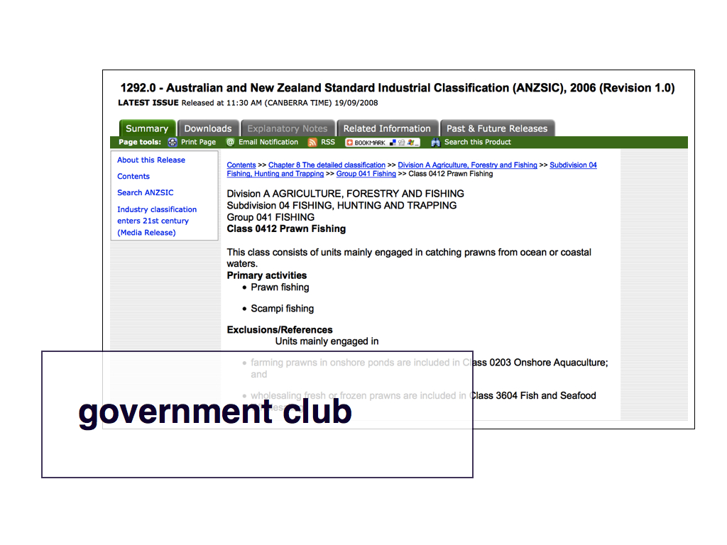
I don't know but I do know that it's happening elsewhere. For example, this is the website for the Australian Census Bureau.
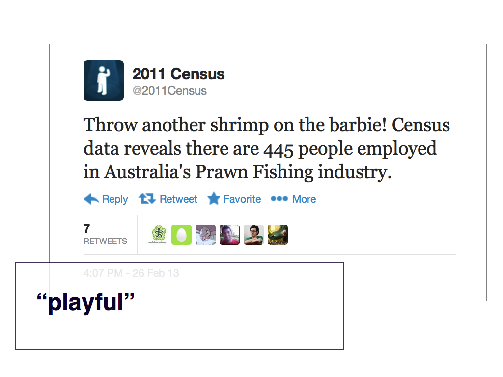
And this is the Australian Census Bureau's Twitter account.
It's clear that they are trying to craft a narrative around what they are doing with a goal and a motive: To get Australians to register with the census. I also choose to believe that this is more than just a careful brand or social media "strategy".
What this tells me is there is an honest and genuine delight that the people who are charged with compiling all these statistics find in their work and they have been given the license – the freedom – to celebrate it.
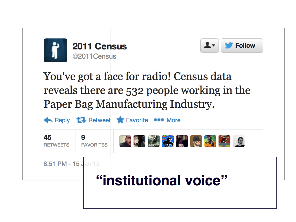
This is the so-called faceless bureaucratic face of government talking.
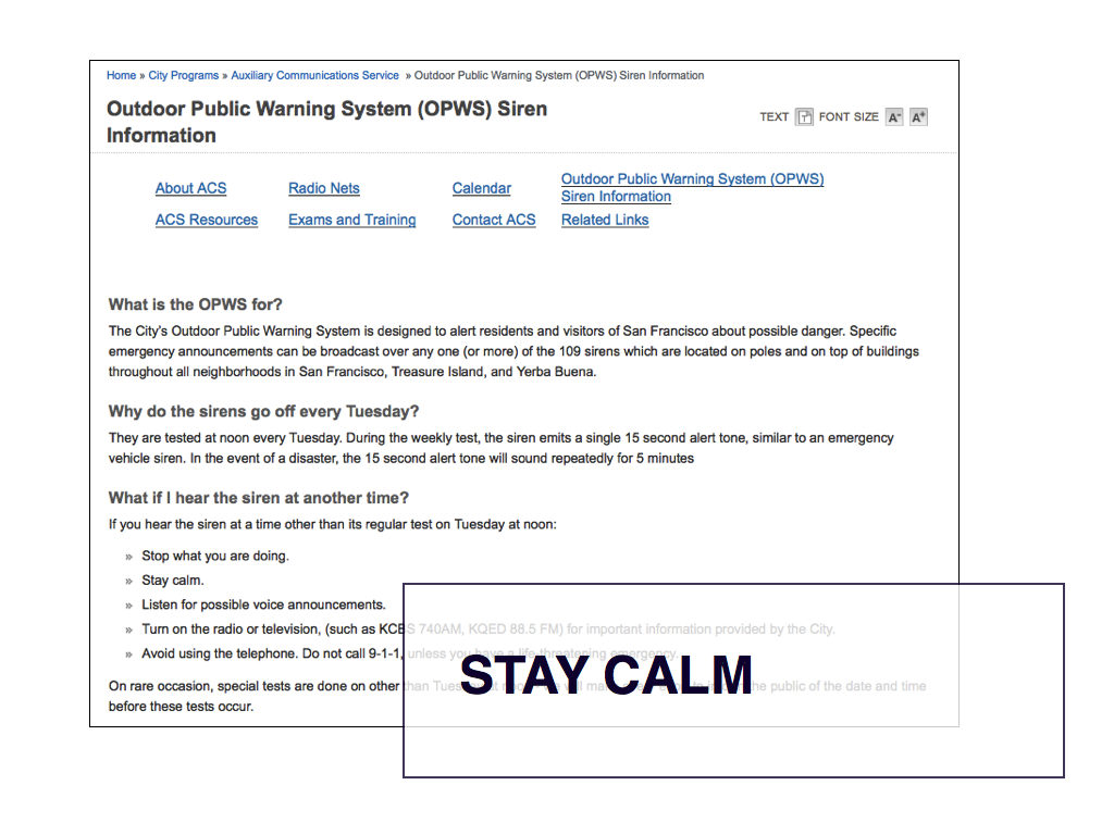
You also see people taking matters in to their own hands. For example, the city of San Francisco has one of those emergency sirens you can hear for miles around. Every Tuesday they test the thing and if it ever sounds off-schedule people get genuinely upset and concerned.
This is the city's official webpage for the siren.
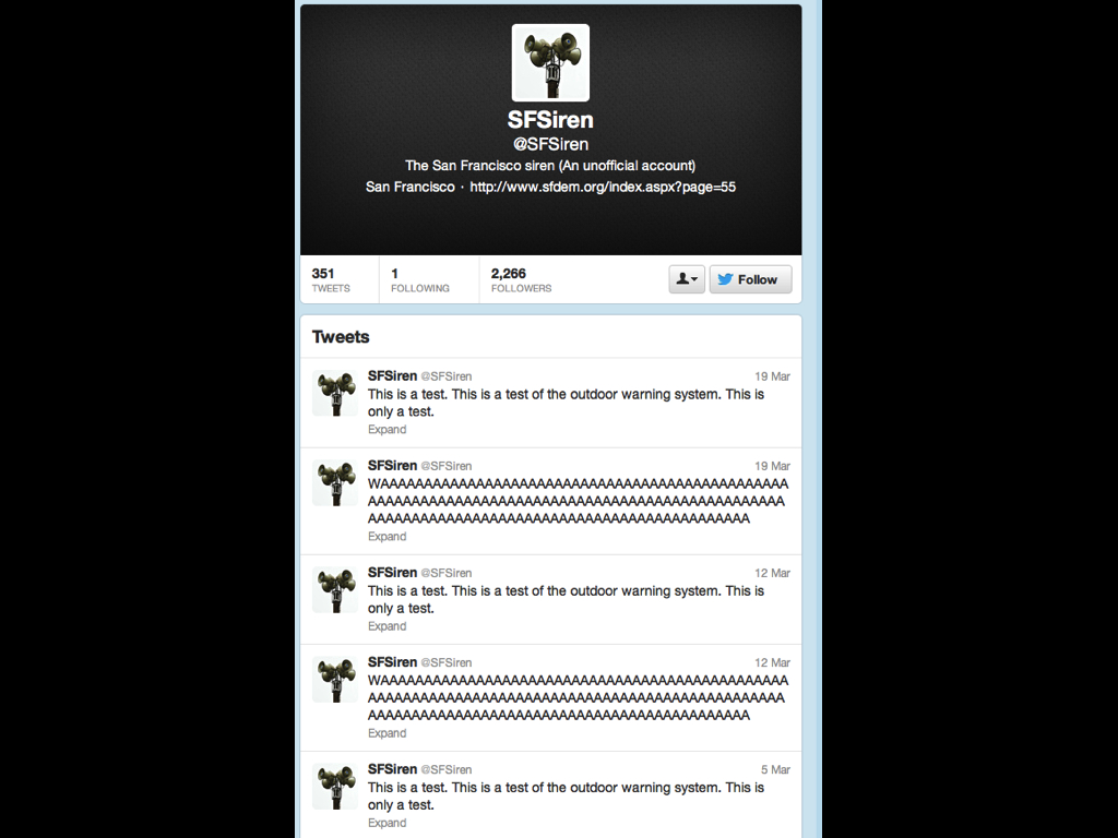
This is @SFSiren Twitter account which, as far as I know, is not maintained by the city. That someone has bothered to create this and maintain it is telling.
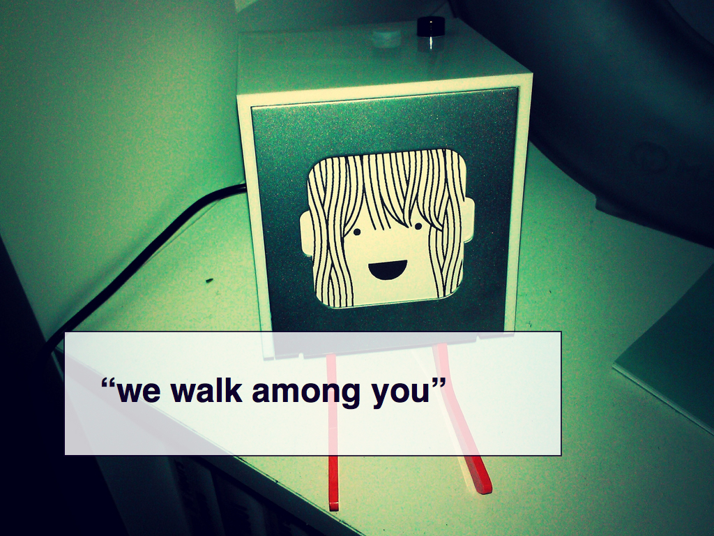
This is Little Printer from BERG, a design studio in London.
It's a printer. It's a little one. It's not only designed to be a kind of network-enabled letter box that is connected to the Internet printing regularly scheduled publications but to be an active (and polite) part of your day-to-day life. Its hair grows over time. It smiles at you. It stops smiling if it hasn't printed anything in a while.
I actually find some of these cues more annoying than not but that's a personal bias. What I think it is interesting about Little Printer is that it is designed — from the start — around those properties and characteristics that we are seeing people invest in objects. It is meant to be a social creature, part of your life and not simply an object that reacts to the mundane triggers of life.
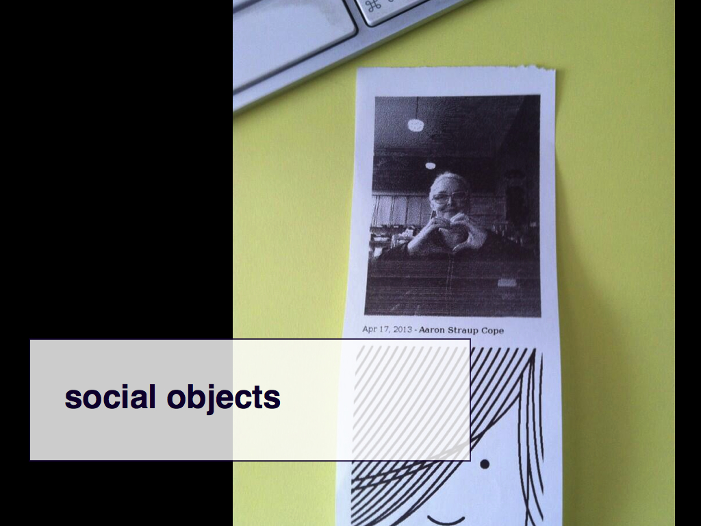
Little Printer also has an API which means that I can write myself an upload-by-email program and email photos to M. back in New York. So I sent her this photo of Heather while we were having breakfast the other day. I could have sent her a text message with a photo attached but there's something lovely about the idea that the sound of Little Printer spinning up (it sounds a bit like a fat snoring cat when its printing) would catch M.'s attention and she would watch as the paper spooled out wondering whether there was a new photograph.
I know that you know that I know and that ability to hold hands at a distance is part of the fun. That's a pretty simple kind of shared anticipation but so are most social moments. So is most play.
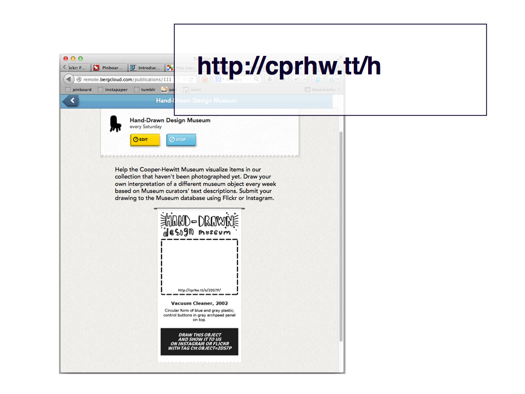
The Cooper-Hewitt launched a Little Printer publication last week. It's sent out every week and invites users to draw the descriptive text for objects that haven't been digitized yet.
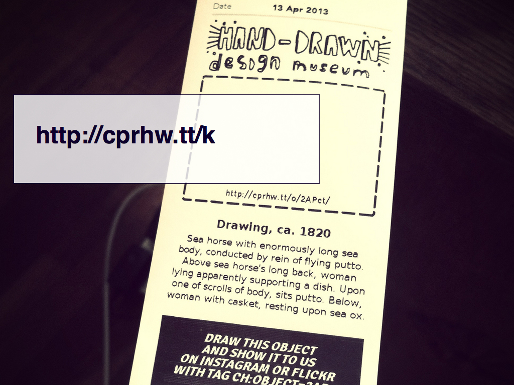
Remember the "sea horse with the enormously long sea body" ?
We don't have an image of it so why not ask our visitors to draw one. Given the amount of metadata we have or don't have many of the objects in our collection, including this one, are essentially conceptual pieces. They are entirely intellectual experiences, especially when you consider that the written descriptions are deliberately void of narrative.
If celebrating the often absurd reality of some of our objects by asking people to imagine what they might look like is what it takes to give people even just a toe-hold in to our collection then I see no problem indulging them in a bit of speculative fun. None at all. It is through projects like this that we might start to assert a communal proof — with an emphasis on community since we are the Smithsonian and have a mandate that extends beyond the museum's walls — that these objects actually exist.
We haven't gotten a drawing of the sea horse yet.
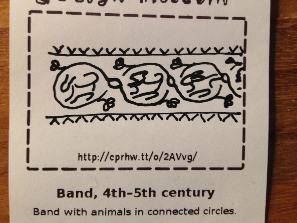
But we have gotten this! I mentioned the descriptions for our object records are essentially a way-finding device. They were the photographs before museums had cameras, the databases before we had computers so I will leave as an exercise to the viewer to decide whether this drawing or it the description that spawned it would better help you find the original object in the stacks.
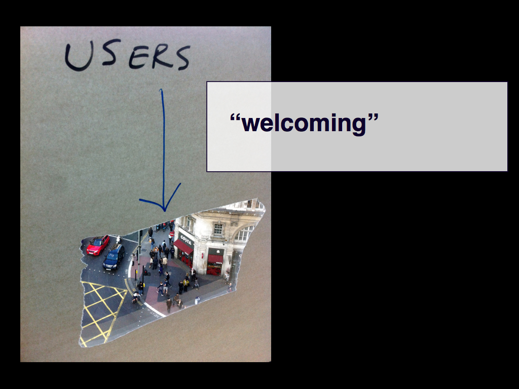
It's more than just being playful, though. It's really about being welcoming. That may seem like hair-splitting but I think it's an important distinction. Welcoming means a few things. In our case it means understanding that many of the people who visit our collection don't live and breathe the gorey details of captial-D design let alone an historic decorative arts collection. But that does not mean they are unequipped to deal with it.
They are just busy enough being awesome in other field of study that they haven't had the time to learn our shop-talk. They are more than capable of understanding what's going on only if we stopped talking to them in codespeak of professional anxiety and stopped expecting them to think that nonsense like International Art English (sic) is some kind of proxy or signal for knowledge.
This is a photo taken by someone who works for the UK government, specifically the Government Digital Services (GDS) team. It's a sheet of paper with a hole cut out of the center taped to the window of their offices. It is a healthy reminder we could probably all use from time to time: That we are afforded the luxury of our jobs by our peers. Not our professional peers but all those people we live with every day. That we are given positions of trust and the public good by those people because we, as a society, believe they are vaulable and important.
GDS are also doing, hands down, the best work on the Internet right now.

GDS is tasked with reducing government costs by not simply migrating services online but in their ways by making those services so good that people will prefer digitial by default
. And these are very real services — taxes, health information, business requirements — with very real consequences.
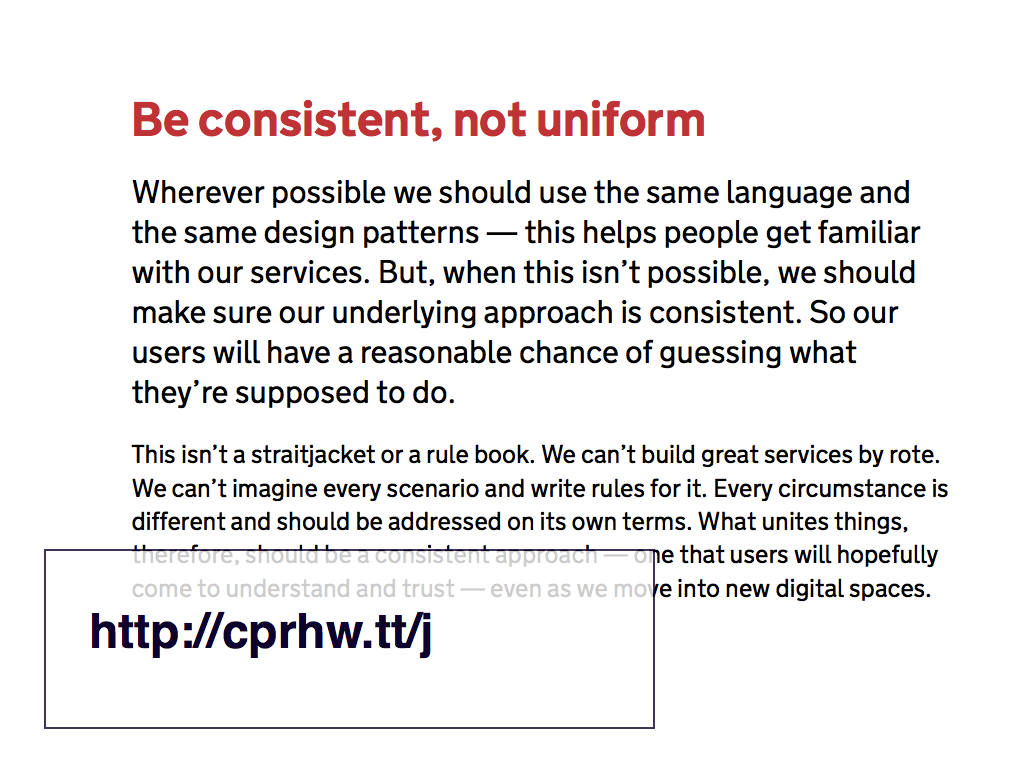
This is not about tailoring a flashy government experience but about speaking with a language by and for the people the government serves, which is absolutely not the same as pandering to the lowest common denominator. The websites that GDS are building are, by-and-large, entirely absent of images. These are websites that, almost literally, speak to users and as such GDS has been publishing a series of guiding principles for the work they do.
I think the ninth principle to be consistent, not uniform
is especially important. This is what the detailed description says:
Like the Australian Census Bureau, this is the government talking. This is voice of capital-A authority speaking. Russell Davies has written a really good piece about the work GDS is doing in which he says that The Product Is The Service Is The Marketing
which is a useful way to think about institutional voice.
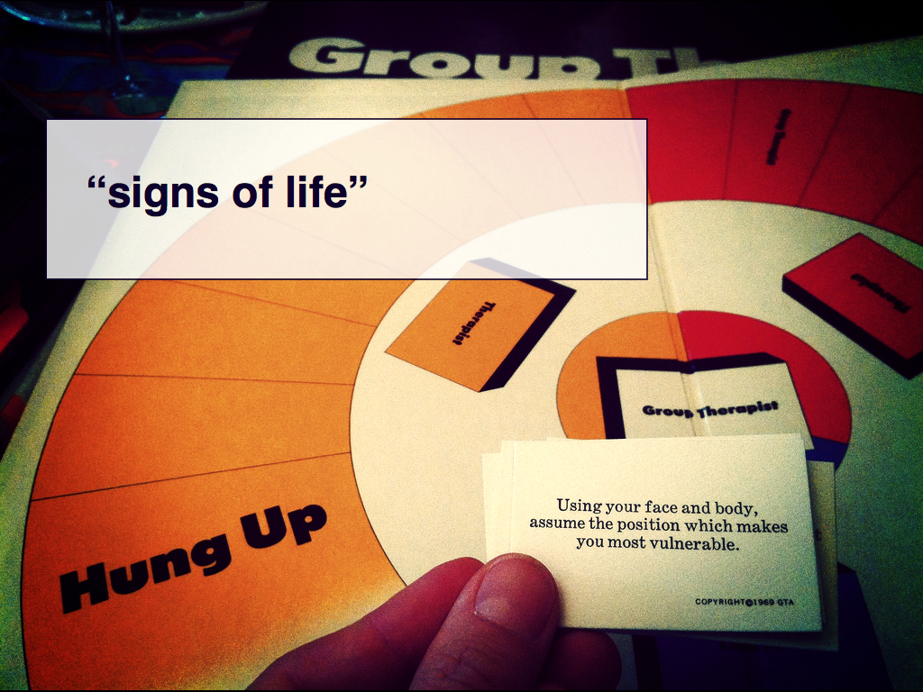
Being welcoming means being willing to be open and honest about one's own uncertainties and trusting that those same visitors are capable of understanding that sometimes we are still actively working through a problem. Most importantly it demonstrates that there are signs of life.
Because it's not all funny-haha all the time. The work that people do around collections is genuinely serious but it's also not always complete or even correct but it's still worth talking about. That sometimes the discourse of failure is more interesting than triumphal certainties of staying "on-message". That not all failures are the same or have the same consequence.
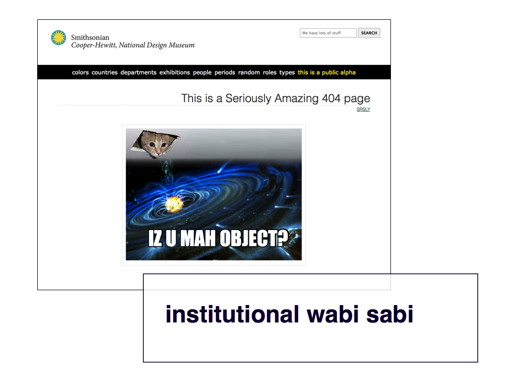
We have to find ways to allow ourselves to speak about this stuff. And I wonder if that's why we get so excited and so focused on the idea of humour. When Seb Chan talks about the work we're doing at the Cooper-Hewitt he often talks about the idea of institutional wabi sabi. He says:
Wabi-sabi is a challenging concept for Westerners raised on a diet of Modernism. It celebrates impermanence, imperfection, and incompleteness. It celebrates the small and the intimate. It is the rough hewn bowl, not angular refined box.
Importantly, though, it is not an excuse for incompetence.
Consider how your museum could be a bowl, rather than a box. A tumble of objects rather than a grid. What might this mean for your institutional design aesthetic? Is it a return to the densely cluttered cabinet of curiosities? The dusty attic or antique shop? What might that mean for the 'approachability' of your institution? And what of our long desired aim of serendipitous discovery in our online databases?
Seb also talks about the work we're doing at the Cooper-Hewitt as a strategy of accelerating towards failure as a way of nurturing a confidence both in what you’re doing and the ability to correct when things don't work and adapt to change.
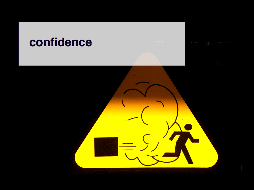
To be serious enough in the motivations around the work that it has a mass and a presence but not heavy as to be an immovable lump. So when we talk about the measure of success we are often really talking about the measure of failure. And the confidence to do both. Thank you.
This blog post is full of links.
#faceThis blog post is full of links.
#measure