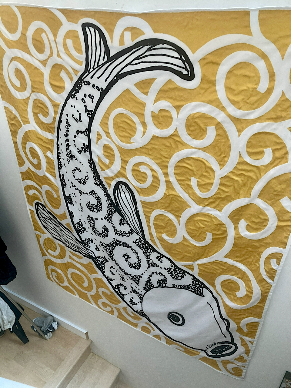
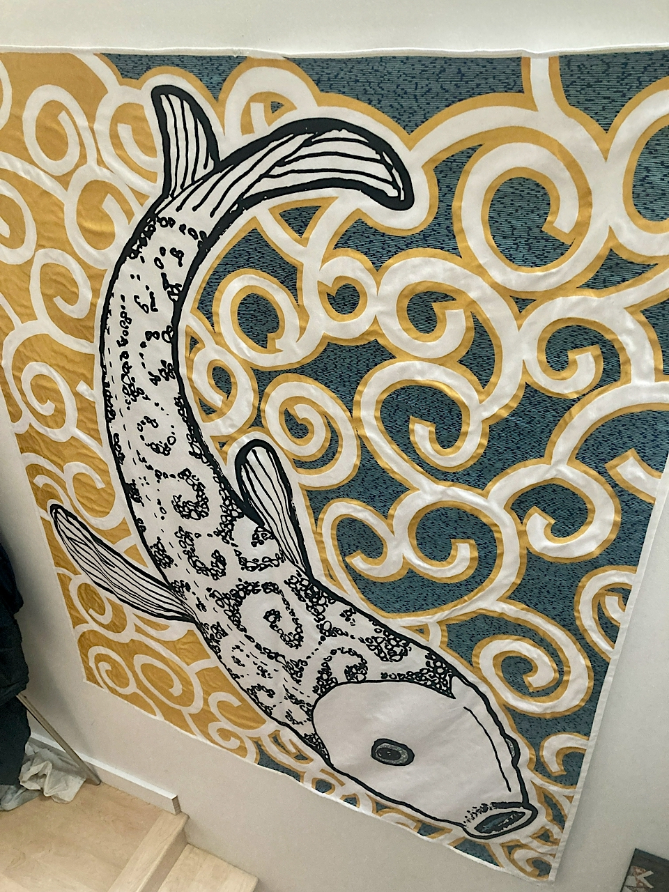
big fish (2023)

This piece began life as a 4 x 5 inch pen and ink drawing in December, 2019. Earlier this year I did the same-but-different thing and had it printed on a six-foot length of fabric.


This felt like a good idea until the precise moment when the acrylic gel used to bind the paper to the fabric dried.

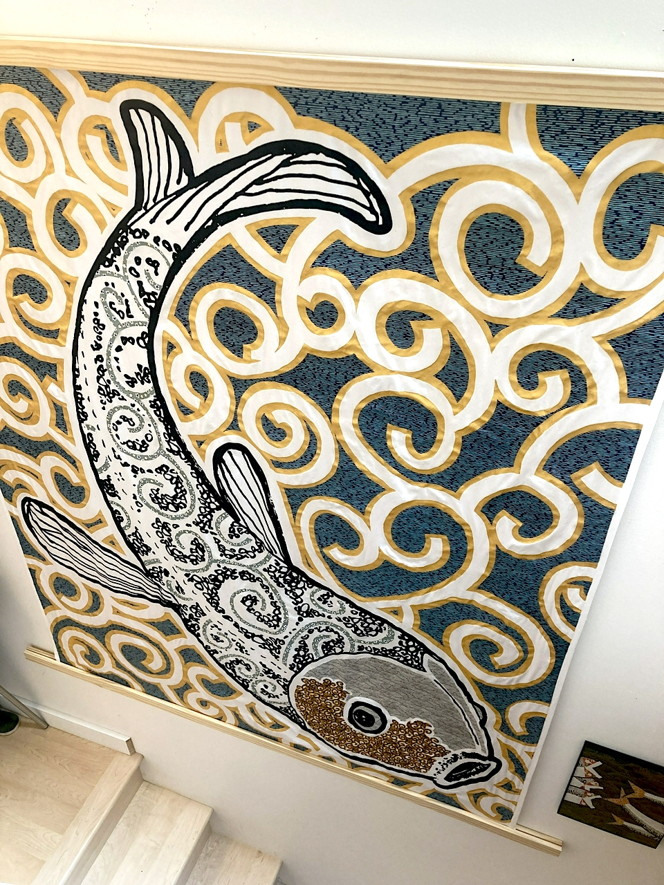
56 x 69 inches. Digital print, choyogami, katazome and acrylic on fabric. The smaller piece to the right is 9 x 12 inches, for scale.

Seb Chan was in town last month for the Museums of Tomorrow Roundtable. He wrote up the talk that he delivered at the public forum, held on the last day of the symposium. One of the things he mentioned during his talk which didn't make it in to the written version is the idea that visitor's experience
of the works that museums show is ever-more mediated by the images of those works. This is a longstanding phenomenom, think of the distorted expectations people bring to paintings having only ever seen four-colour (CMYK) reproductions of them in postcards, but one that has been amplified almost beyond understanding with the rise of social media.

I mention all of that because if it weren't hard enough just to finish a piece like this I am constantly filled with dread at the work involved in documenting it. I suppose my life would be easier if I just used someone else's software tools for working with images, notably images captured on a camera phone, but I don't and this morning I discovered that Apple uses its own colour space for iPhone images; a colour space not handled by any of my tools yet, which explains why the scaled and resized versions often look dull and muted.

So in addition to the blue light of the sun and the thick yellow light of overhead lights, both of which have been mediated
by someone else's math in a whisper-tree of software, all of these images have also been juiced by hand to try and give them a little more life than matrix multiplication affords on its own.

This blog post is full of links.
#big-fish