in the age of ubiquitous reproduction

Last month I was invited to participate in a one day museum-related workshop. I was asked to do a 15-20 minute presentation describing some of the work I've done at Flickr and Stamen and the occassional noodling that happens on the side. It was an uneven talk because it was a crowd unfamiliar with my side of the room, so to speak, and because frankly some of this stuff is genuinely involved and a twisty maze of layered connections and that's hard to condense in to something that doesn't sound like boiler-plate buzzword-bingo. There is a genuine art to that kind of talk and I'm not sure I'm very good at it.
The NACIS talk earlier that month was, in retrospect, liberating. Not feeling the need (the desire?) to stop and call out lots of individual works and to trace to relationships between them opened up the space, literally and metaphorically, to talk about ambitions and the undercurrents that shape the work we're all doing. But because I was an unknown presence in the meeting I was asked to focus on specifics which was a reasonable request.
In that respect it's a bit of smushing up of past talks, specifically those dealing with OpenStreetMap, Flickr Galleries and Alpha shapes. If you've seen or read those talks there's a lot that will look familiar but there's a little more (perhaps too much) talk about those larger motivations that hold them all together in a not entirely inappropriate hug.

Hello, my name is Aaron. I am from the Internet. I am part of that first generation of people who were going about their lives when the web first appeared in the early to mid-90s and for whom everything changed.
I was studying painting and the attraction of the web at the time was that it seemed like it might be the perfect end-run around the gallery system and, if I'm being honest, the art world entirely. When I looked out at the web and realized that it was full of people and that we had a fast cheap and easy, and just as importantly playful, way to communicate and share our work and ideas it was pretty hard not to fall in love.
Somewhere in the time since then I've stopped painting and now program computers so some days I feel as though the joke might have been at my expense but I've grown up alongside the web and watched it evolve. Along the way I spent five year working at Flickr the photo-sharing website and 800-pound baby that is largely credited for ushering in the age of Web 2.0
(we're sorry about that, by the way) and the experience is very much a prism through which I see the world.
More recently, I’ve held the titles of Design Technologist
, Internet Typist
and Director of Innappropriate Project Names
at Stamen Design in San Francisco. The studio has had the good fortune of being at the forefront of data visualization, cartography and online mapping including work that has been shown twice at MoMA as well as the Chicago Institute of Art. A few years ago we also did a project called ArtScope which visualizes the SFMOMA's permanent collection as though it were a Google Maps style slippy map.
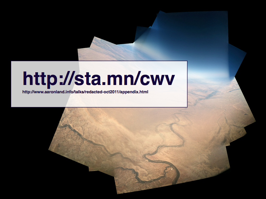
I will tell you, up front, that this talk might feel a little like this photo. This photo is as you can probably see is a composite of many photos, all taken from an airplane window.
We have a whole panel ahead of us to discuss museums, and the study thereof, so I'm go to spend my time trying to give you a sense of some of the work I've been doing for the last four or five years stopping along the way to look a little closer at three or four of them.
There is a common thread in all the works but in telling the story it may seem as though the horizon occasionally shifts. Dont' worry if it does. It will be okay.
There's quite a lot of work and almost as much writing to go along with them and I'm not going to try and cram it all in to a 15 minute presentation. Along the way you'll see some links appear on the screen but I've also compiled an appendix of those links as well as others and put them online. That appendix lives at this URL and I will show it again at the end of my presentation.

I mentioned that I worked at Flickr in the past. Of all the projects I worked on this is probably the one I am the most proud of. It is called Galleries
. Galleries was a deliberate piece of social engineering on our part. One of the problems, if you want to call it that, we always faced was how to convey to users, new and old, the richness of the 5 (now 6) billion photos that had been uploaded to Flickr over the years.
The most famous attempt we made at solving that problem was the Explore
section where we highlighted photos that ranked high according to their "Interestingness" score. Interestingness is a kind of secret-sauce that we wrote in the early days and is calculated using a variety of inputs including the social activity around a photo and which requires constant tuning and upkeep.
Both Interestingness and Explore were probably the right thing to do in 2005 but by 2009 (2007, really) they were the root cause of two types of behaviour we had never wanted or imagined for the site. The first is that Interestingness scores and a photo's inclusion in the Explore section had created a culture of leaderboard-ism where people's only goal was to game the system or to leave comments on photos that had made in to explore in the hopes that it would drive traffic to their own work.
Beyond that, people honestly thought that those of us on staff were actively choosing and promoting one user over another and, in trying to piece out how the Interestingness algorithms works, ascribing motive and intent to actions we have never taken.
Galleries have exactly two rules: A gallery may contain a maximum of 18 photos and none of them may belong to the person creating the gallery. That's it. After that the content, the meaning and the associations are left entirely to the discretion of the user.
What we were really after was to force users in to a situation where they would have to engage in the act of choosing. In so doing, we hoped they would start to see the site as something more than a tool for promoting their own work and also to understand that each one of them carried a unique history and understanding, which is really the only way I can see making any sense of something as big as Flickr.
Twenty-five thousand galleries were created in the first week after launch and there are nearly three million of them now! I could spend all day showing you screenshots of galleries people have created but this one of Barack Obama fistbumping people sort of says it all, I think.
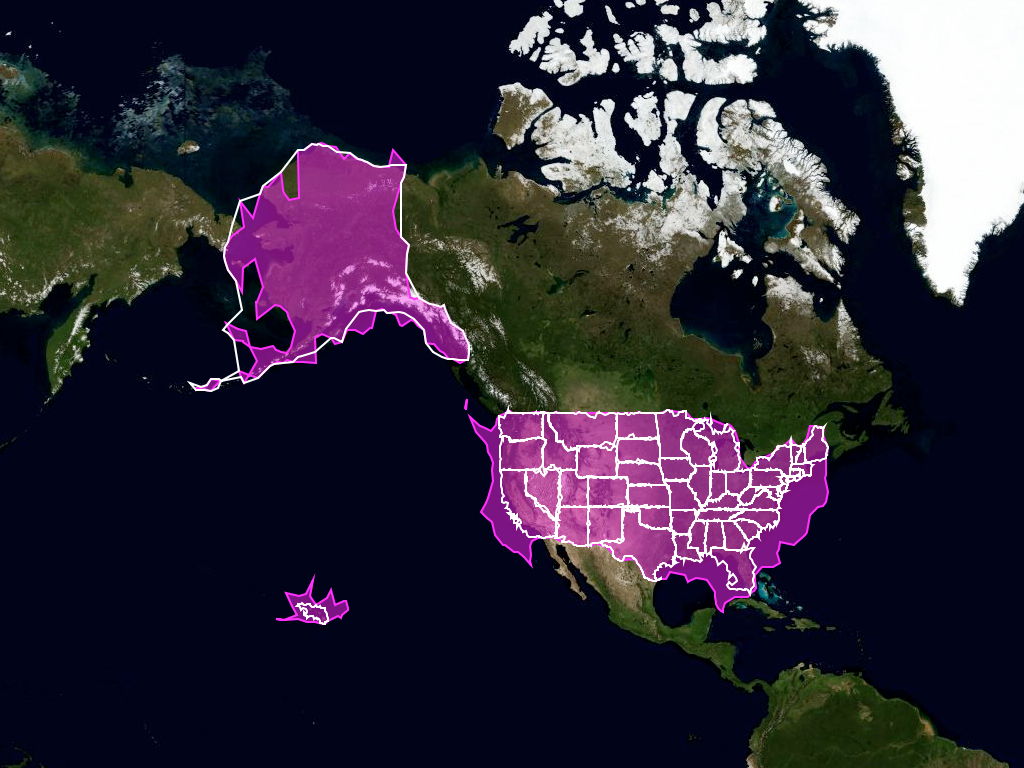
On the other hand this is probably the work I did at Flickr that I am best known for. These are the Alpha shapes
(sometimes called the Flickr shapefiles). They are geographies of actual places that are generated computationally using only geotagged photos from Flickr.

The technical details of how the shapes are created are both squirrel-y and out of scope for this discussion but the short version is this: Every time a user geotagged a photo on Flickr we assigned it to a hierarchy of place types. This is what the hierarchy looks like.
The choice of those place types was dictated by the technical constraints we faced running a site the size of Flickr so we had to boil the earth a little and we were never able to properly account for things like islands or metropolitan areas.

Each one of those places lives in a big database, with another 6 million locations, called GeoPlanet and is assigned a unique numeric ID.
So, the Flickr shapes are generated by sorting all of the latitude and longitude coordinates associated with each photo in to a bucket for each one of the place types that it is contained by. After that we applied some scary maths to determine the contour of all those points.
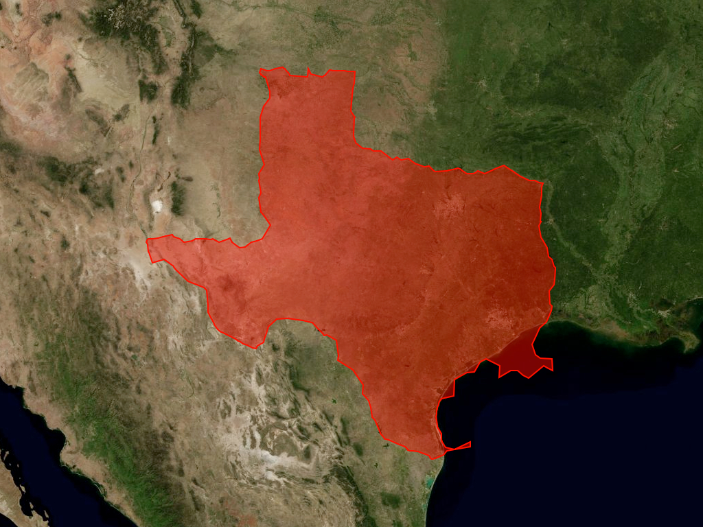
And out the other end comes stuff like this. This shape was derived by tracing the contour of all the geotagged photos taken in the state of Texas. These are new data files created entirely from the act of individual Flickr users geotagging their photos.
We had some fairly mechanical needs that precipitated the project and were really only hoping for some minimal gains over our existing technical infrastructure. We had no idea this is what we'd see.
And those little irregular pieces sticking out in to the Gulf of Mexico? Those are people who've taken photos on boats and, I would argue, are just as much "in" Texas as a person who is standing on dry land.

We repeated this process for every place type on the hierarchy I showed you earlier. We also did it for airports which are a special-case in Flickr. I'll come back to that later.
What I love about this shape is that you can see where all the people on airplanes are asked to turn off their electronic devices.

If you thought Texas looked a little funny, these are all the neighbourhoods in San Francisco drawn in white. The outline for the city as a whole is in blue. Not only do all the neighbourhoods overlap the ones bordering the bay all spill in to the water.

They are in fact the shapes of people looking at San Francisco from places like Alcatraz and Angel Island. They are the shape of activity and the shape of the histories of those activities.
Eventually we released the entire collection of shapes as a public domain dataset because there wasn't, and still isn't, any freely available corpus of geographic shapes with the level coverage we had (especially for neighbourhoods). It was a problem that we kept running in to ourselves and so this was one small way that we thought we could help make that situation better.
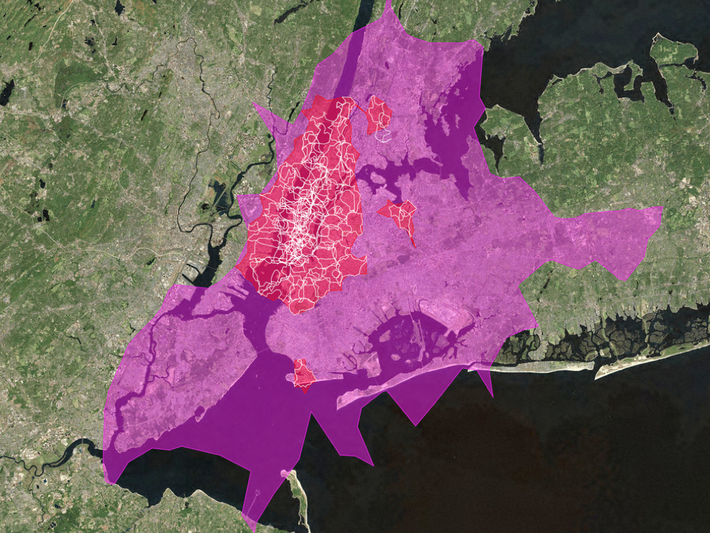
Here's a similar view, but of neighbourhoods in New York City. New York remains the edge case that defeats all classifications, especially geographic which is one reason everything looks a little crazy. And by crazy I mean wrong
.
The large pink shape in the background is what we thought of as the city, proper. The white shapes are the neighbourhoods.
The red shapes were generated by bucketing the points formed by the white shapes and re-running the algorithm. The technical name for these shape is a "donut hole" because when we ran this procedure for London and Paris the newer smaller shape created using beighbourhoods almost always maps to the historical old city and looks like a big hole cut out of the larger present-day metropolitan area.
So clearly the red shape tells a better story about New York than the pink shape. The fact that New York encompasses part of the Jersey shore might rankle some people's sensitivities but it's also not wrong.
And those three red satellite shapes on the right-hand side?
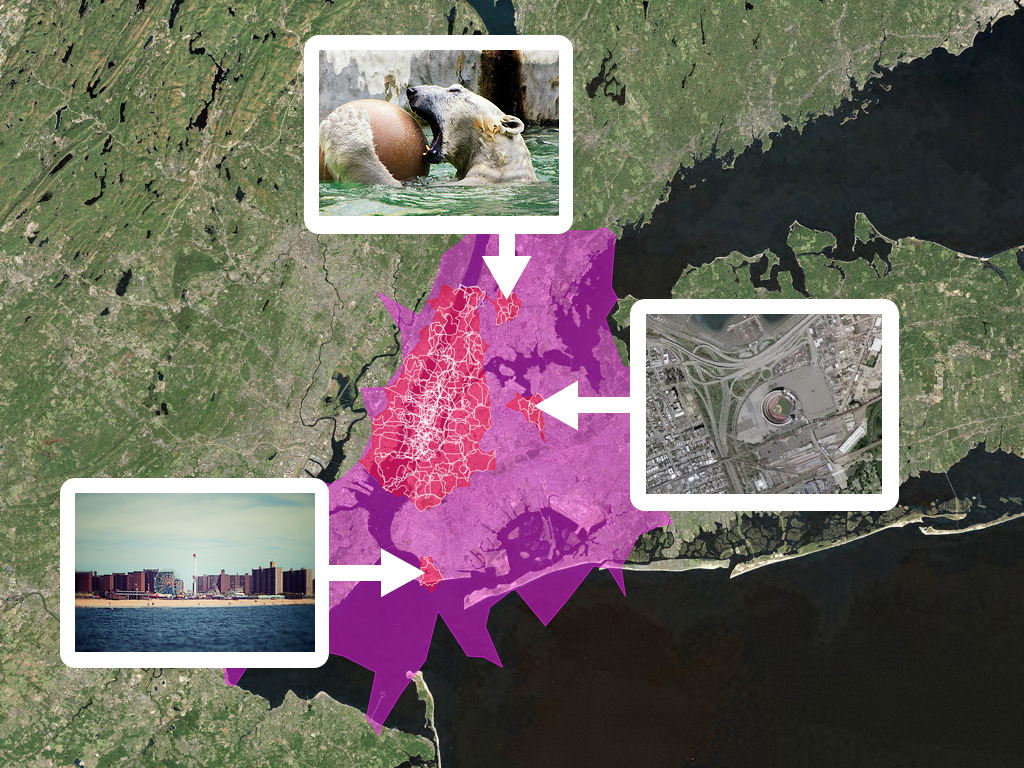
The Bronx Zoo, Coney Island and Shea Stadium.
These are not maps that you would use to bomb your enemies but neither are they inaccurate representations of place.
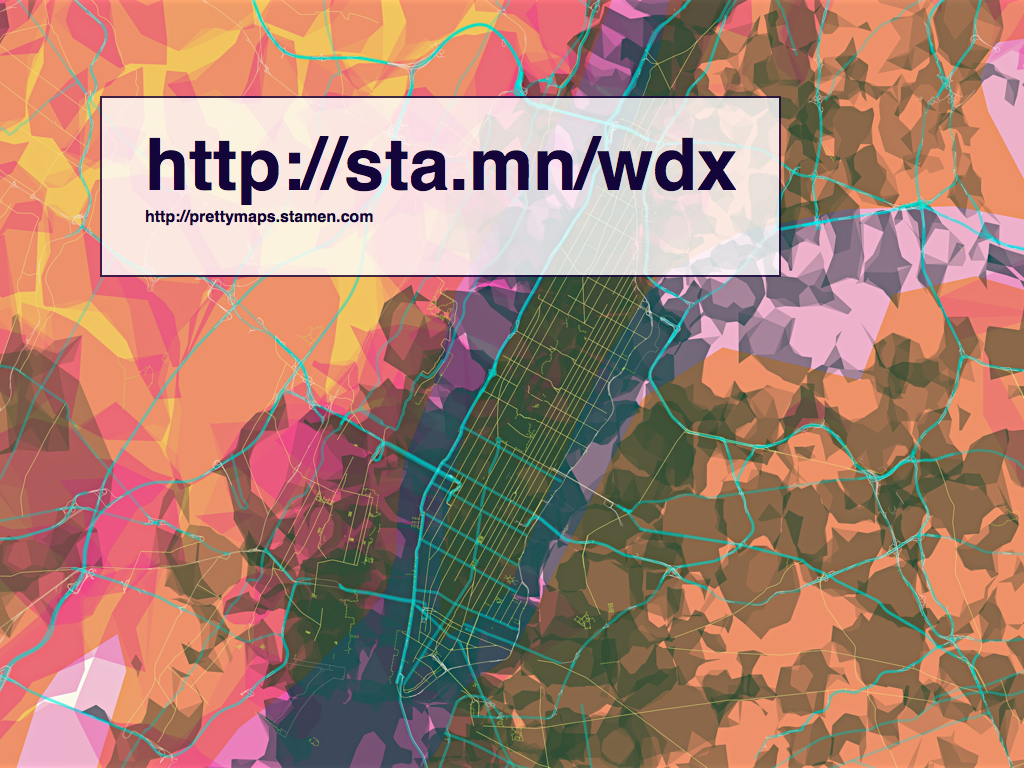
Fast forward a year and a half. This is a project that Stamen released last year called prettymaps.
prettymaps is an experimental online map of the world built of multiple freely available, community-generated data sources including the Flickr shapefiles, the NaturalEarth dataset and OpenStreetMap.
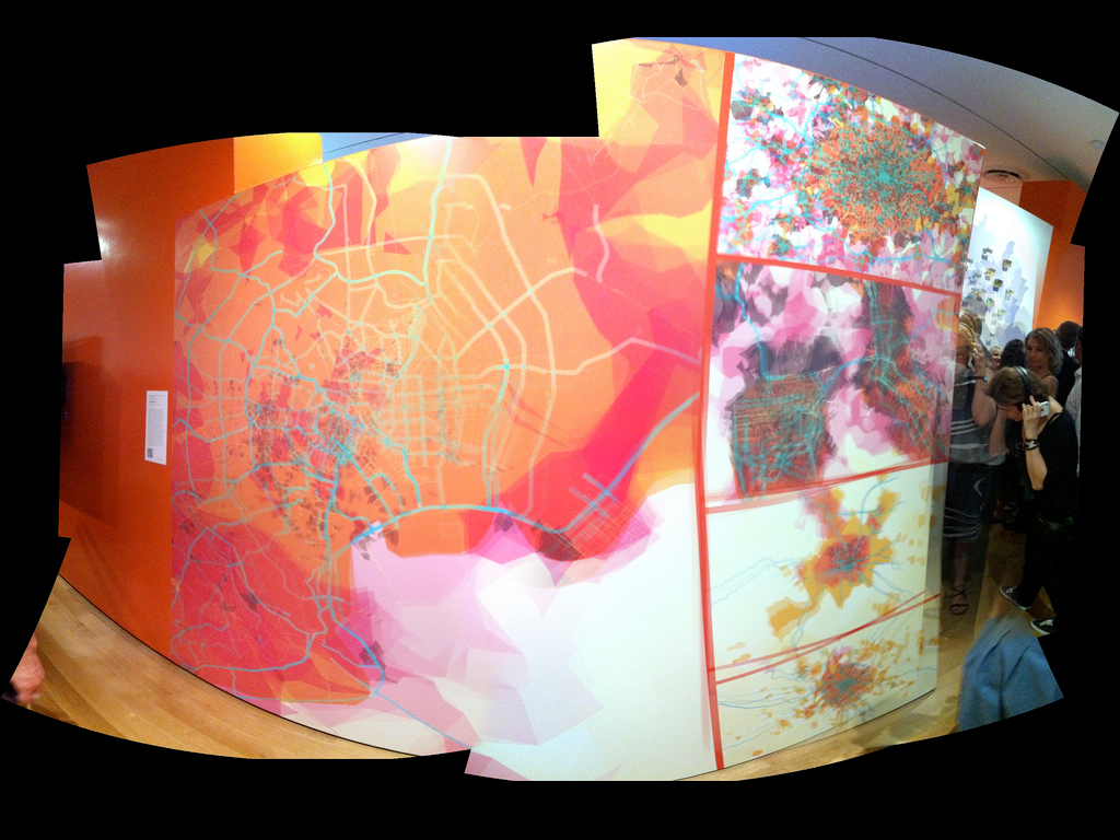
If that last image looks familiar to anyone it might because the MoMA is using it to promote the Talk To Me exhibition which is currently on display. Since this is a meeting about museums, I'll just take this opportunity to say: If anyone ever tells you they don't really care whether or not they show their work in a museum, they're lying. Just remember that even when the naysaying is at its worst, mine included, it's usually born more of frustration than of malice.
I mentioned that prettymaps is built using data from the OpenStreetMap (OSM) project. If you're not already familiar with OSM it is a seven-year old volunteer project to map the world. All of it. By hand. One neighbourhood at a time. Under a Creative Commons license.
You would be forgiven for thinking that the project is pure folly except for the part where seven-years and four-hundred thousand users later it has proven itself to work. It's coverage in the UK rivals that of the Crown-funded Ordinance Survey and its maps of Haiti, produced in the weeks following the 2010 earthquake, are the maps of record for both the United Nations and the World Bank.

prettymaps only use data about road networks from OSM, specifically large and medium-sized roads and their corresponding on/off ramps.
It does not include residential roads because there are just to many of them and the thing I was trying to focus on with these maps were the big ring roads and through ways that define all cities today.
Not unlike the flickr shapes these are maps that represent place through it's use and it's history of movement through time.

In some ways the whole thing was really just an exploration of on ramps and off ramps. We never see them isolated like this and they are beautiful. This is Houston.

I also really like airports.
Earlier this year I decided to try pulling the idea-thread around these maps of highway ramps and do a new map of nothing but on and off ramps, again, and airports that have been added to OSM.
This was not an entirely successful project but I wanted to show it because I think it's a good example of what the future holds in store: There will be more projects like OSM, projects where communities of interest come together and take ownership and authority of a subject whether it's a map or something else, and start to create these huge catalogues of raw material, metadata , that can be used for a whole universe of projects that were never imagined.
To use data the way that a textiles person might approach a bolt of fabric and seeing all the possibilities. No one set out to build OSM so that I could create a quirky map of airports but by their efforts I am able to.
I mentioned before that at Flickr we treated airports as a special-case in our taxonomy of place. What I mean by that is that we quite deliberately abused the system we had created in order that we could start to list airports as cities.
Flickr has that luxury. It's a photo-sharing website and not an engineering firm contracted to build tunnels or bridges that have to withstand the elements.
We did this because it more accurately reflects the reality of people's experience at, and taking pictures of, airports. When you're at JFK it's pretty clear that you're not in Rochdale or Inwood but equally when you're at London Heathrow you're absolutely not in Surrey.
Maybe we should have let people geotag their photos in the individual terminals too and classified them as neighbourhoods too, right? Actually, I thought about that a lot but we didn’t have the data to do it, back then.

And while it was convenient that I worked at Flickr and had access to the source code that runs the site and could make these kinds of changes I don't think my desire to do this sort of thing is isolated or unique.
Despite what people from the Internet tell you about how the network has transcended time and space we all still very much live in a physical world made up of place and history and I think people are desperate for any kind of tool or device that they can use to reflect the day-to-day bumping around that make up most of our lives. None of us can punch mountains so we are always on the lookout for some sort of proxy.
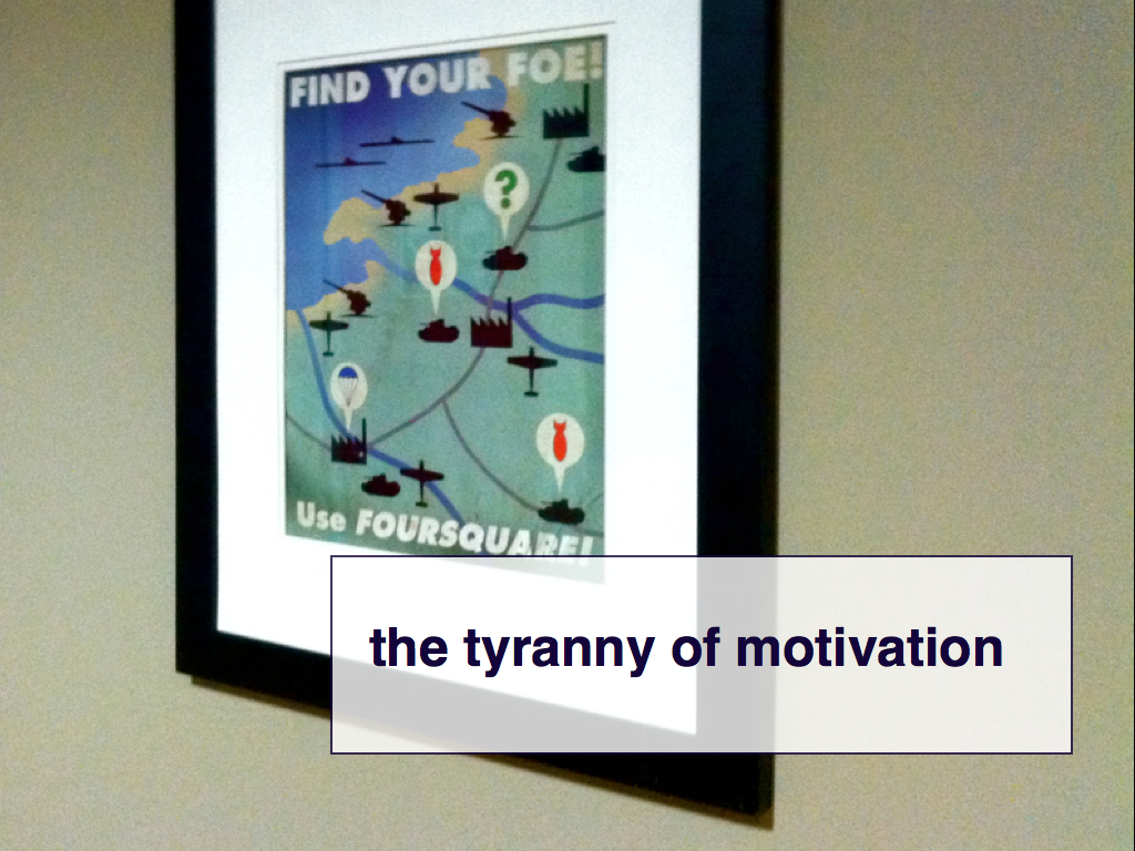
For a lot of people today this plays itself out through an online service called foursquare. foursquare is essentially a big communal realtime-calendar where you tell the service where you are and what you're doing and that information is shared with people whom you've given permission to. foursquare claims to have amassed a database of 25 million venues or "places" this way. 25 million.
Including the recently demolished Terminal 6, at JFK.
My favourite foursquare story these days is how a user has not only listed one of the body scanners at SFO as a venue but classified it as a "resort". On the way in from JFK yesterday I discovered that people have started adding individual taxi cabs, identified by their call numbers, as places where you can check-in!
We don't have the time to dwell on the reasons why people use foursquare or what motivates them to share their locations, often with complete strangers, but it's important to recognize that they do and to understand that it's not a passing trend. foursquare itself might not last but the motivation that compels people to use the service will.
Also, this is a real poster. It’s hanging on the wall at the foursquare office in San Francisco.

You know who else has that kind of data? OpenStreetMap. It turns out there are, as of the beginning of this year, 26 million buildings in OSM. Not many of them have the kind of metadata associated with them that foursquare venues do. On the other hand they have complete geographic tprints and are part of an open system that encourages participation and collaboration.
So I've been thinking a lot about registries lately. I'm focussing on buildings but it could be anything.
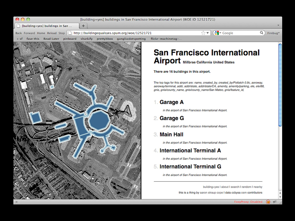
In order to try some of these ideas on for size I built a bespoke catalog for all those buildings. It's a website called building=yes and it's basically just a single page with a unique ID for each building.

Each one of those buildings has also been slotted in to the same hierarchy of places that Flickr uses for its photos.
At the moment the site is read-only
but I'm hopeful to have inline editing working by the end of the year so that people can update data on my site and have their changes automatically fed back into OSM.

There is also an ongoing experiment to use social version control systems for software to store and edit this data. So far, I’ve uploaded airports and buildings parented by airports. This project is very much in its infancy and, frankly, full of bugs still.

This is the last project I'm going to show. It's called map=yes and it's work Stamen did for MapQuest earlier this past summer. Of all the big consumer mapping websites out there MapQuest has been the only one to embrace the OSM project.
One of the way they've done this is by building out the infrastructure required to do certain tasks with OSM data, including supporting something called the extended API (or XAPI) which allows users to query the metadata associated with all the coordinate data that people have collected.

OSM has a deliberately simple tagging system for adding metadata that uses nothing more than key, value pairs to define information. For example: building=yes
or highway=secondary
or anything prefixed with leisure
. That's what you're seeing. Buildings are white; leisure areas (pool, parks, etc.) are blue; the black lines in other slides are, again, on and off ramps.
Again, it's one of those things that seems absurd on the face of it but it works. What XAPI does is allow you to pull out select pieces of data in OSM by querying for a combination of tags and geographic extent.

Which sounds a lot like the airport project because it's basically the same thing but generalized in a way that allows people to do the same thing by taking full advantage of the richness of the OSM data set.
map=yes is a love song to the English painter and comic book artist Dave McKean.

In fairness, you might ask: Is this really any different than Google's "map styling" tools? Is this all just window dressing?
I think the answer is "no". It's true that with Google's maps you can achieve some impressive results by limiting the appearance of map features and by adjusting their visual properties. But you can only choose to exclude items from a pre-defined list and you can't actually add any new ones.
Also, Google recently announced that use of their map tiles is no longer free.

This is the strength of OSM.
OSM itself is actually chunked in two separate database. One called the rendering database is a subset of the entire corpus and is tailored for producing an online map.
The other is the tagging database consists of everything ever added to OSM and is not something that's gotten a lot of attention until recently but combined with tools like XAPI it is possible not simply to imagine new kinds of maps but to actually mechanize them and make it possible to create them on an actually global scale.
That presents a whole new world of crazy opportunities.

So that's where we are, today.
Some, maybe all, of what I've shown you today may seem a bit odd in a discussion about museum studies but I actually think it's incredible relevant and important.
Museums and libraries and archives are no longer the only institutions capable of collecting, housing and organizing cultural heritage. What the Internet has demonstrated is that it is possible for communities of interest to self-organize around a topic and in a relatively short span of time produce bodies of work that sometimes rival traditional scholars in their depth and almost always exceed them in their breadth.
I'm not talking about the mechanics of storage or preservation and conservation. For the sake of brevity I'll also say that I'm not talking about curating or museum programming. What I am talking about, though, is the other thing that museums and archives do: cataloging.
It used to be that the mechanics and the means of production and distribution were the gating factors in determining whether or not a particular work or object was worth collecting or researching. This is no longer true in a world of databases and networked communities. The unit of measure for whether or not something is considered important is no longer dictated by the cost of inclusion.
This is the place where museums and the larger public and communities of enthusiasts are meeting and being forced to find common ground. The opportunity facing museums, and by extension museum studies, today is to how to use and shape a participation in that cataloging process: To imagine museums not simply as archive of a considered past but also a zone of safe-keeping for future considerations.
Thank you.
This blog post is full of links.
#reproductionParallel Flickr
I started working at Flickr on December 10, 2004. I started writing a Perl library called Net::Flickr::Backup the following day.
I did not do this because I was worried that Flickr was going to lose my photos. I did it because you should always keep backups. At the end of the day an online service is no different than the hard drive in your laptop. It's not that you should go through life assuming it will fail but considering the possibility that it might (life is complicated that way) and having some contingency in place if it does saves you a lot of teeth-gnashing down the road. We still live in a world that suffers electrical failures as grim a prospect as that is to consider.
Flickr's gotten a lot of flack in the last year or so for its lack of a one-button download option. This includes a lot of hyperventilating about how Flickr is holding people's photos hostage, especially if they neglect to pay the annual 25$ fee to use the pro version of the site and are thus prevented from accessing anything but their 200 most recent photos. I have limited sympathy for these arguments simply because they beg the question: Why weren't you actively backing up your photos when you did have a pro account?
If it is in fact table stakes for community-based websites to have one-button exports in 2011, and it may well be, it's important to understand that you can get all your data out of Flickr using the API. There were a lot of things we didn't do along the way because we actively wanted third-party developers to fill those gaps and to reap the rewards by building tailor-made applications using the API, including a backup client of which there a few now. If we had to do it all over again I would probably push for a Flickr-blessed backup client (the Tumblr kids got it right in that regard) because "just use the API" is not a particularly useful thing to say to most people and backups should probably have been exempt from that requirement.
Kellan's already written a better blog post about this and the idea of minimal competence
so I'll let him have the last word on that subject.
Since leaving Flickr, some of the old application engineering team have been writing a "white room" implementation of the various core libraries that we all grew to love while we worked there. It's called Flamework. It is mostly unfashionable since it does pretty much everything (minus some of the dumber bits) we did when we worked there, is not a "framework" and still uses PHP and MySQL. But you know, it got us to five billion photos and beyond in five or six years (with at most ten to fifteen people on the nerd crew (thanks for that, Yahoo...)).
I wrote some other stuff here but then [redacted] it because I didn't want to get Myles all wound up.
Anyway, it's made it possible to build a faster, quicker and generally easier version of Net::Flickr::Backup (N:F:B) and one that actually generates a website along the way instead of littering my computer with a million tiny RDF files that confuse web browsers and hurt your eyes to look at. Data-wise it doesn't do quite as much as N:F:B (yet) but it does do the following:
- It downloads and stores your original photos and their "640x" versions. Currently photos are stored locally but there's a plan to add support for S3.
- For each photo it downloads and stores the contents of the flickr.photos.getInfo API method as a JSON file. (None of that data is displayed yet but at least it's there.)
- It stores enough data about each photo in a database so that it can reconstruct your photostream and create a webpage for each photo. With the same photo ID. And the same URL structure. With Flickr-style path aliases and everything.
- It uses the Flickr API as a single sign-on and validation service, which means that the site can fetch and store my contact list and relationship which each person in it.
That's it, so far. There is zero amount of spit and polish and I haven't been able to make any changes in a few months, now. But it works. Every couple of days I run the backup_photos.php script by hand because I still haven't bothered to automate that part and it sucks down any new photos I've uploaded to Flickr. You've never seen me mention the site here or point to it because I'm still perfectly happy to use Flickr but now everything I do there has a shadow that I control. And when I say "everything" I mean almost everything. I mean the stuff I'd put at the top of a ranked list of things I'd be sad to see vanish in to the... yeah... let's not go there yet, okay?
The thing that's most interesting to me though is the last piece on that list: The part where the site uses Flickr to authenticate logged in users. What that means is that I can replicate Flickr's privacy settings locally. It means that I can have a local copy of my photos and keep private things private without having to think about smashing my face on the rocky shores of abstract one-size-fits-all social-network pony-graph magic. If you come to my site and you're not logged in (via Flickr) you just won't see non-public photos. Neither will I, for that matter. But if you do log in then because you've logged in via the Flickr API auth dance I have a auth token for you and can look up your Flickr ID and whether you're a contact and see when and where you have permissions to see all those other photos.
The other part that is exciting is that I can start to add hooks in to the account management side of things on my end to let a user log in with their email address or their Twitter account or whatever. If the unthinkable ever happens (trust me when I say I don't know anything you don't and it hurts me more than you'll ever know to write those words but let's be honest: It's hard to look at Yahoo and not wonder if they're dumb enough to fuck things up because they've done nothing in the last few years to suggest otherwise...) then, because I start out by knowing who users are on Flickr, I will have already made the link between that account and some other website or email service that is happy to act as a validating (read: login) agent.
If the worst were ever to come to pass it's not a solution that helps going forward but if we ever get to that place we'll have a lot more to worry about and this is better than the proverbial nothing. Either way I have a means to ensure that certain people can continue see not-public photos on my website without sharing them with the entire Internet. That little bridge between services and identifiers is important and something that interests me these days. If you don't think it's what things like Google+ are all about then we should go for a drink, sometime.
The thing I have written is not the mythical backing up of the entirety of Flickr which is nearly impossible to do correctly because you bump up against the problem of permissions and relationships which can only be solved, really, by operating the service, with all its users, in toto. But at least it's a way for individual users to keep their little piece of the larger whole and to preserve a little more of the richness that makes Flickr itself worth using (read: the other Flickr users) beyond a freeze-frame replica of their photostreams.

I suppose I could run this thing I've written as a captial-S service but I doubt I will. Certainly not now, anyway. Instead I'm going to do that thing I do sometimes which is release code that mostly-almost-sorta-still-needs-work-but does a thing I know a lot of people would like to use without really making it easy to actually do on their own. Yet. For all I know someone will take the code or the idea, or both, and run off and make a successful service out of it. They certainly won't do it using my code without a lot of work to account for all the outstanding details but I'd rather put it out there now in the hopes that maybe there are other people who want to help me make it better.
Failing that it's a "reference implementation" and proof that it can be done.
This blog post is full of links.
#parallel-flickrA refreshing lack of laptops

I had the pleasure at attending NACIS 2011 in Madison
this week and being part of a panel on Art and Modern
Cartography
organized by Tim Wallace. Tim asked me if I
would speak shortly after he started writing a
series of blog posts questioning the role and relationship of art
and cartography and science which stirred a healthy and
interesting debate in the community (most of the responses are
linked to the post I've linked to) and I jumped at the opportunity.
Tim put together a great panel including Daniel Huffman, Melanie McCalmont, Patrick Hofman and Matt Knutzen. Frankly, the whole thing would have been worth it if all that happened was being able to go out to dinner with Matt, the night before, and work through our respective talks.
I made two unusual choices given my history of public speaking. First, I limited myself to no more than one slide per minute of talking. The second, a consequence of the first, was to ditch all the pictures of maps from the talk. Instead I create an appendix of links and screenshots and links of all the projects I would have shown and stuck it on the web with a handy short URL for typing in to a laptop or writing down in a notepad. This was not a long talk and it seemed like a topic that didn't need to be fighting for time with a show-and-tell presentation of past work that already wouldn't have fit in a 15 minute slot by itself.
This turned out to be the right decision except for the part where NACIS is one of those conferences where the majority of the audience members still don't bring their laptops with them to talks. So that was weird (and new given how quickly we all got used to speaking to a crowd of glowing faces) but there wasn't anything to be done about it by the time I realized what was going on.
For once, this text is pretty close to what I really said once I got up to the podium. This of course means that I now feel like I am shirking my SKYBLOGGING responsibilities because I am basically copying the same text that I spent most of Wednesday writing, in between short walks and fuckyeahsharedbike rides around Madison. Rest assured, though, that there is SKYBOURBON as I re-tell this story to you now, Myles.
This is what I said:

Hi, my name is Aaron. I am from the Internet. I am not a cartographer by training. I am not even a computer programmer by training. Nor am I a capital-D designer although I work at Stamen Design in San Francisco. If I studied anything at all it was painting but I haven't done any serious painting in at least 15 years.
I mention all of these things because they, along with the web, have been the rip currents running through my life for the last ten years most of which I've spent thinking about maps and community at Flickr and more recently at Stamen and in every personal project in between.

I'd like to start with a pair of stories about Lisbon.
I have had the privilege of visiting Lisbon twice in as many years. The first time was 2010 and when I came back I described the city as being like a turtle. What I meant is that it presents a very beautiful but ultimately hard (and nearly impenetrable) surface to visitors. The pattern on the turtle's shell being the map – the route – of the city that almost every tourist follows when they visit Lisbon.
It is the map that every travel book publishes and it says the city can be seen in approximately three days and then there's basically nothing left worth seeing afterwards. It is a route that so many people have taken you can see and feel it being etched in to the city like a river-bed or some other heroic land-feature.

But that is not where Lisbon's beauty lies. Lisbon's beauty lies in walking the same streets day after day and letting themselves open up to you gradually. Like many things on the Iberian peninsula a lot of life goes on behind the thick walls and heavy shutters that front the streets. That's a hard thing to "map" because the facts on the ground are really just facts on the surface. This is true of many places but I mention Lisbon because it's demonstrates the problem nicely.
This is one of two weeks worth of GPS traces I made while we walked around the city. That's all we did. We walked around. We ate fish. We walked around some more. We got drunk a lot.

This is what the entire trip looked like. This is neither art nor cartography but I show this because there's not really any point talking about maps in 2011 without acknowledging two things:
The first is that the raw data and most of the plumbing used to collect it are now available to those who want it. I did all of this work with my phone. The second is that the idea of "location" is now front-of-mind for more and more people.
Despite what people on the Internet will tell you we all continue to live in so-called "meat-space" so there's never been a time when geography hasn't been important. What's changing is people's expectation that it's something more than a hill or a lake or something bigger than them over which they have no control.
What's changed is the expectation that "location" is something they can affect even if it's just at a personal level. And right now that mostly plays itself out in maps.

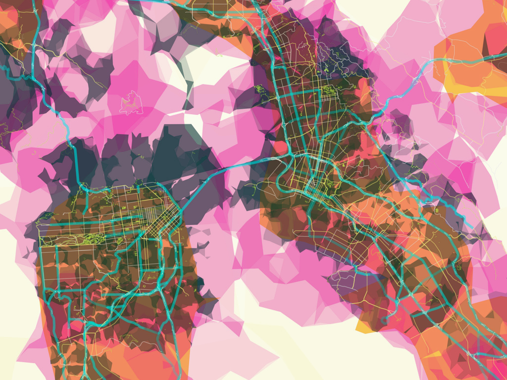
These are all those GPS traces, simplified and overlayed on a project the studio released last year called "prettymaps".
This is also the last map you'll see in this presentation. This is too short a talk for me to try to get to the meat of an argument and do a slide show of all the work that's gotten me invited up on this stage.
Every project I would have shown you lives on the web and I've put together a list of links, along with screenshots, at this web page. I'll show the URL again at the end of this talk.
The second time I went back to Lisbon was earlier this month. I was attending "Experimenta" which is the Lisbon Design Biennial. During one of the panel discussions someone suggested that what Portugal (and presumably every other country) needed was a Minister of Design as though bringing someone to the decision making table who could apply "design thinking" to all our social and economic problems was the thing we've been missing all along.
I actually presented at Experimenta this year. The talk was choppier than most which is why I haven't posted the slides or notes yet. It's a talk that was a bit ambitious given the constraints (see above) but if I can find the time (a flight longer than this one) I'd like to try to to write it out in long-form...
That's an interesting idea, I suppose, but it's also a little naive because it pre-supposes that public policy isn't a kind of design thinking by any other name.
How do you create and orgranize a system that will perform some basic set of functions that can be reliably used by a large and heterogenous population so that they are free to pursue a life beyond basic survival needs?
More importantly maybe is: How do you tell the history, the debate and the nuances, of those decisions to someone who's only just arrived at the conversation? Sometimes all those people freaking out at town hall meetings have reason to do so but sometimes they're just not aware that there's a "why".
This is what I mean when I say that it's just "design thinking" by another name.
For a studio like Stamen which is increasingly being asked to make sense of large, public datasets this second question is going to be central to all the work we do. Which is not unlike some of the problems that all maps face.

I mentioned earlier that before I joined the Internet I studied painting. That was almost twenty years ago, as it happens, and back then we were all neck-deep in the debate about relationship between art and design and craft. They were brutal and vicious arguments and a lot of it was wrapped up in an intellectual and social positioning, typically with the fine artists coming out on top and the craftsmen people being seen as little more than, to use a contemporary name-calling, code-monkeys.
Somewhere stuck in the middle were the designers who were treated more or less the way cartographers are today. Everyone knows they're doing something that is hard and requires skill and a kind of aesthetic but no one is quite ready to call it "Art".
I think one of the reasons the debate was so antagonistic when I was in school is because people were already seeing and could feel a shift in those roles even if we couldn't articulate them. Twenty years on there's no denying it anymore.

That is: The distinction between the three groups has by and large always been predicated on economic grounds, the cost to produce a work and the burden required to sell it. That is a ground which has almost entirely fallen out from underneath everyone's feet.
It is no longer clear what separates one from the other in ways that make the traditional arts vs. crafts debate seem quaint by comparison.
Artists are producing "designer" bags, designers are talking about their
work as bespoke "pieces" over questionable function and
crafts-people are busy blazing trails across the Internet and
the technology world. Think: Threadless and the larger world of
textiles (aka wearable computing
) beyond that.
Last year I wrote the following:
"For most of their histories the carefully crafted roles separating each has been a function of the means of production. In the absence of those constraints how are those roles distinguished when the only measure are the communities of interest that form around the work they create? I don't think anyone really knows, right now."
The perennial debate around the distinction between the fine arts and
crafts is made more confused by the question of whether designers,
particularly those making data visualizations
are creating new
art-forms or simply illustrating buckets of information."

Way back in 2007 my collegue Mike Migurski made this diagram which is different way of saying the same thing.
Often, we treat the science, or the math, in these endeavours as little more than tools. It's role is like that of the craftsmen executing a task well but one that requires external guidance and vision. I think is one of the reasons that the question of art and (or art versus) cartography keeps cropping up.

Historically, we've used the difficulty with which something is created as a shorthand for a measure of confidence in it's authority. Typically this has meant classic 20th century means of production and distribution but we've also substituted economic freedom with academic rigour. If something places extraordinary demands (whether it's time or money) on an inidividual then the feeling is that they won't pursue it, simply out of a sense of self-preservation, unless they are serious about it.
Maps occupy a special place in this equation. It's not that all maps need be accurate but some of them really do because there's actual consequence (or at least money) at the end of each one.
But maps aren't difficult to make anymore. If anything there's never been a better for people to make them. The availability of comprehensive, open data sources and an exponential in the design and ease of use of the toolsets means that we're seeing not just more maps being produced but, frankly, better crafted maps by more people with less cost.
I happen to think this is a good thing because not all maps ought to be meant for bombing your enemies but I am aware that "more beautiful" doesn't mean "more better" or even in some cases, "correct".
But that's also a weird, squishy corner that we're painting ourselves into I think that one of the reasons the art and cartography debate gets so heated is that we all know some of the maps we make *need* to be held to a higher standard of circumstance but we no longer have the convenient short-hand of maps being "hard" to produce for distinguishing one from the other.

But we've been here before. We've been here for a long time. Language exists at a similar intersection between necessity and art but if we held language to the same standard of absolute utility that we some times hold maps to then we would not have literature, we would not have humour, we would not have philosophy.
Language is capable of both poetry and the kinds of soul-crushing prose we think are required to create documents that can be dragged in to court or otherwise held to some unknown but fearsome accountability.
If there's anyone who can't read the text in this slide: On the flight out to Madison the other day, I discovered that someone has not only added the body scanner at SFO to foursquare's database of places but they've classified it as a "resort". I am debating trying to check-in from inside the actual scanner the next time I go through security.

It's not just literature, either.
It took photographers all of a year, if that, after the invention of the medium to understand that they had no more of a lock on "reality" than the painters ever had.
This is a photograph I discovered earlier this year by Balazs Gardi as part of basetrack.org, a Knight-News funded project to document marines in Afghanistan. This is a photo a Predator drone getting ready to take off from an airbase in Khandahar.
If it looks a little odd that's because it was taken with an iPhone using a camera application called "Hipstamatic" that post-processes photographs and makes them look like they were shot and developed using colour film from the 1970s. Note the addition of the faux-paper "border" around the image.
This is all kinds of weird. This is a photo taken with a device that more than any other collapsed not just the financial but social barrier to people taking a particular kind of networked mobility, an by extension maps, for granted. It's a photo of a machine that is forcing people to confront a whole new set of questions about war and technology; about accountability and moral authority. In a place that the US has been fighting a war for the last ten years. Dressed up in a summer dress from 1974.
It's a beautiful photo. It's also profoundly weird. There's no going back.

This is not a staged photo, by the way. This really happened. It's not a bad way to think about the question of art and cartography, either.
I've long held that all media transit from being "functional" to "art" when they are no longer economically viable. It is that transition which dampers the cost and the consequence of failure and makes the space necessary for people to experiment and play. Think of lithography which was born of purely utilitarian needs and sherparded the arrival of the mass-produced image only to become a capital-O object as soon as the offset press was invented.
The thing that is exciting about cartography today is that it seems able to exist in both places simultaneously without automatically being sucked in to the gravity well of either. This means most of the social cues we've learned for interacting with maps will need to be revisited but in the end I think it will be worth it.

Thank you.
This blog post is full of links.
#nacis