That was me, talking (part three)
Nothing says luxury like airport hummus. I'm sitting here in the Vancouver airport with hours to kill after triggering every single warning signal known to US customs and immigrations officials: Arriving with way too much time to kill, being efficient in line and generally dismissive of Air Canada staff, carrying a ten-year old passport unrecognizable by any machine produced post September 11th, wearing a t-shirt and probably smelling bad.
Which is sort of what I imagined speaking at GeoWeb 2009 would be like. Looking through the conference schedule this spring I wasn't entirely sure why they accepted my proposal. Or what sort of reception it would get.
What follows are my unedited presenter's notes. This talk was delivered at a time when I did not write things out in long-form and usually just got up on stage and did a sort of stream of consciousness dialog. Sometimes it worked, sometimes it didn't. Mostly though it's meant that the ideas just kind of fade in to the mist...
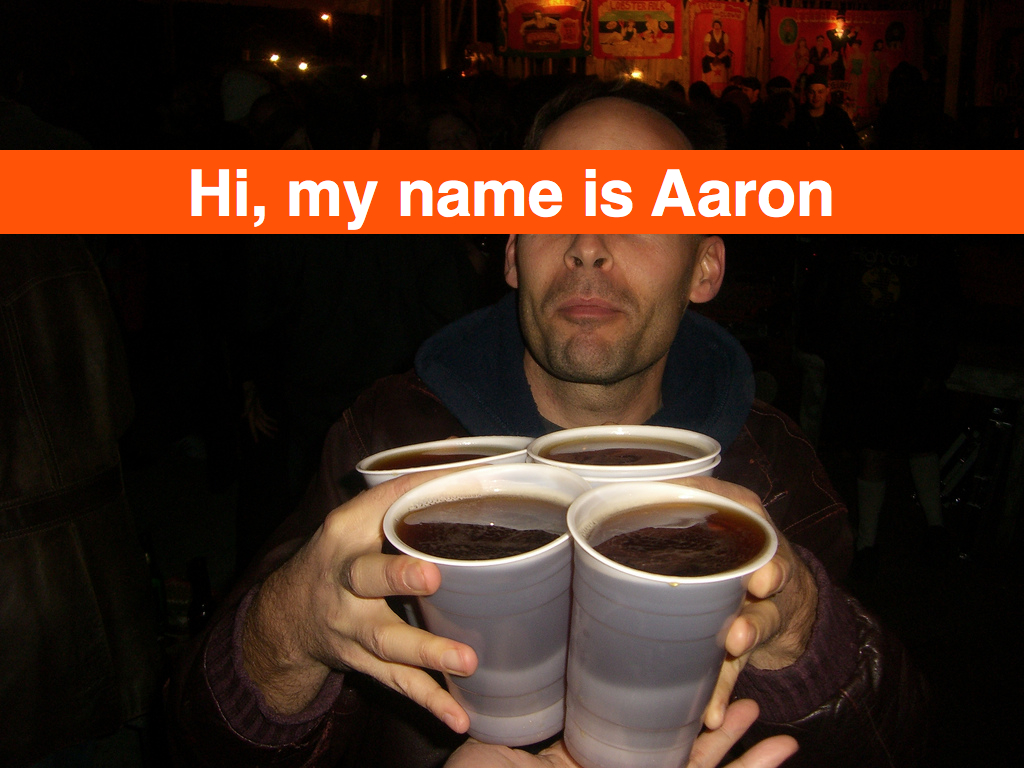
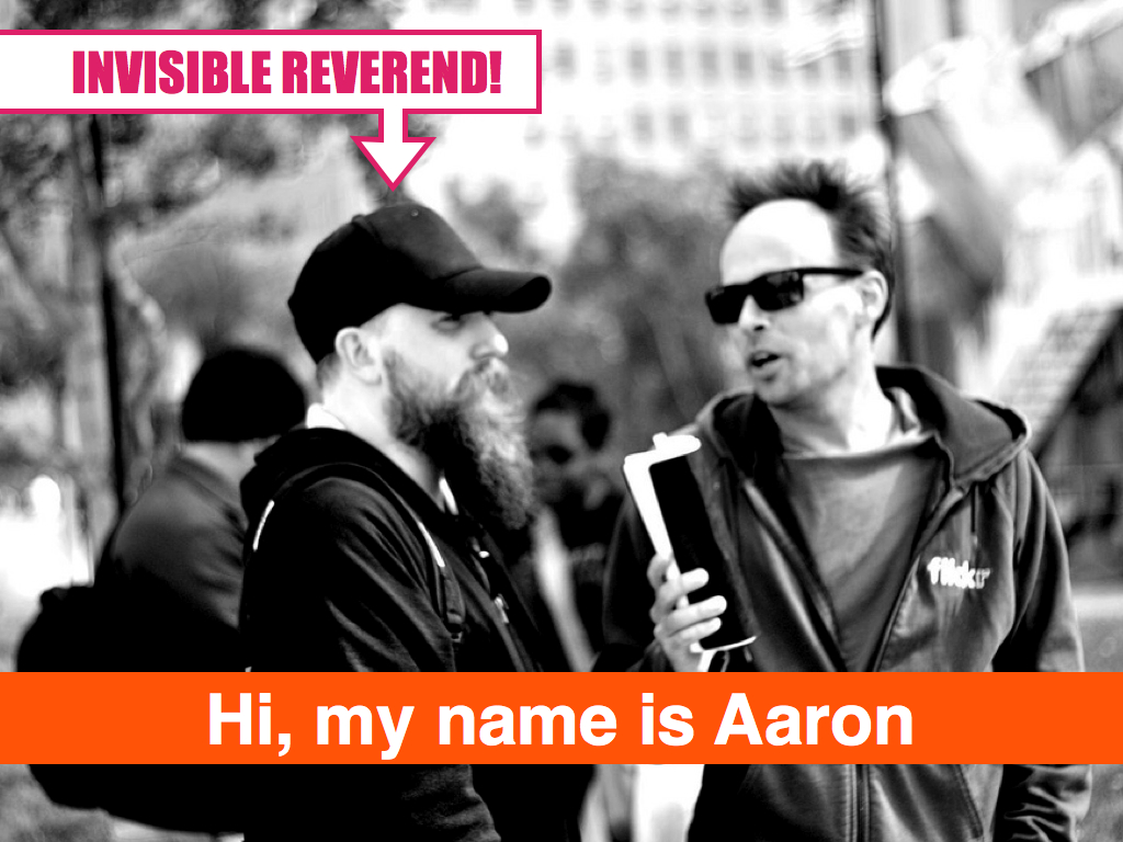
Hi, my name is Aaron. The short version is that once upon a time I was still a painter and then the Internet happened. These days I am the senior engineer at Flickr where I work on all the backend stuff for the geotagging project.
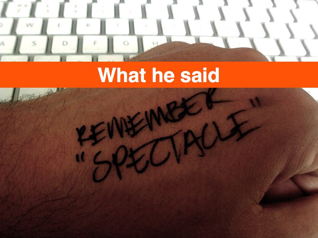
I feel a little bit like that guy because I am that guy but also because this talk feels a little like carrying plastic cups full of beer across a crowded room. I mention that to remind myself that it’s possible but also to say:
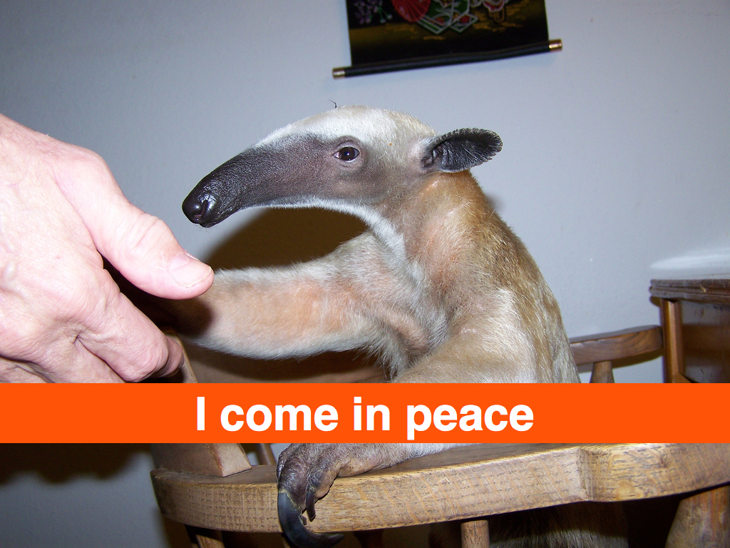
I come in peace. This is a bit of an open-ended talk. I do not have any answers. I do not have solutions, strategies or products. Instead I have a ... I want to illustrate some of these ideas using stories from our experience ...
I promise you, all these things have something to do with the web. And geography.
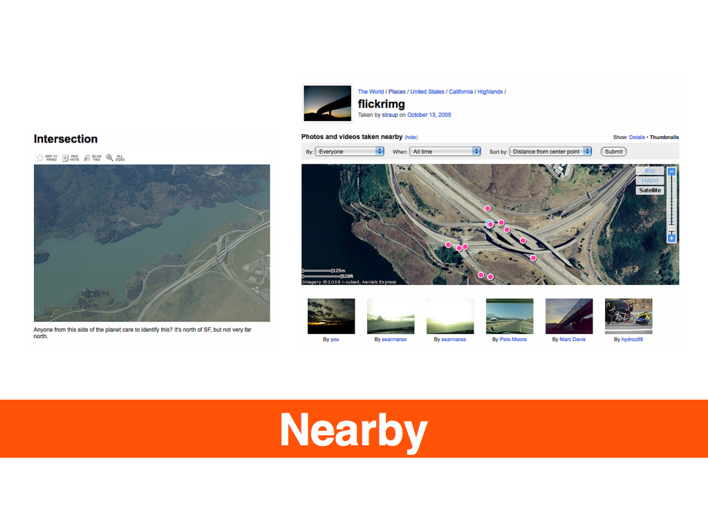
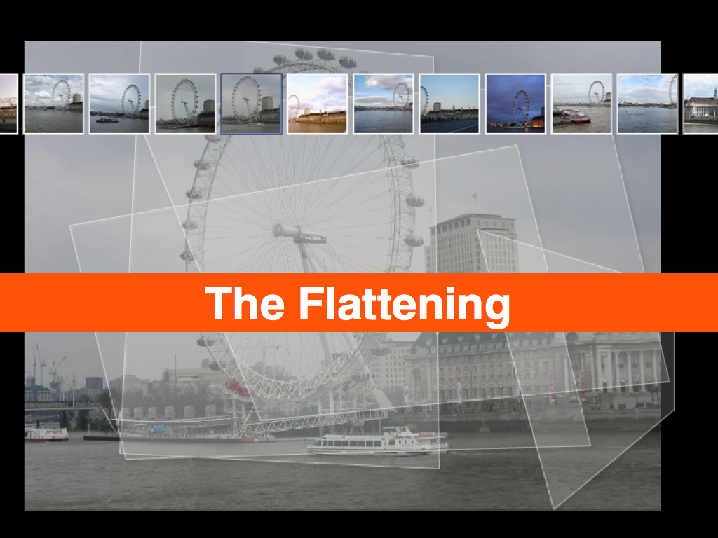
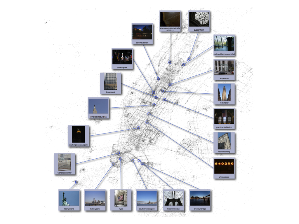
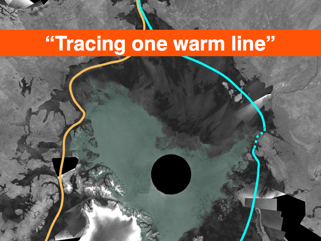
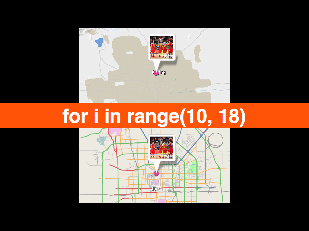
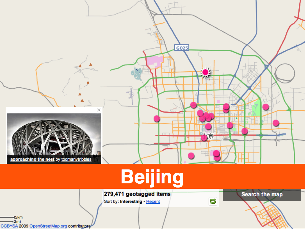
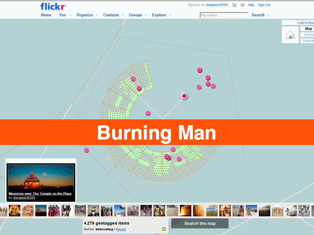
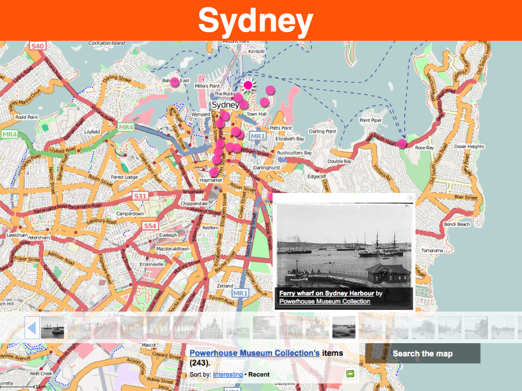
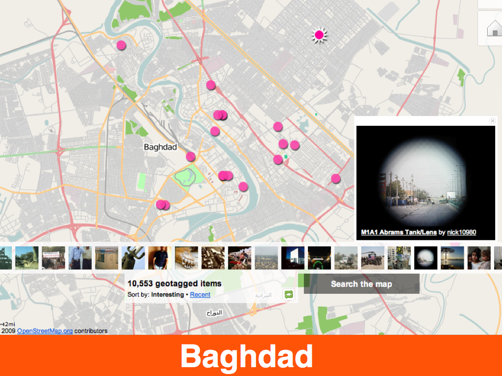
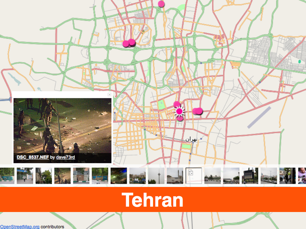
Earlier this spring we released the “Nearby” project. At it’s simplest, Nearby is a radial query for geotagged photos near a point whether that point is a coordinate entered by hand or associated with a photo. We have enough geotagged photos that, in cities anyway, every point becomes a looking glass.
We did not want a “God’s Eye” view.
Allowing users to construct a narrative based on the relationship between the photos, sorted by time and distance.
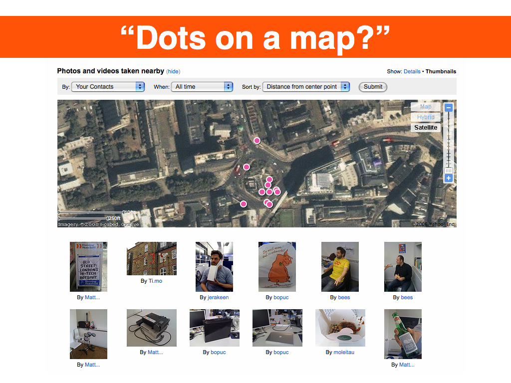
Nevertheless, one of the questions that’s been asked is: Wouldn’t this have been better or easier as dots on a map. I think the answer is no.
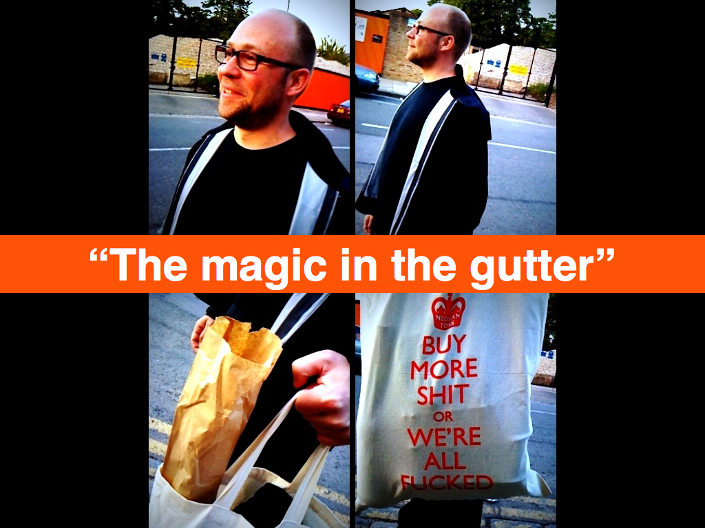
The comic book artist and writer Scott McCloud has called this the magic in the gutter. The gutter is the space between panels in a comic strip, in the between the action, whether the reader fills in the story.
This is taken from a series of illustrations that James Bridle did to try and understand the conflict in Gaza and the West Bank. ... Room to imagine.
This isn’t anything new really. It’s what we’ve been doing with maps and geography for most of our history because, until recently, lacking the tools to accurately map the world around us we have ...
What we can accomplish today is pretty astonishing.
Now, this is the part where I say bad things about Google Earth and Microsoft’s PhotoSythn and everyone thinks I’m crazy. I want to make it clear that I think both of these tools are amazing. And important. And I’m not going to stand here and suggest we go back to a world without them.
(To be at the center of the map...Fuck that!)
What I am going to say is that the ... betray a desire to create a mirror world...stitching...what’s the point.
I don’t want to point fingers at anyone and say they are doing the bad thing. I do want to say that we risk doing this without being aware of it. And by doing it we paint ourselves in to a corner that we’ll more than likely be able to get ourselves out of. But life is short and there are better, more interesting problems to work on.
Recently Google has been adding more and more photos from its users to StreetView, in effect “Nearby”. What they’ve also done in the last couple of weeks is introduce the element of directionality presumably to create a ooh-shiny ... to compete with PhotoSynth.
And yet, the most interesting thing about the current implementation anyway is not the photos but the abstract representation of where the photos are and their vantage point. These are the gutters. It’s not a criticism of the photos themselves but the act of ... fails.
It’s not that we shouldn’t have accurate tools with a high degree of fidelity but if you are building tools for a community of users (or viewers) what is gained by sucking all the air out of the room.
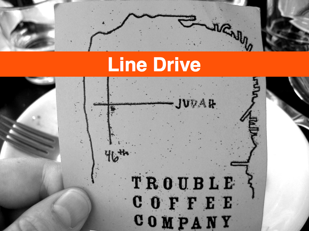
If for no other reason than that you limit the potential of your ... Who here remembers LineDrive? It was a fantastic research paper published by Microsoft in 200?? that described an algorithm for rendering driving directions in the manner that you or I might scribble them on the back of a map.
This is one of my favourite maps. It’s a good example of the technique of comics of juxtaposing highly stylized characters on a realistic and detailed background. But the other reason I like it so much is that you could have replaced the ... contour of the bay with a single arc and people in San Francisco would have understood exactly where the coffee shop is.
They would have filled in the details of getting to Judah or 46th themselves.
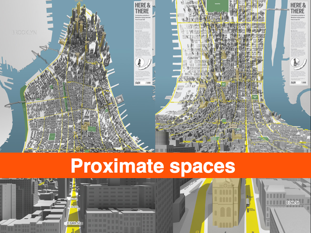
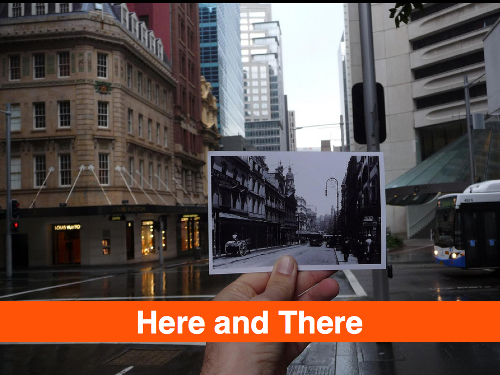
And there are other ways of marrying accuracy with interpretation. It’s a really great example of what you can do with [WORDS] data without necessarily falling into the trap of creating a mirror world. This is “Here and There” map creation by Schulze and Webb, as design agency in London. I’ve seen ... of similar work that AutoDesk is doing. I really like the notion of creation these sorts of “proximate spaces”, spaces that ...
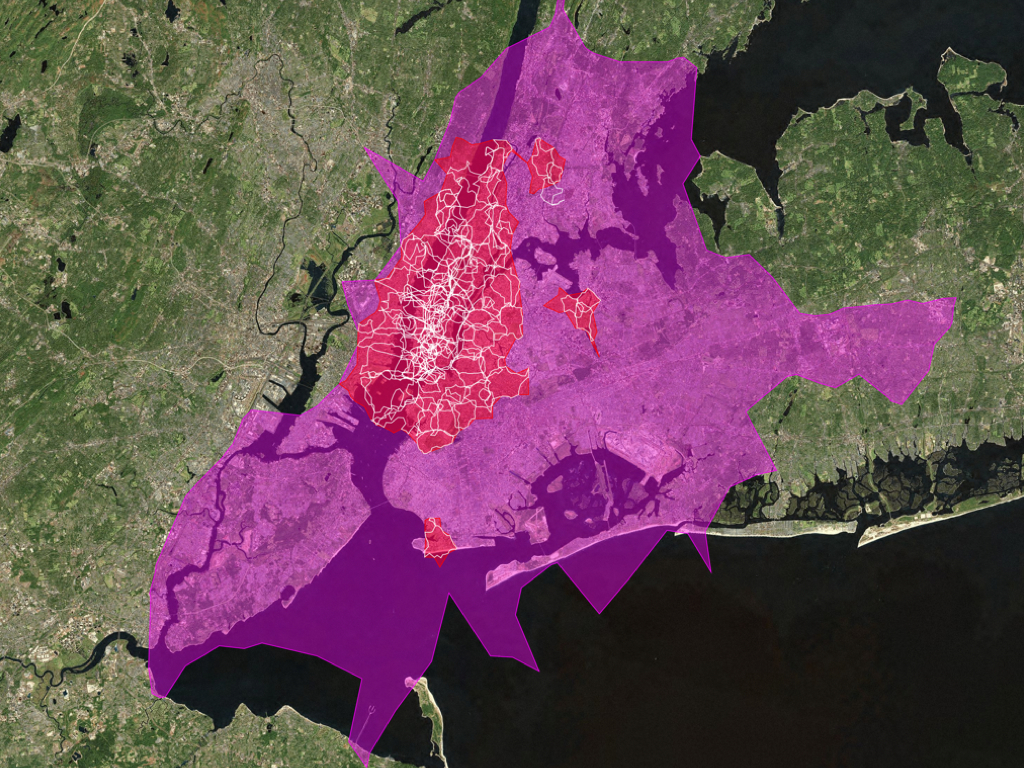
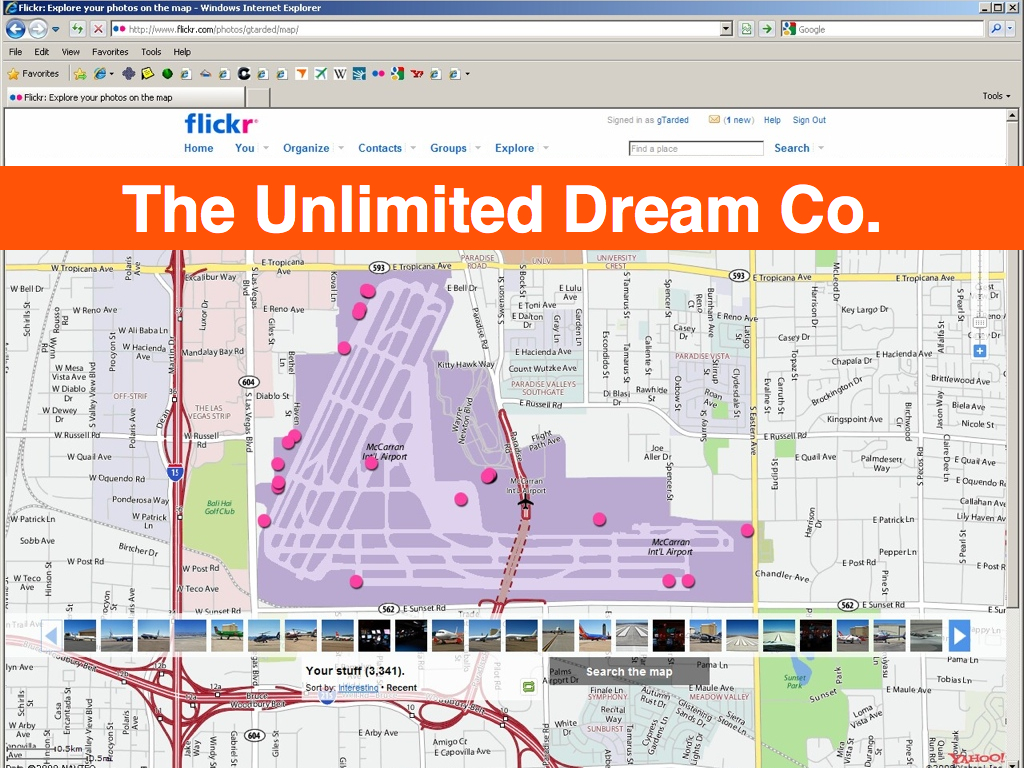
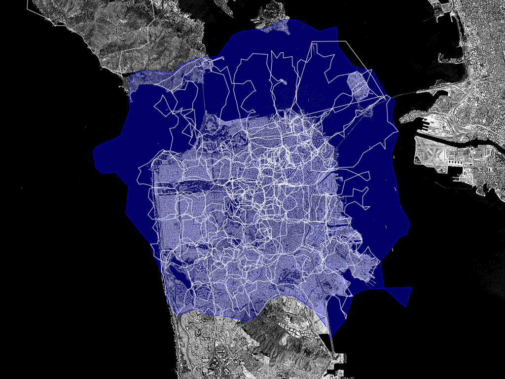
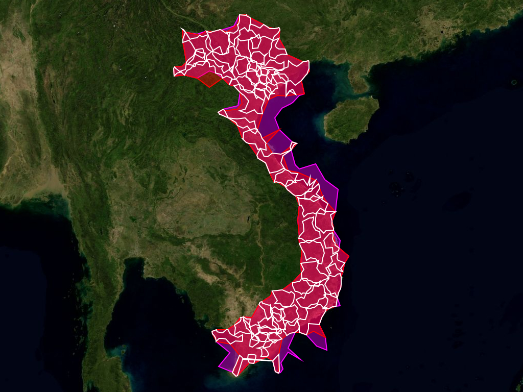
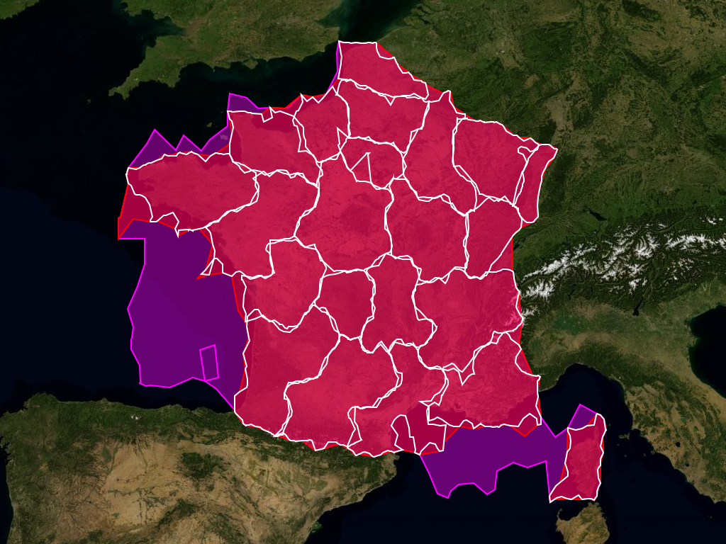
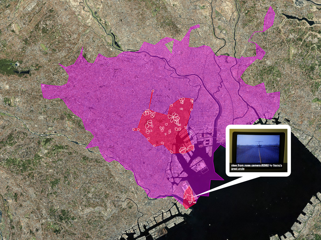
Last year, we started generating and publishing shapefiles that are creating using the only the geodata associated with geotagged photos in Flickr.
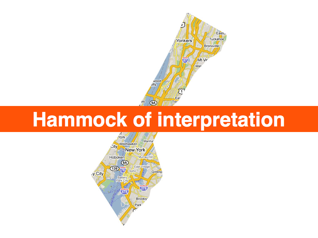
The larger pink shape is the shape of New York City, or rather the metropolitain area of New York. It is like a perfect storm of bad assumptions on our part and bad data from our providers grafted on to the constantly changing assumptions of New Yorker’s sense of themselves and the physical space they occupy.
The smaller white and red shapes are the generated from photos whose neighbourhoods are children of New York City. A couple interesting things start to happen. One, the larger shape in the middle is a whole lot closer to what most people think of as New York, encompassing the five boroughs and even parts of New Jersey. This may not be the administrative reality but it does mirror facts on the ground.
And those other three smaller satellite shapes?
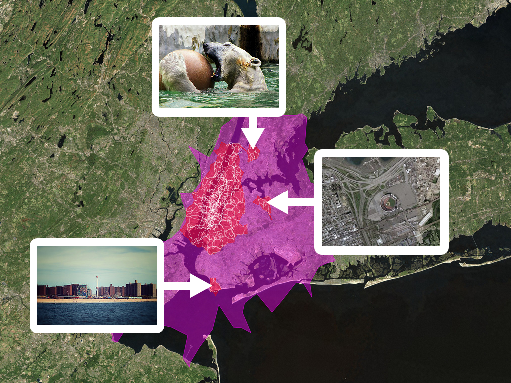
The Bronx Zoo. Shea Stadium. Coney Island. I mention this because we invest a lot of time and energy into trying to accurately reverse geocode our user’s photos. If they are going to go to the trouble of ...
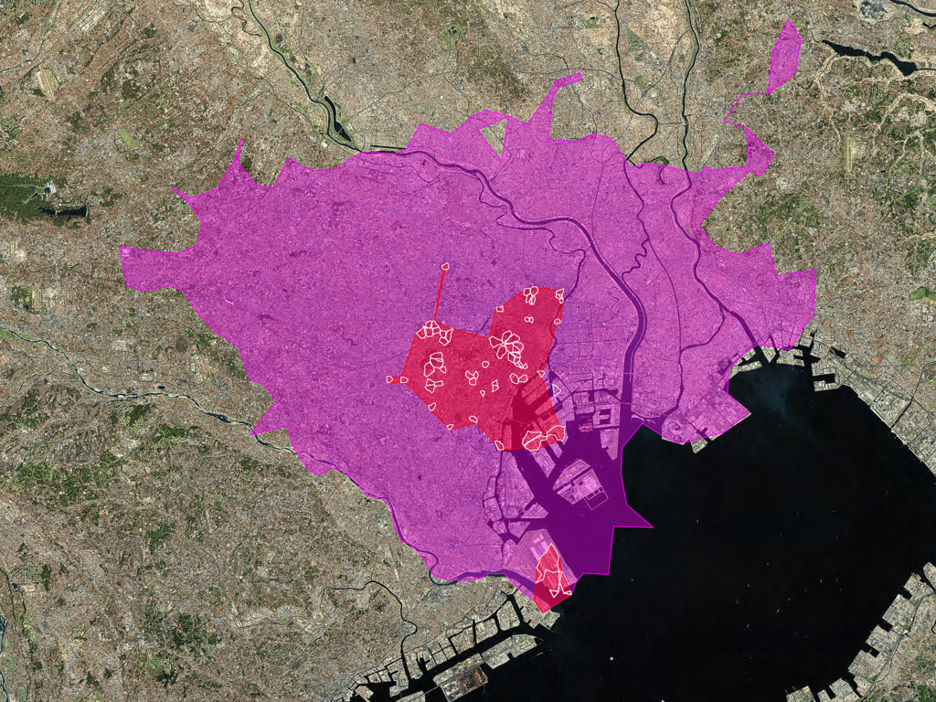
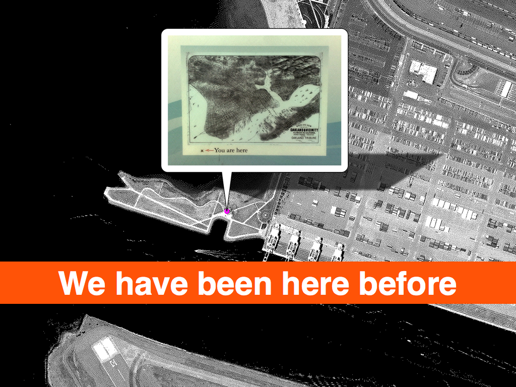
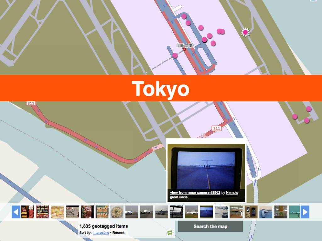
Here’s another example: Tokyo. See that smaller shape at the bottom of the photo?
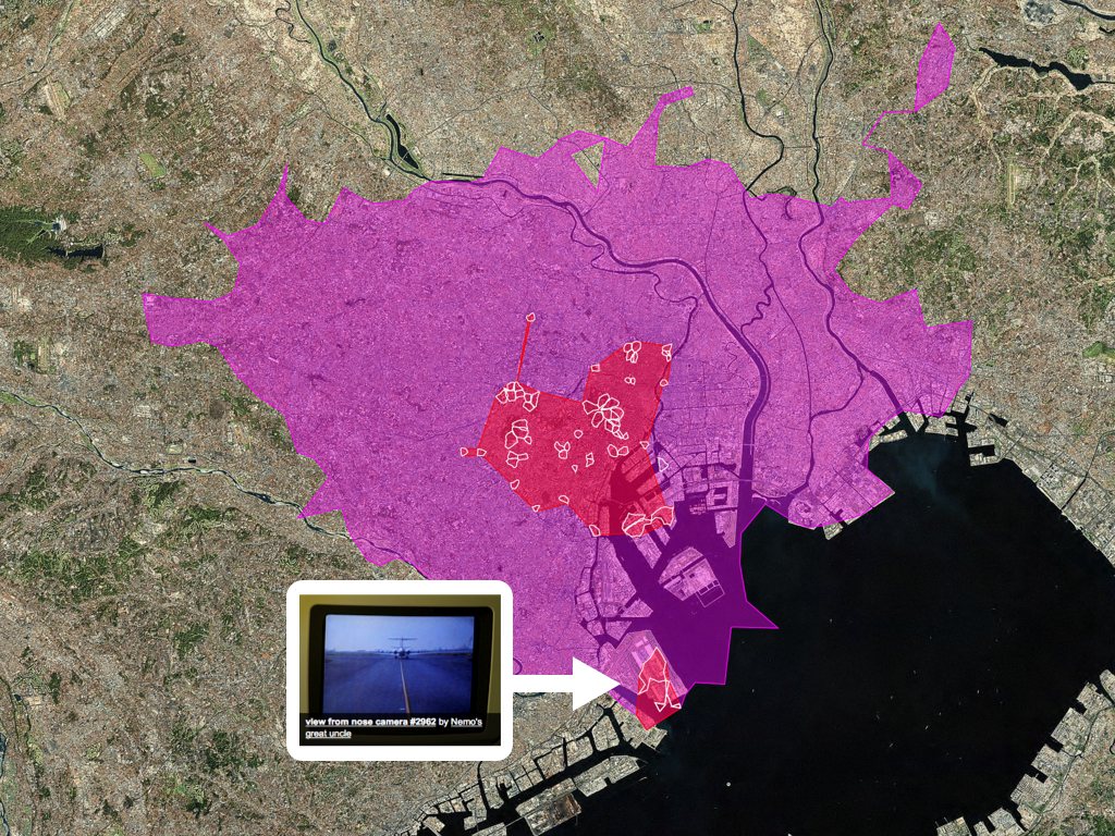
That turns out to be Haneda Airport, the one that most people don’t even know exists.
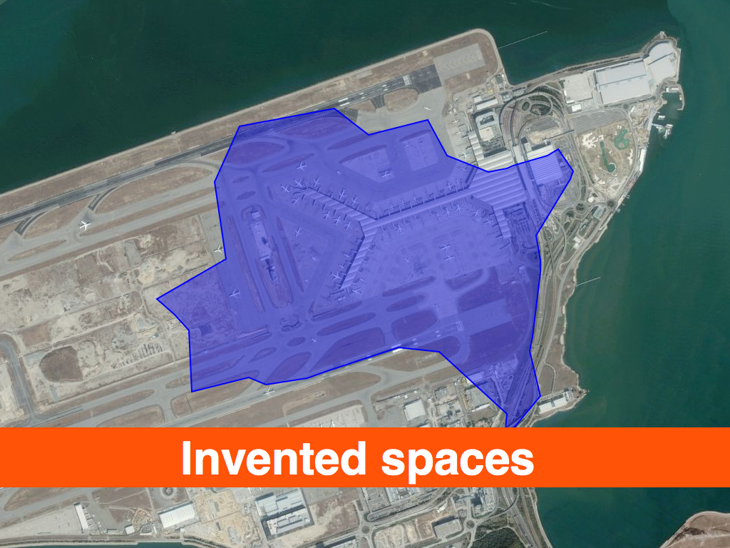
Airports are another example of the flexibility to accommodate different models.
… at an airport the individual is defined, not by the tangible ground mortgaged into his soul for the next 40 years, but the indeterminate flicker of flight numbers trembling on an annunciator screen. We are no longer citizens with civic obligations, but passengers for whom all destinations are theoretically open, our lightness of baggage mandated by the system. Airports have become a new kind of discontinuous city, whose vast populations, measured by annual passenger throughputs, are entirely transient, purposeful and, for the most part, happy.
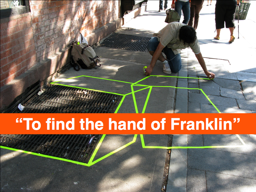
We have a lot of users who spend a lot of time in airports. This is just one user who walked the shape of the airport in Nevada between flights. Technically airports are an administrative area or a private enterprise and are indexed accordingly. In reality, airports have emerged as a kind of city-state.
Now, I’m not suggesting that everyone follow our lead. I only want to highlight ... All neighbourhoods are disputed at the edges. Once you introduce time in to the mix it only gets more complicated.

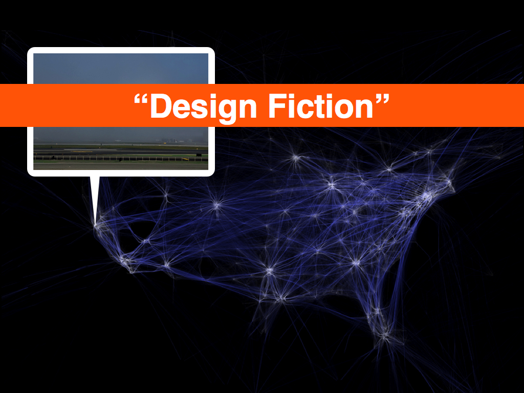
Julian Bleecker calls this “design fiction” ... Aaron Koblin
Dan Catt has talked about creating places, and histories, by using buildings in the city as wireless access points where you pay for use by exchanging photographs of that building and it’s surrounding. This is a fascinating idea that there’s just not time enough to go in to.
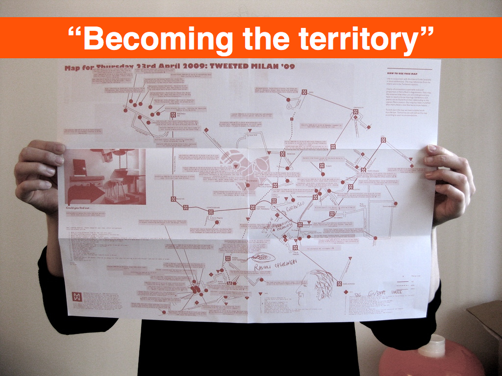
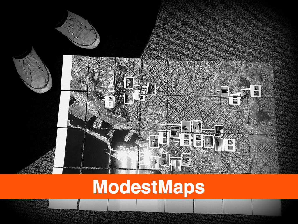
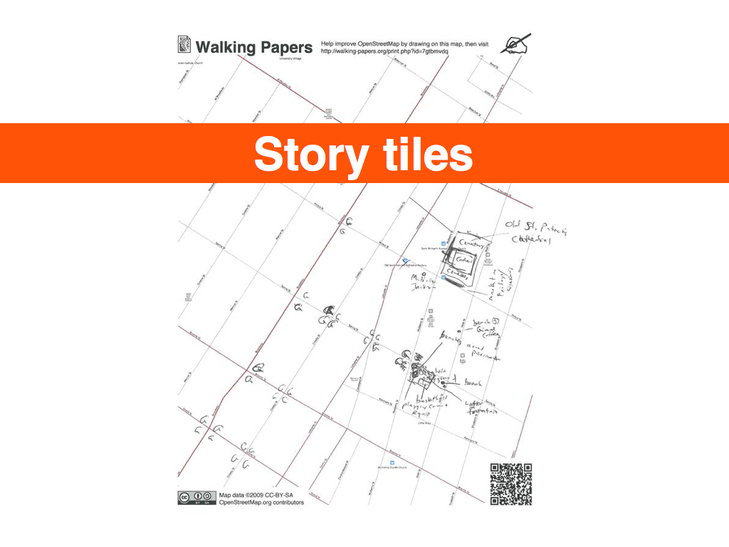
Matt Jones described this as the map itself becoming the territory. He was talking about a physical map that was produced during each of day of big furniture and design fair in Milan using geotagged photos and Twitter messages and other ... using this rapidly-produced thing then becomes a ’social object’: creating conversations, collecting scribbles, instigating adventures – which then get collected and redistributed. ... The Incidental is feedback loop made out of paper and human interactions - timebound, situated and circulating in a place.

Here’s where I go right off the deep end and tell you about two meals I’ve had in two different restaurants in the last year. In one I was served a t long “noodle” made of banana. It was half an inch in diameter. At the other I was served bacon ice cream for dessert. It’s probably obvious that the noodle wasn’t very good. An interesting idea, probably worth trying once but never again. The other, the ice cream, it turns out was just as bad. Bacon ice cream if you’ve never tried is the uncanny valley of d.
And what I’m really talking about is this. And I’m being unfair to both. The Situationists were boring but they weren’t wrong though they would choose the dragons over the landscape every single time. Likewise, synthetic worlds are fantastically useful for all kinds of things ...
So, we’ve got these two competing approaches.
I’m not going to show the Naked City map to illustrate the Situation approach. We’ve all seen it too many times and if you still haven’t enjoy the time you’ve got left. As an aside, the Situationists inform most of the current thinking behind ubiquitous computing so you’ll be seeing it soon enough.
One of these days, it really wouldn't kill me to do the same talk twice. The idea behind the talk is still very much a work in progress and still sort of hard to articulate properly. I wanted to talk not about the kinds of things we're building around place and geography these days — they're both awesome and understandable in an historic context — but rather the stories we tell ourselves about what we're building.
I finished my presentation at State of the Map by talking about the, admittedly hand-wavey, idea of what it would mean to use all the precision we've accumulated as a blunt instrument. We've collected all this data and create all these tools in the service of a faithful representation of the world and what would it mean to treat it all not a finely-honed tool but a sledgehammer in the service of story-telling and understand the world?
You would be forgiven for thinking that was just the over-priced airport beer talking but this is what I was thinking about when I got here and that's where the talk dove in arms-a-flailing...
This blog post is full of links.
#geoweb09That was me, talking (part two)
On Thursday I spoke at the Visual Web Meetup, in San Francisco. Peter Samis and Susan Chun were also presenting current research material from the Steve.museum project. We were talking about tags. It wasn't my best talk ever partly because I was speaking from the back of the room (note to self: when someone offers to be your slide changer say yes) and partly because it was the end of the day and I was still working through jet-lag and partly because I did not have any funny picture-slides.
The last part isn't really true because it's a bit like blaming a camera lens for a bad photo and because there is one funny cat picture in the presentation. Anyway, I decided to try a minimalist presentation style using only big words and, essentially, two colours. When this works it can really lovely like Dave McKean's black and white and blue graphic novel Cages.
This was not that lovely but people seemed to enjoy the talk.
What follows are my unedited presenter's notes so apologies in advance for incomplete sentences and the like...
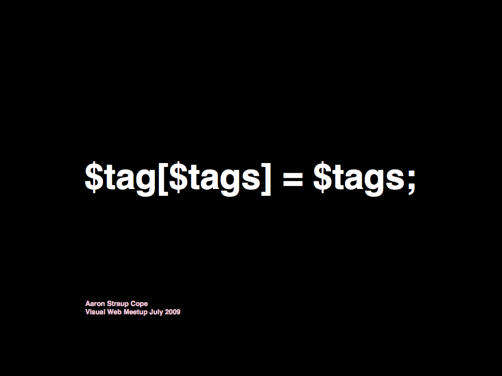
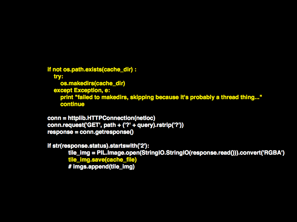
This is an actual part of the Flickr code base. No one can bring themselves to change it now.

My name is Aaron. The shortest possible introduction is that once upon a time I was still a painter, and then the Internet happened.

These days I am a senior engineer at Flickr. We are a small (ish) photo sharing website, specializing in pictures of cats. And other things. We are also known for the many tags that our users have added to their photos. We have about 40M unique tags.

We didn’t invent tagging. We “borrowed” the idea from Joshua Schachter’s social bookmarking website del.icio.us.
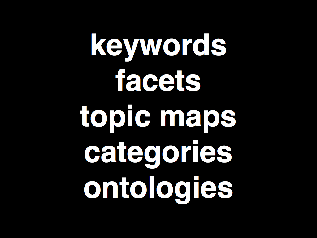
It’s important to remember that Joshua didn’t invent tagging either. We’ve been chasing systems and forms of classifying information for as long as we’ve been collecting anything worth calling information.

It’s been a bit of a wild goose chase really. More than anything, formal ontologies outside of so-called domains of expertise are hard to master and, if we’re being honest about it, boring to use.
But del.icio.us offered tangible proof that if you make the process (for adding tags) simple enough and provide tools for managing those tags then people will participate. Small tools for self-organization. I’ll come back to this idea later on. We added tags because it provided a fast, cheap and easy way for our users to catalog their photos. If that were all tags did, though, they wouldn’t be that interesting. They also double as a kind of t-bridge between users and meaning; little rabbit-holes of serendipity.
One of the earliest tools for managing the volume of tags was a text-based visualization called a “tag cloud” where the size of each tag displayed is relative to the number of photos associated with it. We’re sorry about tag clouds.
Eventually we started to experiment with a variety of algorithms for detecting new and interesting tags. It’s worth noting that there hasn’t been a day since I’ve started working at Flickr when “wedding” wasn’t the top tag so that should tell you something about ranked lists.
We also added tag “clusters” which are generated nightly by analyzing the entire corpus and feeding them through a variety of hierarchical clustering algorithms. Clusters are good serendipity magnets. As a rule, I find the associations between the different clusters more interesting than the associations between the set of tags in a given cluster. Maybe that’s just me.
In 2006 the Yahoo! Research Berkeley (YRB) team released the tag maps project that generated a dynamic, map-driven interface to Flickr photos by analyzing their tags for geographic information. We implemented something like that, incorporating the work we’d done with hot (“hawt”) tags, for the second iteration of the Flickr map. More recently, researchers have expanded on the work done by YRB and published a really fascinating paper called “Mapping the World’s Photos”. I’m not going to talk about it now but the paper is definitely worth reading.
In 2007, we added formal support for “machine tags”. Machine tags are really nothing more than regular tags with a special syntax to denote a faceted relationship: a namespace (or a subject domain); a predicate (or a subject topic); and a value. Our users had already been adding tags using a machine tag like syntax and then parsing out the structure, and the meaning of those tags, themselves using the Flickr API. What we added was the ability for Flickr to recognize and index the different pieces of a machine tag and to allow users to search for them across the entire corpus of photographs accordingly.
Machine tag extras are we refer to as the process of using the value of a machine tag to look up data in another service (as defined by the namespace) and squirting that information back in to Flickr. For example we recently added machine tag extras support for the Open Library so that when someone tags their photo with an Open Library identifier we can display the name of that book.

We also added the ability to query for machine tags as part of a plain old URL. For example, if you want to see all the photos that people have taken at places to eat in the Dopplr Social Atlas you can just go to http://www.flickr.com/photos/tags/dopplr:eat= Or all the photos taken at Upcoming or Last.fm events: http://www.flickr.com/photos/tags/*:event=
For anyone familiar with the idea of the Semantic Web machine tags might look a familiar but somewhat causal implementation or a variation on the theme. They are. Machine tags try to provide some of the bridging facilities of the semantic web but without forgetting the original lesson that del.icio.us offered: Keep it simple.
Recently a project called Common Tag has been launched. It seems to be a short form for addressing authoritative topic descriptors in web pages. I haven’t decided what I think about it.

In 2006 Dave Beckett presented a really great paper called “Semantics Through the Tag” at XTech, in Amsterdam. One of the ideas Dave proposed was setting up a Wikipedia-like site for tags, to document their many meanings and uses. He chose Wikipedia specifically because that community has developed lots of tools managing conflicts and mechanisms for disambiguating concepts. I think it’s a great idea. Unfortunately, neither Dave nor I want to actually run the site so if someone here wants to take on that responsibility I think it could be a really valuable resource over time.
That would certainly help managing equivalencies in tags, whether it’s equivalencies in concepts or just across languages. We don’t do anything like that right now on Flickr. Personally, I’d like to allow users to define equivalencies between tags but we haven’t been able to think of a way that would be easy enough to warrant doing.

But really what we have is this fantastic lexicon of terms and connections that keeps growing every day. We make a point of trying to expose as much of that information as we can via the API and are eager to see someone tease out the shape of language on Flickr. That’s some of what we’ve done with things like hot (“hawt”) tags and the clustering but there’s still plenty of interesting possibilities to explore.
There is also the question of when and why a tag evolves in to being a first class data type and whether that’s actually reflected in how people use tags. Dates are one example, and geotags another. Each are uniquely indexed in the Flickr database and, still, people continue to add both as tags on their photos. The short answer, of course, is that it’s usually just easier to type 2008 or 2009 than to try and remember a specialized syntax for doing searches.
That’s the funny thing about language.
There’s been a really interesting discussion on the FlickrCommons group around a blog post written by Larry Cebula questioning the limits of user contributed tags, notes and comments citing the volume of conversational additions like “cool” and “awesome”. Another camp argues that the value of user-contributed data comes from not simply analyzing the photograph itself but analyzing the activity that surrounds photograph a photograph.
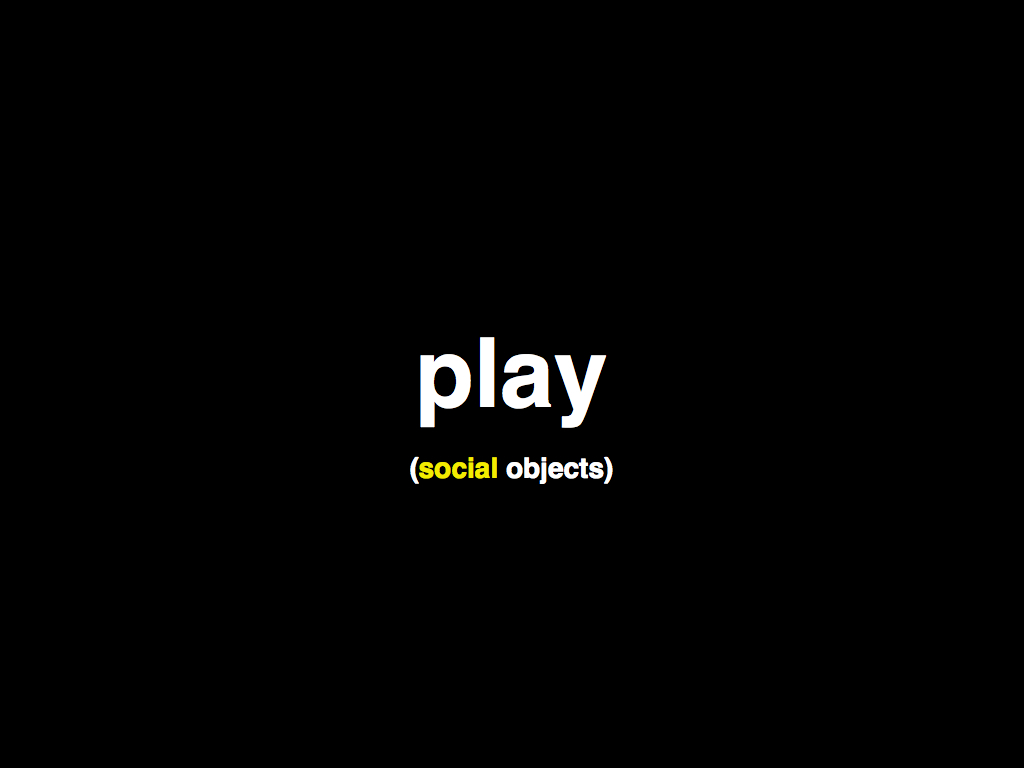
The photograph is a “social object” around which people can use tags, and notes and comments, to have a conversation. The different kinds of metadata are devices for shuttling the discussion in a variety of different ways. While the signal to noise ratio can often be higher than researchers are used to the contributions from the “commons” have also proven to be valuable and rewarding.
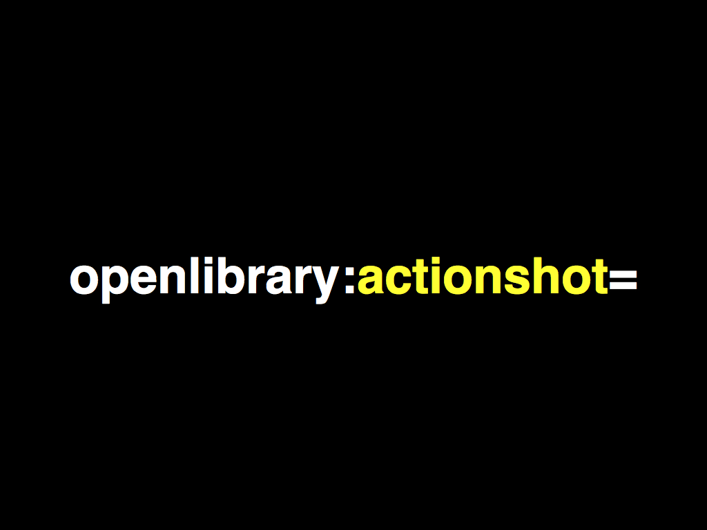
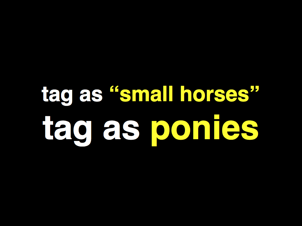
And the value of play as a motivator shouldn’t be underestimated. I mentioned earlier that we added machine tag “extra” support for the Open Library. This prompted one user to ask (the Open Library staff) whether they could, or should, tag a photograph of themselves reading a book, rather than the cover itself, with an “openlibrary:id” machine tag. The answer was: Of course, why not! It is early days and we can still make our own consensus so let’s see where it goes. Or maybe tag it as an “action shot” instead.
It’s not as crazy as it sounds. The Open Street Map project whose mission it is to map the entire world uses just this approach and they’ve been surprisingly successful. In just five or six years they’ve managed to produce a dataset in the UK nearly as good as the Ordinance Survey which has had ... By using tags like this. No, really.
We’ve used tags as part of the Flickr Clock, a visualization of videos uploaded throughout the day, that was created for us by Stamen Design. Most videos don’t have very much useful metadata, including the day or the time they were created. We were able to use machine tags to give people a way to add structure date/time information to their videos which was then interpreted by the Flickr Clock application.
In the process we were able to teach people how to add tags and how to use them and, hopefully, see their value. I’m pretty sure (or at least like to believe) that the moment people understand how something is useful for them is the also the moment they start to think about how to play with it and how to use it for something entirely new.
This is also called discovery.

No one said it was easy.
Formal ontologies are useful when you know the boundaries of your domain. I’ve seen people in the public safety sector get very excited about them because it means they can keep track of where are their ambulances are. This is a good thing. I want them to know where the ambulances are. But it’s a pretty brittle approach when applied to something as wide-open and open-ended as the Internet and even more so when it involves communities from all over the world coming together to share and discuss their photos. We try to be mindful of building what a colleague described as “small tools for self-organization”. Tags are one such tool because there’s just enough convention (language) for people to have a common ground to operate on but still have a rough enough surface to hang new and wacky ideas off of.
I'm not sure how I would do the same talk differently. I certainly didn't read from the notes which have since been edited to reflect what I meant to say and what I wish I'd said. I wouldn't use yellow text again unless I was confident that the room I was speaking in was pitch dark.
This blog post is full of links.
#visualwebThat was me, talking (part one)
I am back from State of the Map. It was fantastic.
I spoke on Friday morning about how the Flickr uses Open Street Map and people seemed to enjoy it. One part of the talk that was interesting for me was threading the needle between acknowledging the obvious existence of an unhappy version of the story while not dwelling on it or saying things that, uh... did I say that?
Would that I have written presenter's notes, right...

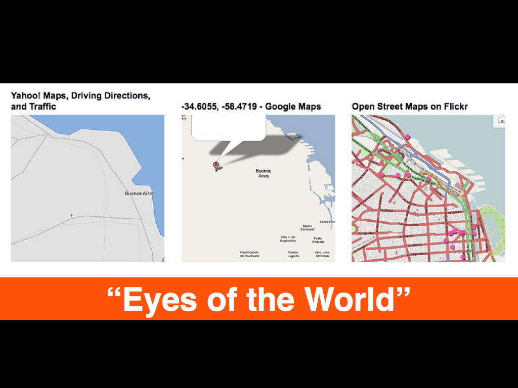

The only thing I've changed slightly in the slides to reflect a world where I would do it differently next time is the inclusion of Stewart's vision statement
for Flickr: to be the Eyes of the World. I think that the Open Street Map community does the same thing and I think it's one of the reasons that we like it so much!
At the very end, I tried to belabour two important thank yous:
- For helping make the thing that we (at Flickr) care about and struggle to work on every day better.
- For proving the nay-sayers wrong.
The goal of the Open Street Map project, when it began, was of such hair-brained proportions as to be laughable. Which is rarely a reason not to do something and (however many years it's been) on they've not only pretty much done it they have also, despite all the inward facing questions about participation and conflict resolution and general sausage making, they have done it in a way that probably ensures it will keep going and only get better.
There is no going back to a world before Open Street Map and that is, in many ways, just as impressive as the actual thing
they've created. One reason the Internets have always excited me is that they afford the possibility of building the world we want to live in so I am doubly happy when someone does.
There's no time to do a proper recap of the rest of the conference, right now, so I will end by parroting Mike when he says: Amsterdam is magic!
This blog post is full of links.
#sotm09This is me, talking
As it happens, I will be speaking quite a lot this month. I will be making the words about:
- The Flickr-OpenStreetMap integration at State of the Map, in Amsterdam later this week.
- Flickr and
Social Tagging of Multimedia Collections
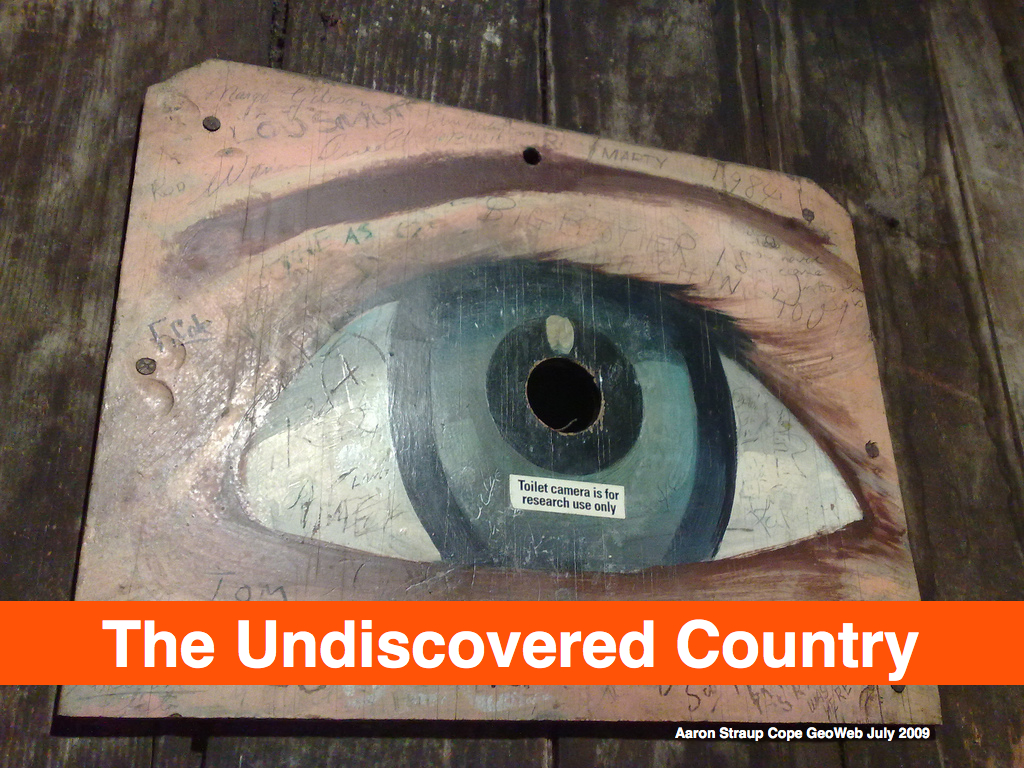
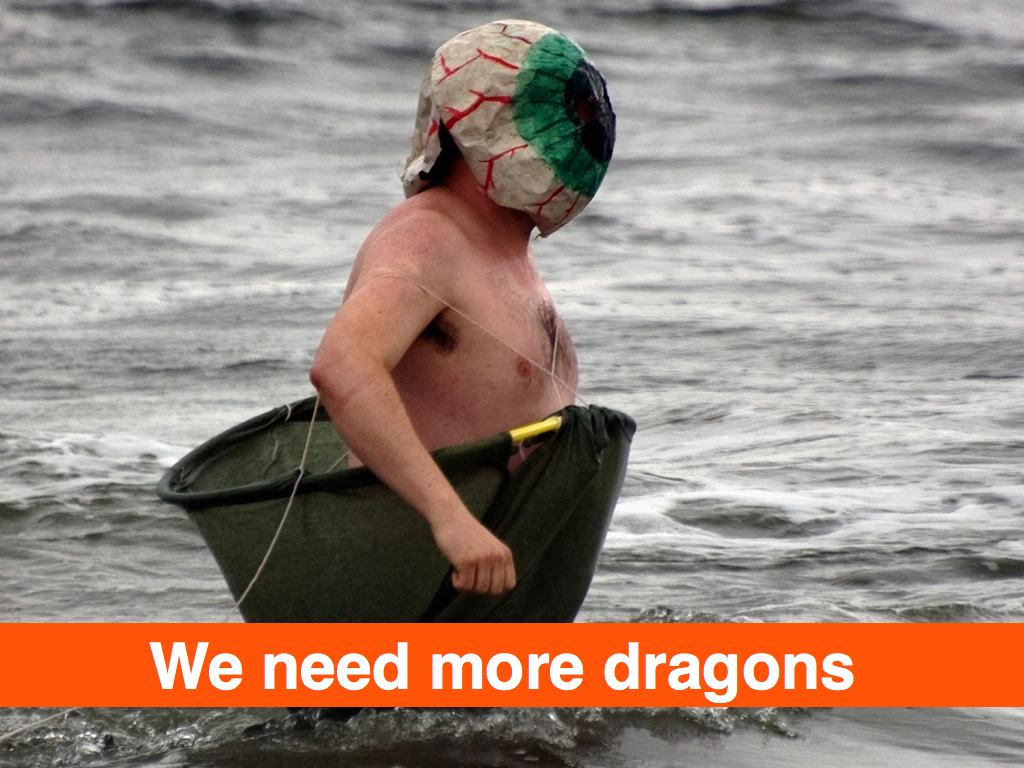
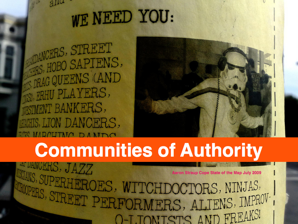
at the Visual Web Meetup, in San Francisco on July 16. - Maps and dragons and comics (aka the
Undiscovered Country
) at Geoweb 2009, in Vancouver at the end of July.
With any luck The Thing, With The Stuff
will be ready to talk about publicly by the time Geoweb rolls around but since July has already shaped up to be sixteen different ways to crazy that might be ambitious.
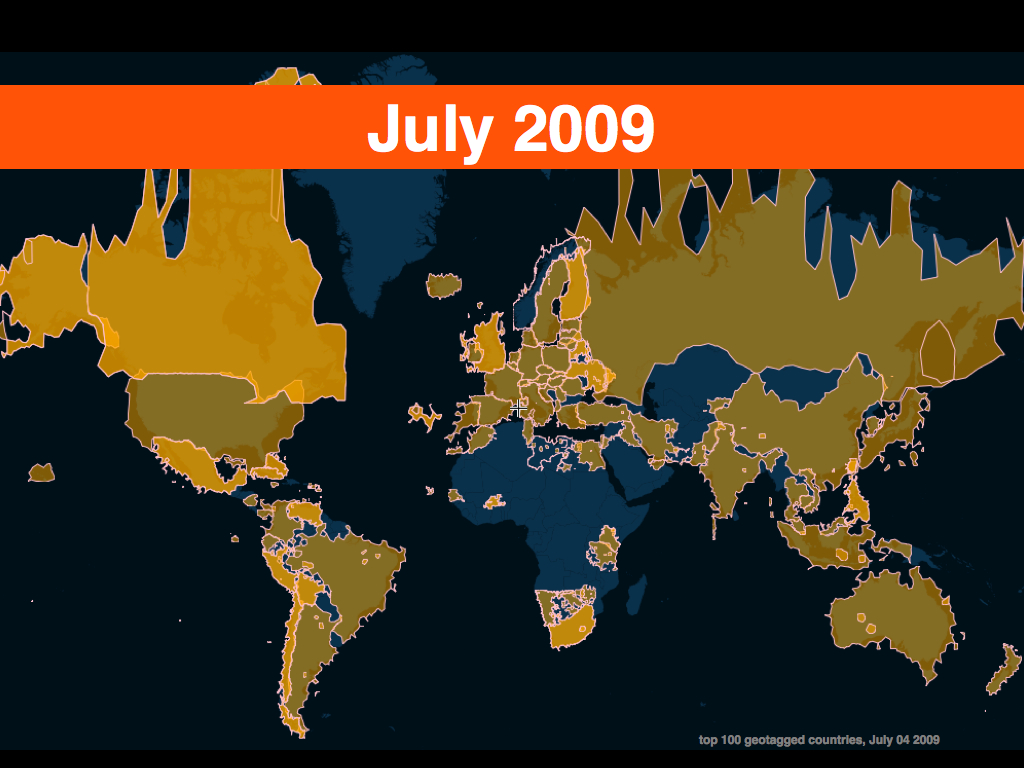
In the interim, the Talk Is Cheap Department offers instead a small thing I made with the I Am Here Map to test the new and shiny flickr.places.getTopPlacesList API method. Here are:
- The top 100 countries with geotagged photos.
- The top 100 regions (states) with geotagged photos.
- The top 100 regions, in the United States, with geotagged photos.
Also, extra:extra=extra !
This blog post is full of links.
#talkI Am Here Map (with apologies to Simon)
I finally got fed up of hunting around for simple latitude/longitude tools when messing around with mapping APIs, so I built my own with a memorable URL.
Simon will be remembered for many things and I hope one of them is getlatlon.com. It's a remarkably simple site — you drag a map around and it displays the latitude and longitude of the center point — but it insanely useful for all kinds of things and no one, before Simon, had managed to put two and two together. It was definitely a Duh! moment for me.
I use it all the time, now, and I needed something like it for a side project I'm working on. My first thought was to clone Simon's work but when Tom, from Stamen, told me that they had been working on an (still) experimental Javascript branch of the ModestMaps code I decided to try that instead.
Most days I still haven't gotten over the initial shock and awe of seeing Google Maps for the first time but at a certain point All-Things-Google-All-The-Time starts to feel like walking on thin ice. They're doing just fine competing on features (a good thing!) but I think it's important we also continue build and support an infrastructure of tools that people can run and host themselves.
With that in mind, I set out to write my own
getlatlon
map tool last week. It's called I Am
Here Map
and on Sunday I finally pushed it out the
door.
- It does basic getlatlon-style lookups
- It does geocoding using either the Google Maps or Flickr APIs. It's part of the plan to support a variety of other geocoding services soon.
- It does reverse geocoding, using the Flickr API.
- It will fetch and display the shapefile for associated with a point, assuming it's been reverse geocoded successfully.
- It does client-side geolocation/positioning (aka
find my location
) using a variety of third-party services. - It allows for an arbitrary number of map tile providers and styles. At the moment, there is only one tile provider: CloudMade.
- The whole thing, including core dependencies, is bundled in a single Javascript file and loaded with a couple lines of code.
Like this:
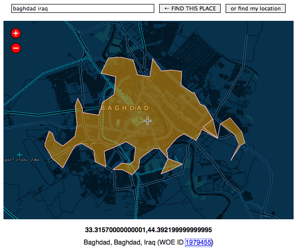
(Map data CCBYSA 2009 OpenStreetMap.org contributors, because that's an early screenshot before I added proper attribution.)
This is what the code to generate that map looks like:
                        // as in <script src="iamheremap.js"></script>
                        // and   <div id="map"></div>

                        var args = {
                        	'modestmaps_provider' : 'CloudMade',
                        	'flickr_apikey' : 'YER_FLICKR_APIKEY',
                        	'cloudmade_apikey' : 'YER_CLOUDMADE_APIKEY',
                        	'map_style' : 999,
                                'map_height' : 480,
                                'map_width' : 640,
                        };

                        window.map = new info.aaronland.iamhere.Map('map', args);
You can see a live demo over here, using a different style
,
specifically Matt Jones' Image of the City tiles:
http://www.aaronland.info/iamhere#style=2241
The style=
stuff isn't part of the default
install but it's a simple example of the sort of thing you
can do. At the moment there are no standard controls to
toggle between n number of map views/tiles but
that's obviously a good next step. It's also one of the
things that ModestMaps makes really easy!
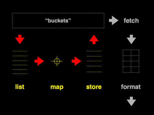
I am pleased and excited by all of this. One of the things I talked about at PaperCamp was the desire to get back to building some of the online tools for Papernet projects. That includes a generic list-map-store style interface for things like geotagging Twitter posts, a new and Moar Bettar version of deliciousmaps and the Other Thing (with the Stuff).
The I Am Here Map
is not that toolkit but it's a
building block, at least.
As usual, the code and a list of known-knowns (this has only been tested in Firefox and Safari, for example) is available over on Github:
http://github.com/straup/js-iamheremap/
Enjoy!
This blog post is full of links.
#iamhere