
In a spinny bar
No one asked me to do a recap presentation for Museums and the Web but since I enjoyed the one I did for ETech so much I just decided to abuse the format and do a “dog-eared” conference post from my notes and conversations.

From Max Anderson’s opening keynote, which was excellent and inspiring and seemed to act as the touchstone for the rest of the conference.
From Max Anderson’s opening keynote.

From Max Anderson’s opening keynote. This rang especially true with me since it was part of the point I was trying to get across when I spoke at Museums and the Web last year and the IMA are proof of what a small team that gives a shit can accomplish with a little bit of support.
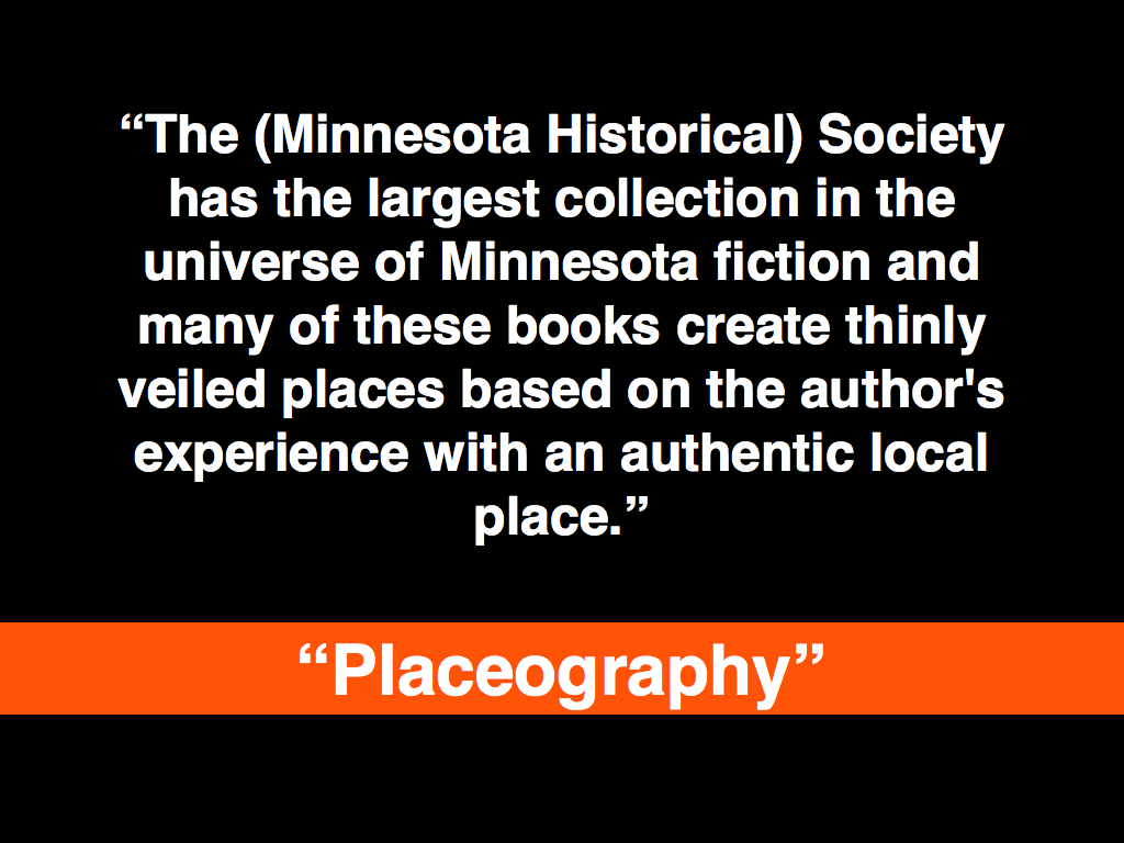
This was from the social media session and was a comment by Joe Hoover about placeography and creating projects as passive invitations. I also like it as a way to describe the way Twitter was used as a very public and good-natured hecklebot throughout the conference.
- http://www.archimuse.com/mw2009/papers/baker/baker.html
- http://www.slideshare.net/mnHistoricalSociety/collaborative-history-creating-and-fostering-a-wiki-community?type=presentation
- http://www.placeography.org/index.php/Main_Page
- http://search.twitter.com/search?q=mw2009
- http://joi.ito.com/joiwiki/HeckleBot
The social media session was heavily focused on the use of wikis in a museum context and two things stuck out: 1) How many people are starting to use MediaWiki and how many of them can already imagine the possibility of using it "in-house"; that is, effectively replacing their existing and highly-specialized CMS' and having curators and the "community" work on the same document. 2) The progress that the Semantic MediaWiki people have made. I say that not because I want to spray triples all over everything but because they are slowly building out the tools to hide the vagueries of entering structured data from people.

Darren Peacock asked about this in the “psychogeography and storytelling” unconference session and it's just a nice thought exercise. I don’t expect there are any answers (yet) but it was an idea that kept cropping up in conversations.

One of the things I started getting on about the second night, at the bar covered in moose heads in the building said to be designed by Kurt Vonnegut’s grandfather, was printed FAQs under individual works of arts. Why not actually answer the question: Why is this considered art? Why not try to answer the question outside of the formal language of art discourse? Why not see what questions people are really asking and then, at least for some of the questions, let visitors answer some of them themselves?
This seemed all the more interesting to me because there is an LED/video installation near the bar showing a stylized woman swaying her hips back and forth, in an endless loop. It’s a bit creepy really and from a distance looks like a weird and slightly disjoint attempt at public art. It prompted a lot of jokes until someone pointed out that it really was capital-A art and then everyone shut up. Because, you know, it was...art.
Josh Greenberg, from the NYPL, and I talked about this in the context of the Commons, the desire (and pitfalls) of people wanting to put their work in the public domain and generally the uncharted territory called “backing up the web”.

This was a phrase Richard Urban mentioned in the context of some semantic markup language for collections whose name I’ve forgotten. I’m less concerned with the mechanics than with the idea of attaching a whole scene, something more than a series of staccato tags or keywords, to a piece. Like a short story or a winter coat, which would have made artists like Francis Bacon cringe but it tickled my “magic words” bell which I always enjoy.
It is also an interesting avenue when applied to maps and Josh (Greenberg) had just finished showing me the work that Schuyler (Erle) has been doing building tools for the NYPL historical maps collection.

Nina Simon talking about casino theory but applied in a non-creepy way to museums.

Nina Simon had two “library” slides in her talk. One was a fancy-pants RFID-enabled library in the Netherlands where the both the books and the drop-off shelves were programmed to automatically tag a book (“good”, “bad”, “sad”, “mad”, etc...) when placed on a particular shelf and the other was a mocked-up photo of an old skool book drop on the side of a library where the labels had been changed to read “return books” and “return awesome books”. I liked Nina’s better.

Richard (Urban) suggested this during Nina Simon’s talk and all I can say is: Um... fuck yeah!

This was the other seed that I left in anyone’s ear who cared to listen. I want to able to “friend”, “follow”, whatever individual works of art in a collection. I want to know when a painting goes on display or back to the storage facility. Never mind big traveling exhibitions, institutions lend out individual works all the time and I want to know when something that I’m interested in is going to be on display nearby. It’s the same principle as Dopplr really: If a work I travels to Los Angeles then I might make the effort to visit it too.

One of Neb’s comments in his talk at ETech this year, was that an amusement park afforded you the freedom to side-step some of the thornier issues surrounding ubiquitous (and physical) computing and the sensor world because you were working with “willing participants”. I'm just saying...
Frequency 1550, Waag Society.

Rituals, Waag Society.
Who knew? I mean... seriously, who knew? Now they just need a, whadaya call it, a website
.

It turns out the spinny bar, at the top of the conference hotel, runs off of nothing more than a single 5/8 horsepower engine and a pair of gear reducers that push the whole of thing around on a rail. There’s a lesson in that.
The other lesson is that so-called private tours, of anything really, are the most interesting and helps me belabour the point that curators and Art Professionals are about a million times more interesting when they let their guard down (read: are drunk) and speak simply, rather than in the language of “professional discourse”, about the things that they are passionate about.

It’s a good thing Paula’s talk was so interesting because otherwise I’d give her shit for dropping the “switch” and “wookie” slide from the materials she posted online.

This was from Brian Kelly’s “stop and make sure we haven’t painted ourselves in to a Web 2.0 corner” talk. I don’t actually remember how he segued from that in to the idea of critical friends but it’s a lovely phrase.

Attributed to Seb Chan.

No one from the Brooklyn Museum could make it to the conference this year which is doubly sad since they seemed to be present in most people’s conversations and cleaned up at the awards ceremony so I’ll just point to this interview that Mike Ellis did with them:

This blog post is full of links.
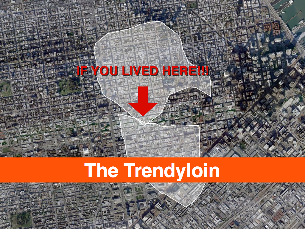
#mw09The Interpretation of Bias
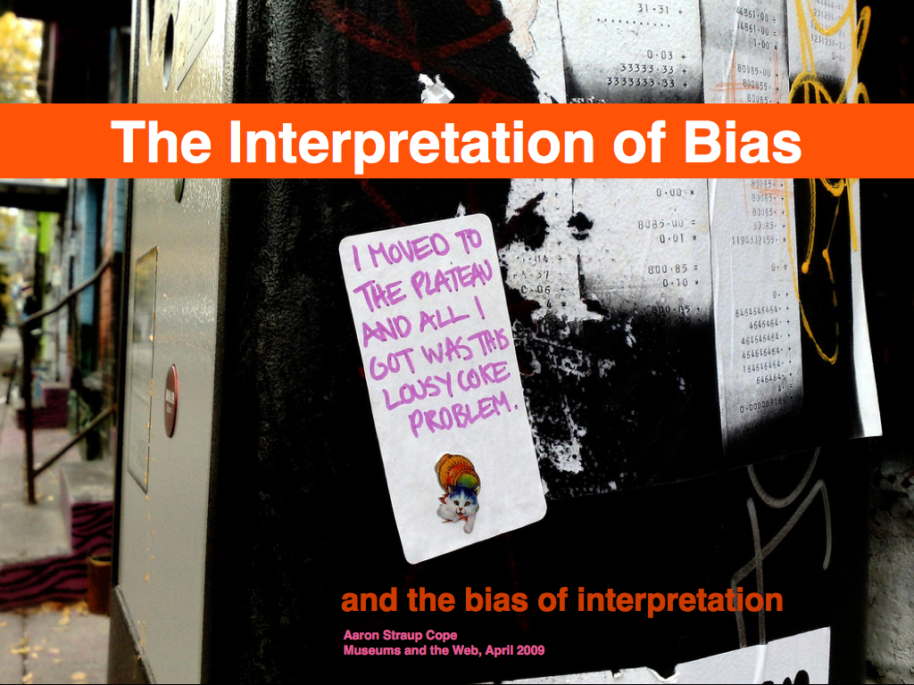
These are the slides from my presentation at Museums and the Web 2009 about the work Flickr did generating shapefiles out of geotagged photos. There are no notes to speak of since this was still a time when I delivered talks ad lib. In retrospect that was ... a thing. There is also an entire paper on the subject which I've included verbatim below with the slides.
A map is, in its primary conception, a conventionalized picture of the Earth's pattern as seen from above.— Erwin Raisz
Every map is someone's way of getting you to look at the world his or her way— Lucy Fellows

This is a story about naming things.

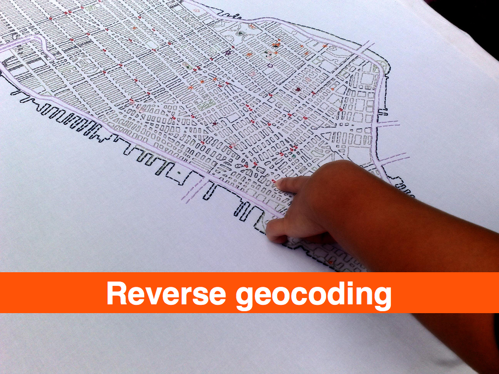
Geocoding is the act of converting a named place or address into machine readable coordinates, typically a latitude and longitude using the Mercator projection. This is Raisz' "conventionalized pattern".
Reverse-geocoding is the act of taking a latitude and longitude and converting it back in to a named place. This is Lucy Fellows' getting you to "look at the world her way".
Geotagging is the act of assigning geographic metadata to a photograph. As location information is increasingly stored in databases as a first-class data type, the way dates are, the phrase "geotagging" might now be considered a misleading. The term evolved at a time when few systems allowed users to index geographic data explicitly and so, taking matters into their own hands, they simply used existing tagging infrastructures to store, query and retrieve location information using ad hoc techniques. And the name stuck.
When users geotag photos on Flickr they, typically, first geocode an address to locate the place they want to say a photo was taken ,and Flickr then revers- geocodes that point in order to display the name of the place the photo was taken in. Geocoding is the art of inferring meaning from a multiplicity of written forms, but it is costly to perform and not a particularly efficient way to store and retrieve documents, photos in Flickr’s case, that have been geo-referenced, particularly when the initial geocoding may have been incorrect or used only to begin a more fine-grained positioning.
Which means: This is a story about naming things.

It is easy to get caught up in the rhetoric of the digital revolution and believe in what I think of as the illusion of addressability. Everything is just ones and zeroes and can therefore can be given a unique identifier, goes the argument. The IPv6 standard, for example, supports 2x128 possible IP addresses, leading many to claim every object created and every human born will be issued their own identifier and, in turn, the world will finally be connected in a seamless Web devoid of ambiguity. Unfortunately, the only "people" who relate to the world this way are robots.
Once upon a time, I worked at a small Internet service provider where we all shared the responsibility of fielding technical support calls. One day I answered the phone and was asked to explain to a person only just beginning to use the Web why the "whitehouse.com" Web site was full of porn. This was a reasonable question, since most people were unaware that domain names are simply conversational short-cuts for the numeric addresses that actually identify sites on the Internet. I also explained that same "name" may exist in multiple domain spaces, none of which needed to know anything about the other, and that the actual United States government Web site was located at whitehouse .gov.
As it happens, the whitehouse .com Web site is no longer a porn site; instead it is a news and information portal, but that only serves to illustrate the still-fugitive nature of "named places", even on the Web. That transience is further reflected in the commercial nature of the Internet which requires that ownership of a domain name be renewed at a yearly cost, and failure to do so is all it takes for another interested party to claim “your” name.

The problem is not that both whitehouse .com and whitehouse .gov have different IP addresses. The problem is that all names are shortcuts for interlocking and constantly evolving sets of ideas, assumptions and relationships that computer science struggles, and generally fails, to keep pace with. The same issues manifest themselves in daily life as the association of French Champagne producers, straddling both sides of the debate over globalization and the politics of identity and terroir, take out full page advertisements in U.S. magazines (New Yorker 20090119 pg. 7) decrying the use of the name "Champagne" by wines produced in California.

Long before the Internet exploded into everyone's lives we were collecting photos in shoeboxes and writing dates and place names on the back of each image; fussing over the time it took to do but eventually regretting the decision not to. Place is history, and names are a reflection of the experiences we share with close relations, the larger community and even our own past. For all its ambiguity and shifting meaning, the name we give a place is the air that a representation of that place breathes.
Geocoding a name, when someone searches for, or geotags, a photo, is only one-half of the problem. It allows you to fix a photo to a map, but how then do you connect that spot to memory and the history of the event?

We need to understand the difference between location and place. Computers and mobiles are very good at location, but we describe where we are as place, where culture meets location.— Matt Jones

Flickr works with a large database of places, historical and contemporary, called GeoPlanet. Every place is assigned a unique identifier called a Where On Earth (WOE) ID and contains information about its ancestors, children, sibling and neighbouring places. For scaling and performance reasons we opted to store only pointers to individual WOE IDs in the Flickr database itself.
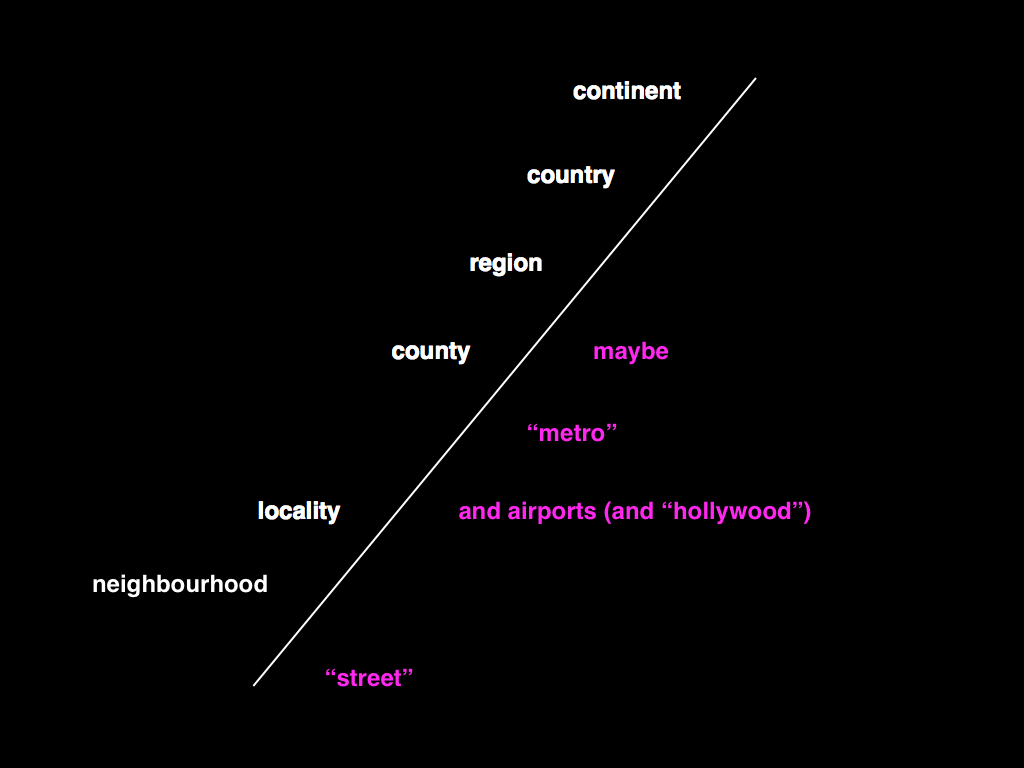
This meant that we had to boil the ocean a little in order to trim the number of possible members in any given location hierarchy. Eventually we settled on the following: Neighbourhoods; Localities; Counties (optional); Regions; Countries; Continents
It is worth noting that this is only one possible hierarchy, and some of the choices we've made were due solely to the mechanics of operating a site as large as Flickr. If only as an exercise, a critic might argue that our model is biased towards a philosophy of liberal economic governance and traditional capitalist land ownership.
Although it would be wrong to ascribe that much motive to our actions (we simply started the geo project with an existing data source that had been originally developed for use by government agencies and worked with what we had), it is interesting to consider the possible facets, still present, in an otherwise seemingly rigid hierarchy.
A simple example is to contrast the way that Flickr and FireEagle (a Web application for collecting and sharing personal locative information) handle "localities" since the two sites share an almost exact hierarchy of places. Flickr treats anything with neighbourhoods as a locality, so in our model Duncans Mills, CA (pop. 84) and Mexico City (pop. 19M) are assumed to be the same "type" of place. FireEagle does not. If you authorize a third-party application to access information about your whereabouts at a city level, there is an expectation, assuming that you share an expectation that cities are "big", that your actual location will be suitably obfuscated (or "fuzzed"), and in a town of 84 people there's not a lot of room to get fuzzy in.
With all that in mind, when a Flickr user drops a photo on the map:

We calculate a search radius based on the map's zoom level, which is mapped to its corresponding place type in the Flickr hierarchy.

We query GeoPlanet for all the places of that type (say, neighbourhoods) that intersect the query radius.

We filter the list to only those places whose bounding box overlaps the center point, factoring in a degree of allowable fuzziness.
If the center point falls outside a bounding box by a hundred meters, then it's usually still worth considering.
We then iterate over the second list measuring both the distance of the center point to the logical and political center point of each bounding box.
As a rule, the bounding box with the shortest distance wins, but the process is often messier and involves testing whether one bounding box is contained by another or whether a particular administrative relationship (the town where mail is typically delivered in the case of very small places) against the geographic reality.
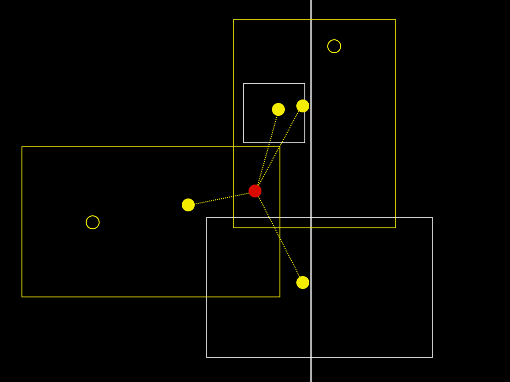
If none of those tests succeed in finding a suitable location, we determine the parent of the place type we've just tested and try again until we’ve exhausted all the possible place types in our hierarchy.

Once we have established a "root" location we then query for its ancestors and store each along with its WOE ID in the Flickr database.

For example, if you've tried to geotag a photo in the woods of Siberia and we can't find a matching town, we should at least be able to tell you the photo was taken in Siberia or, failing that, Russia.

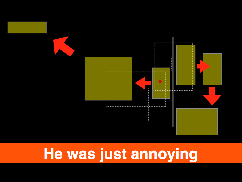
Sometimes, though, after all of that work we still choose to display the wrong place.

Location is an 80/20 problem where the 20 really matters.— Aaron Straup Cope
Until recently we've only ever been able to work with bounding boxes, a limiting function of the available data from our provider. Despite that, we have been surprisingly successful at mapping location to place even in the case of neighbourhoods. But there have always been mistakes, and no one is very tolerant of mistakes about "place". Never mind so-called disputed places (Kashmir, the West Bank, Cyprus, etc.): all neighbourhoods are "disputed" around the edges. This is often true of localities, as well. Our experience, reverse geocoding photos at Flickr, has been that there are few better ways to pick a fight than to tell someone what neighbourhood they are in and being wrong.
The problem of course is that even if we mapped every combination of latitudes and longitudes, multiplied by an infinite number of decimal points, to a single place, people still wouldn't agree on the answer. In the same way that a point is really just a very small bounding box, a single point is also a flattening of the history of that place and, ultimately, there is only so much human subtlety you can, literally, codify in to a computer program.

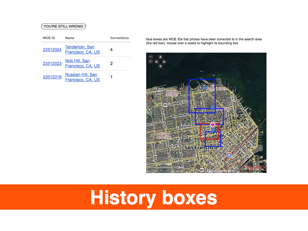
Instead of simply trying to keep pace with all of human history and prejudice as a series of cascading if/else statements, what if we laid our cards (the named places that we think a pair of latitude and longitude coordinates might be) on the table, and when we are wrong, give people the chance to tell us what they meant and to learn from that? What if the next time you geotagged a photo, we compared where we think that place is against the places that you've told us are nearby? If not you, then your contacts? What if every single person on Flickr points out that a neighbourhood, or town, is just plain wrong?

By adding a relatively small change to the site, allowing people to indicate that the place we had associated with a location was incorrect and allowing them to choose from a list of available options, we were able to better reflect their understanding of the world and begin to map facts on the ground rather than from on high. In the first week alone, we received one hundred thousand corrections! Depending on your point of view, this is either a testament to community-driven data, and so-called neo-geography, or proof that everything we've done to date was broken and wrong.
We should be mapping information that in some ways has been historically unmappable because it is 1) not valued or is 2) actively seen as threatening or is 3) simply too hard to map using traditional tools.— Anselm Hook
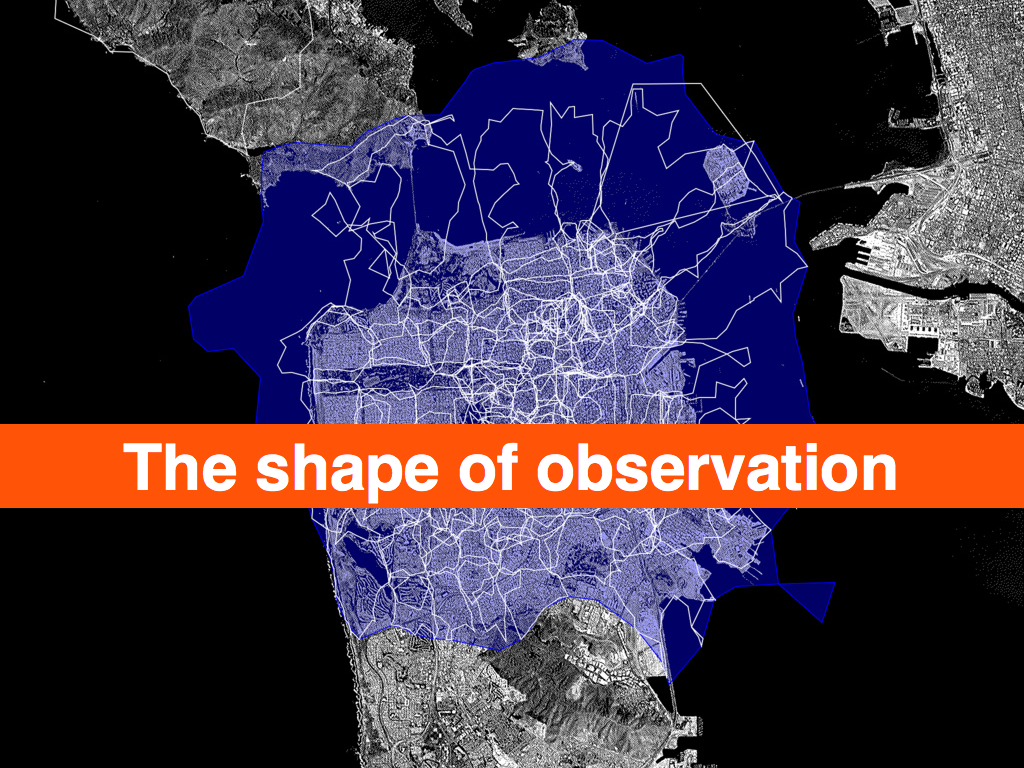
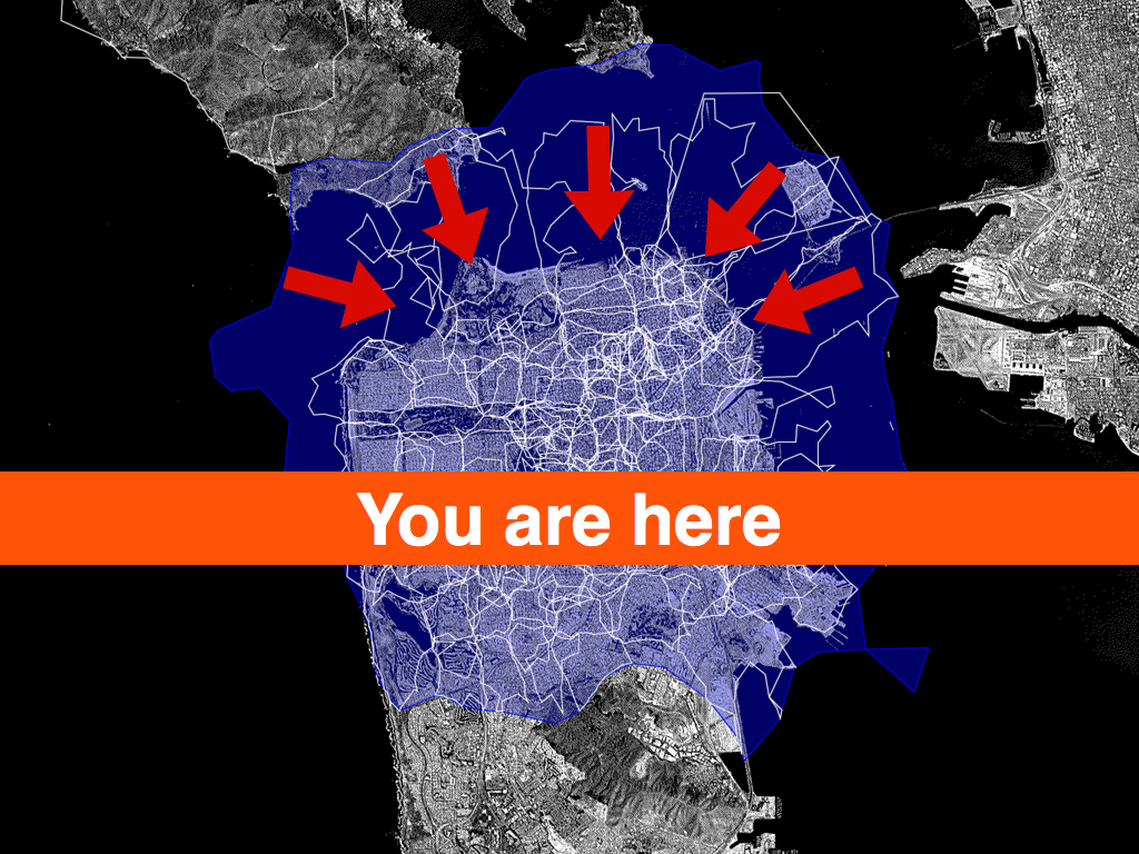
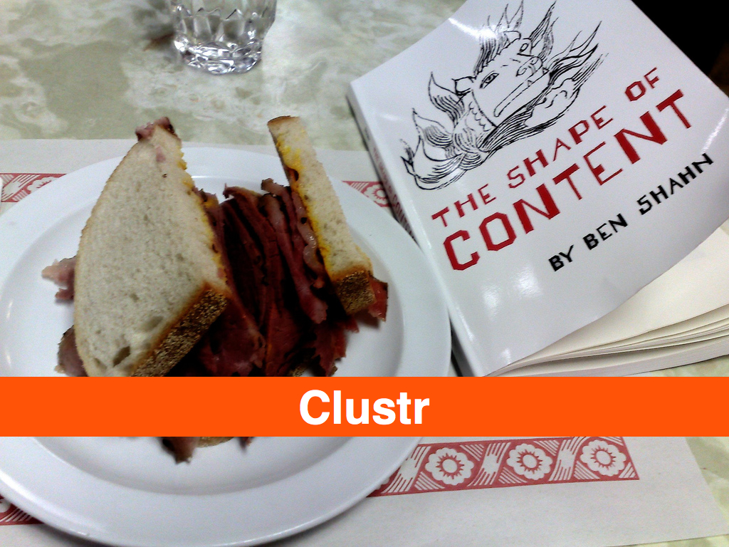
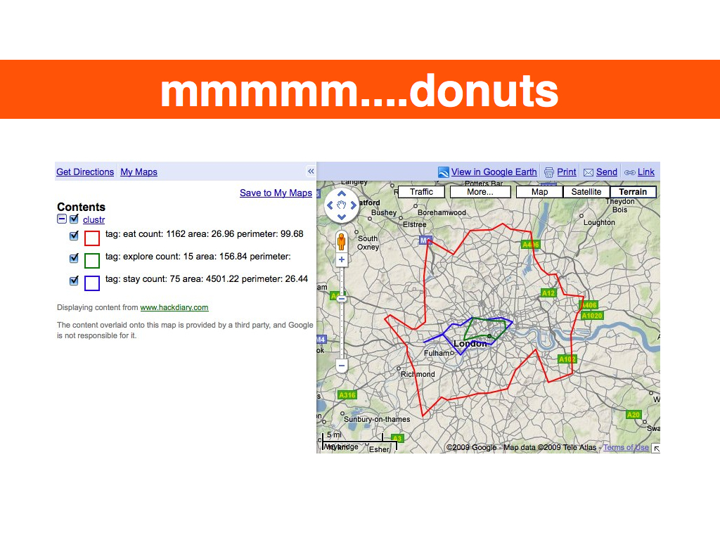
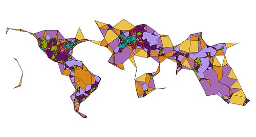
I tell these stories because as of this writing Flickr has over 100 million geotagged photos, each of which has up to six unique place (WOE) IDs associated with it. Over time we've wondered: if we plotted all the geotagged photos associated with a particular WOE ID, would we have enough data to generate a mainly accurate contour of that place? Not a perfect representation, perhaps, but something more fine-grained than a bounding box. It turns out we can, effectively rendering the contour of all the points associated with a place into a recognizable shape, using software we developed called Clustr.
Clustr is a thin wrapper around the open source Computational Geometry Algorithms Library (CGAL) and uses a technique called "alpha shapes" to calculate the shape formed by a set of points:
Imagine a huge mass of ice-cream making up the space ... and containing the points as "hard" chocolate pieces. Using one of those sphere-formed ice-cream spoons we carve out all parts of the ice-cream block we can reach without bumping into chocolate pieces, thereby even carving out holes in the inside (eg. parts not reachable by simply moving the spoon from the outside). We will eventually end up with a (not necessarily convex) object bounded by caps, arcs and points. If we now straighten all "round" faces to triangles and line segments, we have an intuitive description of what is called the alpha shape...— Tran Kai Frank Da, Mariette Yvinec
The results have been stunning, and while we can draw a near perfect outline of the United States or France or Texas using no other geographic information than the locations associated with photos, many, if not most, of the shapes we create look a little weird. Possibly even “wrong”. This is both okay and to be expected for a few reasons:
- Sometimes we just don’t have enough geotagged photos in a spot to make it is possible to create a shape. Even if we do have enough points to create a shape there aren’t enough to create a shape that you’d recognize as the place where you live. We chose to publish those shapes anyway because it shows both what we know and don’t know about a place, and it encourages users to help us fix mistakes.
- We did a bad job reverse-geocoding photos for a particular spot and they’ve ended up associated with the wrong place. We’ve learned quite a lot about how to do a better job of it in the two and a half years we’ve been doing this, but human awareness is fickle and does not always lend itself to being formalized.
- Sometimes, the data we have for trying to work out what’s going on is just bad or out of date, and we rely on users pointing out what is obvious to them but novel and unexpected to us.
- We are not very sophisticated yet in how we assign the size of the alpha variable when we generate shapes. As far as we can tell, no one else has done this sort of thing so as with reverse-geocoding, we are learning as we go. For example, with the exception of continents and countries, we boil all other places down to a single contiguous shape. We do this by slowly cranking up the size of the ice cream scoop; this in turn can lead to a loss of fidelity. There is a lot left to learn.
Does the "shape" of Florida, or of Italy, include the waters that lie between the mainland and the surrounding islands? It’s not usually the way we imagine the territory that a place occupies, but the warping of the coast of Massachusetts by people taking, and geotagging, photos while on whale-watching boats is not an entirely inaccurate depiction of place either. On the other hand, including the ocean between California and Hawaii as "part of" the United States would be kind of dumb.
They do not detail locations in space but histories of movement that constitute place.— Rob Kitchin, Chris Perkins

More recently, while generating visualizations of these place shapes, we've noticed some interesting patterns. If we draw the shape of the city of Paris and then, on top of that, draw the shapes of all the city's child neighbourhoods, we see a richer and subtler definition of its boundaries.

The first outline maps roughly to the extremities of the RER, the commuter train that services Paris and the surrounding suburbs. This is a fairly accurate representation of the “greater metropolitan” area of Paris, reflected in both popular folklore and government administrivia as more and more people shift from rural to urban living. The rest, taken as a whole, follows closer to the shape of the old city gates that most people think of when asked to imagine Paris. Which one is right? Both, obviously!
Cities long ago stopped being defined by the walls that surround(ed) them. There is probably no better place in the world to see this than Barcelona which first burst out of its Old City with the construction of the Eixample at the end of the 19th century, and then again, after the wars of the 20th century, pushed further out towards the hills and rivers that surround it.

There are lots of reasons to criticize urban sprawl as a phenomenon, but sprawl, too, is still made of people who over time inherit, share and shape the history and geography they live in. Whether it’s Paris, Los Angeles, William Gibson’s dystopic “Boston-Atlanta Metropolitan Axis” (BAMA) or the San Francisco “Bay Area,” they all encompass wildly different communities whose inhabitants, in spite of the grievances harboured towards one another, often feel as much of a connection to the larger whole as they do to whatever neighbourhood, suburb or village they spend their days and nights in.
That’s one reason it’s so interesting to look at the shape of cities and see how they spill out beyond the boundaries of traditional maps and travel guides. In the example above, the shape for Paris completely engulfs the commune of Orly, 20 kilometers to the South of central Paris: this makes a certain amount of sense. It also contains Orly airport which isn’t that notable except that Flickr treats airports as though they were cities in their own right; the realities of contemporary travel mean that airports have evolved from being simple gateways to capital-P places with their own culture, norms and gravity. So, now you have cities contained within cities which most people would tell you are just neighbourhoods.
As of this writing, we’ve finished rendering the third batch of shapes for the corpus of places in the Flickr database and looking ahead are wondering whether we should also be rendering shapes based on the “relationship” of one place to another. Rendering the shape of the child places for a city or a country would allow you to see a city’s “center” but also provide a way to filter out parts of a shape with low Earthiness (aka water) quotient, typically countries.
The issue is not to prevent, or correct, shapes that provide a false view, because I don’t think they do. Schuyler Erle, developer of the Clustr application, observed while we were getting all this stuff to work in the first place and testing the neighbourhoods that border the San Francisco Bay that they are really “the shapes of people looking at the city”. They are each different, but the same.
But maybe we should also map the neighbourhoods that aren’t considered the immediate children of a city but which overlap its boundaries. What if you could call an API method to return the list or the shape of a place’s “cousins”? What could that tell us about a place?

The “long here” that Flickr represents back to me is becoming only more fascinating and precious as geolocation starts to help me understand how I identify and relate to place. The fact that Flickr’s mapping is now starting to relate location to me the best it can in human place terms is fascinating ... but where it falls down it falls down gracefully, inviting corrections and perhaps starting conversation.— Matt Jones
We could have released these shapes before the corrections project, but then it would have been little more than a closed cycle, where our misinterpretations of place were relayed back to our data provider and so on. By giving users the ability to signal their interpretation of place, we not only break the feedback loop, but also provide a way for those corrections to be fed back in to Flickr's reverse-geocoding engine to better geotag photos in the future: we use the wisdom of the community to give shape and nuance, and voice, to the authority of the dataset that we are working from.
As with any visualization of aggregate data, there are likely to be areas of contention. One of the reasons we’re excited to make the data, via the Flickr Application Programming Interface (API), available is that much of it simply isn’t available anywhere under a non-commercial license, and the users and the developer community who make up Flickr have a gift for building magic on top of the API so we’re doubly-excited to see what people do with it.
Clustr, the software used to generate shapes, was released under an open source software license and is designed to work with any set of latitudinal and longitudinal derived points. In the future we hope to add a feature to assign an abstract weighting to any individual point to affect how it is interpreted by the application. For Flickr, this weighting might be whether or not its associated photo was corrected or whether the location was offered as a suggestion by another user. Another limiting agent might be whether a photo was geotagged by a user who could be considered a resident of that place, rather than a tourist or visitor.
But more than that, we hope other projects will start to map the shape of their projects and share them with the wider community.
What are the shapes of user-defined places? The first place you kissed your spouse? Napoleon's march in, and then back out, of Russia? Your daily commute? Does the shape of New York City's "ground zero" extend beyond the city blocks excavated after the World Trade Center towers fell, to the places that people ran to, or to the vantage point from which a person saw events unfold?
The Massachusetts Institute of Technology's SENSEable Cities project has been researching and visualizing the movement of tourists in Barcelona through the photos they've posted to Flickr, since 2007. What would it mean, not simply to plot those photos as a cloud of isolated events, but to give them shape, and meaning, as entirely new neighbourhoods or temporary cities in time, like Black Rock City which seems to emerge fully-formed out of the Nevada desert for the annual Burning Man event, only to disappear and "leave no trace" (except, as it happens for a lot of geotagged photos) ten days later?
Stamen Design's Oakland Crimespotting is an interactive map for visualizing and understanding crimes in the city of Oakland. By filtering incident reports by date and type, a viewer is able to see both the shape of criminal behaviour in the city and also the shape the city's response to it; for example, the seemingly clockwork intervals between no activity in a neighbourhood followed by nearly block-to-block reports of prostitution arrests. What is the shape of the history unseen in a place?
"Over 9, 000 Londoners lost their lives to V2 rocket strikes in World War 2," writes Tom Taylor, creator of the rocketstrikes.iamnear.net Web site. "Below are the five ... rocket strike locations" nearest to Westminster. Financial institutions and lenders may want to pattern the world with spending habits and agency, but I'd like to use the same tools to see the pattern of nearby. We all have friends who've sat in the same seat on the same airplane flying back and forth between destinations, only to have a third friend, years later with the aid of the Internet and a GPS-enabled device, see a photo of that seat and realize they are sitting only meters away. Not on the same plane, but in the same physical space that both planes occupied and the same place, the same anti-space, that anyone seated on a plane waiting to taxi from the terminal to the runway inhabits.
You are here, so say all the maps.
Place is history, and if the Internet is even half the "architecture of participation" that its supporter claim, then maybe history need no longer be written by the victors alone. Given the chance, what are the dinner-time, war-time and drunken kitchen-party stories that the places we have known would tell?
What would they name?

See also: the short version.
This blog post is full of links.
#interpretationpy-wsclustr.php
Where place matters more and space matters less...
I will be at Museums and the Web, this week, to talk about the work we've been doing at Flickr around geotagging photos, reverse-geocoding and shapefiles and more broadly notions of bias in and the interpretation of place. Plus, I get to speak alongside the Philly History crew which is extra-exciting!
I'm other thing that I'm excited about is being to talk about how Clustr, the open source tool we use to generate shapefiles, is now bundled as part of the Maps From Scratch Amazon EC2 AMI. There's a long and detailed blog post about all that on the code.flickr blog but the short version is:
We expressly chose to make Clustr an open-source project to share some of the tools we’ve developed with the community but it has also always had a relatively high barrier to entry. Building and configuring a Unix machine is often more that most people are interested in, let alone compiling big and complicated maths libraries from scratch. Clustr on EC2 is not a magic pony factory but hopefully it will make the application a little friendlier.
In that post I talked about wanting to be able to use
Clustr by calling a simple web service so eventually I wrote the
quickest and dirtiest implementation I could think of: a PHP
script that simply shells out to the Clustr application and
then returns the output (compressed). I encourage anyone who
wants to get hung up on the lack of elegance
in that
approach to port CGAL to PHP. Your efforts
will be amply rewarded, I'm sure, but in the meantime this already works:
$> curl -H 'x-clustr-alpha:0.00001' -v --data-binary '@/path/to/points.txt' \
	http://ec2-xxxxxxxx.compute-1.amazonaws.com/ws-clustr/ > ~/path/to/shapefile.tar.gz
ws-clustr.php is available for anyone to download on GitHub, along with a handy README file for getting it to work with the Maps From Scratch AMI. Which is all good but you still need something to make shapes of. How about all the geotagged photos uploaded to Flickr on March 24, 2009:
$> python flickr-tools/geotagged.for_day.py -c /path/to/flickr.cfg -d '2009-03-24' --clustr
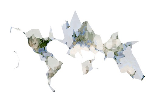
That yields a file with 54, 673 points that I can ask
ws-clustr to plot. By passing those points to
ws-clustr with a variety of alpha sizes (11 times
to be exact) I was able to generate the following image in QGIS:
The geotagged.for_day.py script is one of several Flickr related helper tools available for
download on Github as part of the flickr-tools package.
So now what? Or rather: What if my mapfromscratch/ws-clustr AMI isn't already up and running and I want to generate hawt shapefile action? EC2 servers are great for doing short-fast tasks but if left running for days or weeks on end starts to incur noticeable fees. Fortunately, starting and stopping EC2 can be done programatically so I wrote a client-side interface, in Python, to (ws) Clustr that starts a new EC2 instance, exchanges a points file for a (compressed) shapefile and then shuts the server down again. The code also checks to see if there is already a running instance of the AMI you want to use and simply uses that one if available.
Like this:
from wsclustr import wsclustr

wsc = wsclustr('amz_access_key', 'amz_secret_key')
wsc.startup('ami-xxxxx')

while not wsc.ready() :
    time.sleep(5)

shpfile = wsc.clustr('2009-03-24-geotagged.txt')

wsc.shutdown()
Which was great, except for the part where I sent the
same 1.3MB file across the wire 11 times in order
to create all the shapefiles for the image above. EC2 is
pretty cheap as far as these things go but sooner or later
all that data and traffic is going to add up and Amazon
won't hesitate to send you a bill for it. So, now
both ws-clustr and py-wsclustr
support an equally bare-bones caching layer for the data the
client sends to the server. As far as the Python
side of things go, it looks and acts like this:
shpfile1 = wsc.clustr('2009-03-24-geotagged.txt', alpha=0.001, try_cache=1)
shpfile2 = wsc.clustr('2009-03-24-geotagged.txt', alpha=0.01, try_cache=1)
shpfile3 = wsc.clustr('2009-03-24-geotagged.txt', alpha=0.1, try_cache=1)
If the cached version exists on the server then the
shapefile will be generated using that without the client
having to send all that data again. If the cached version
does not exist then the server will return an HTTP 404 error
and the client will re-try the request with the data. Caches
are stored and referenced with identifiers generated from
the contents of the data file. Specifically: clustr-
+ the
value of md5sum(2009-03-24-geotagged.txt). If you
look behind the curtain, what's actually being sent to the
server is something like this:
$> curl -H 'x-clustr-alpha:0.01' -H 'x-clustr-cache: clustr-c77cae39a4f7e506a9cc8205176f1239' \
	http://ec2-xxxxxxxx.compute-1.amazonaws.com/ws-clustr/ > ~/path/to/shapefile.tar.gz
The Housekeeping Department would like me to remind you that
it is left as an exercise to people running their own
ws-clustr servers to take care of cleaning up their
system's temporary directories, where the cache files are
stored. ws-clustr was built to run on an EC2
instance where it is expected that the server, along with all its
data, will be torn down long before disk space becomes an issue
but since it's just a PHP script there's nothing to prevent it
from being used outside of Amazon's cloud castle. Just something
to keep in mind.

Likewise with caching the output, or supporting
something like If-Modified tags, which currently isn't done yet
for two reasons. The first is that Clustr is just Really Fast so
I'd rather spend my time solving other problems than caching for
caching's sake. The second is that there's no (automatic)
expectation that the EC2 server running ws-clustr
will ever be running long enough to warrant caching shapefiles
by their alpha number and the contents of their data. Again, if
people start to use the server outside of EC2 then it might be
warranted but until then there are problems better solved sooner.
Now that you've sucked down shapefiles in Python it would be
useful to do something with them. I like using Zachary
Forest Johnson's shpUtils.py library to do the actual
parsing (though the ESRI shapefile spec is
actually pretty simple if you need to write a specialized one-off). Here is some sample
code to parse a shapefile returned by ws-clustr and
munge it in to list of Shapely
polygon objects. Shapely is useful for doing all sorts of hairy
geometry and head-scratchy math but the shorter way to think about
it is that it's basically Just Awesome.
The complete code listing is included in the examples directory of the
py-wsclustr project on GitHub.
t = tarfile.open(shpfile)
t.extractall()

# Because the tarfile.getnames method always seems
# return the list of files in random order...

shp = shpfile.replace(".tar.gz", "")
shp = "%s/%s.shp" % (shp, shp)

import shpUtils
from shapely.geometry import Polygon

polys = []

for record in shpUtils.loadShapefile(shp) :
    for part in record['shp_data']['parts'] :

        poly = []

        for pt in part['points'] :
            if pt.has_key('x') and pt.has_key('y') :
                poly.append((pt['x'], pt['y']))

        poly = tuple(poly)
        p = Polygon(poly)
        polys.append(p)

Or, if you're like me you'll want to display all those
shapes using ModestMaps. Here is
the code used to generate the image below, modulo the part
where the modestMMarkers package is not public
yet. This is code still under active development to display
the turkishMMap (remember that?) cluster-y bits but that's
not really the point. The point is that there are now a few
more nubby bits
in the toolbox with which to build
things. I happen to have a bit of a map fetish.
alphas = (100, 25, 10, 5, 1, .1, .01, .05, .001, .0005)

swlat = None
swlon = None
nelat = None
nelon = None

shapes = []

for a in alphas :

    shpfile = clustr.clustr('2009-03-24-geotagged.txt', alpha=a, try_cache=True)

    t = tarfile.open(shpfile)
    t.extractall()

    shp = shpfile.replace(".tar.gz", "")
    shp = "%s/%s.shp" % (shp, shp)

    records = shpUtils.loadShapefile(shp)
    polys = []

    for record in records :

    	# this is a bit redundant since it only
        # needs to be calculated once but you get
        # the idea...

        data = record['shp_data']

        if not swlat :
            swlat = data['ymin']
        else :
            swlat = min(swlat, data['ymin'])

        if not swlon :
            swlon = data['xmin']
        else :
            swlon = min(swlon, data['xmin'])

        if not nelat :
            nelat = data['ymax']
        else :
            nelat = max(nelat, data['ymax'])

        if not nelon :
            nelon = data['xmax']
        else :
            nelon = max(nelon, data['xmax'])

        for part in record['shp_data']['parts'] :

            poly = []

            for pt in part['points'] :
                if pt.has_key('x') and pt.has_key('y') :
                    poly.append({'longitude':pt['x'], 'latitude':pt['y']})

            polys.append(poly)

    shapes.append(polys)

w = 6000
h = 4000

pr = ModestMaps.builtinProviders['BLUE_MARBLE']()
sw = ModestMaps.Geo.Location(swlat, swlon)
ne = ModestMaps.Geo.Location(nelat, nelon)
dims = ModestMaps.Core.Point(w, h)

mm_obj = ModestMaps.mapByExtent(pr, sw, ne, dims)
map_img = mm_obj.draw()

shp_img = PIL.Image.new('RGBA', (w, h), 'white')

# Hey look! This is modestMMarkers.py; it has not been released yet!!

poly = modestMMarkers.polylines.polyline(mm_obj)

for polys in shapes :
    shp_img = poly.draw_polylines(shp_img, polys, color=(0,0,0))

mask = shp_img.convert('L')

enh = PIL.ImageEnhance.Contrast(mask)
mask = enh.enhance(2.5)

mask = PIL.ImageChops.invert(mask)

cnv = PIL.Image.new('RGBA', (w, h), 'white')
cnv.paste(map_img, (0, 0), mask)
No, really.
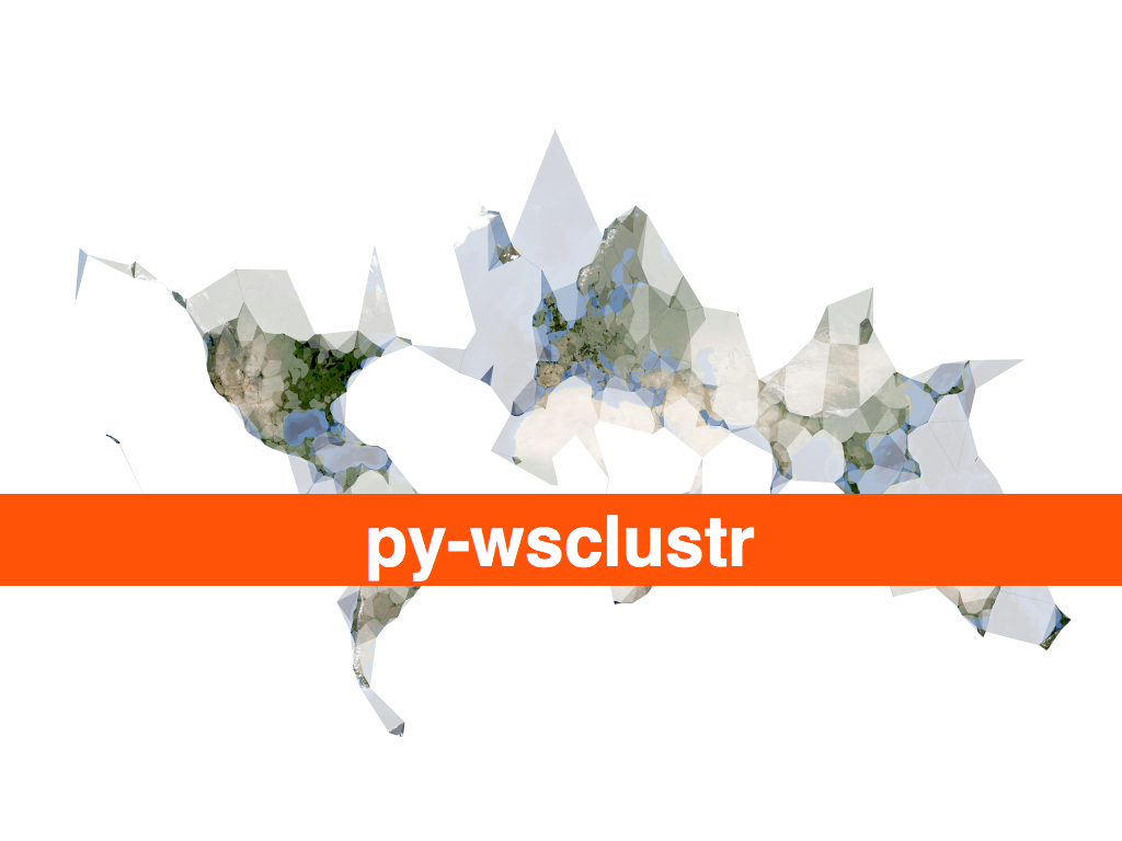
Like everything else, py-wsclustr is available for anyone to play with on the GitHub. At some point in the near future I will make sure that all these packages are also given a home on aaronland.info, filed under Just In Case.
As an aside, I finally made my peace with EC2 and Amazon on the
grounds that, at the end of the day, it's just a plain old
Unix box with tailored build instructions that can be backed
up and re-created like any other server and if you're not
already backing up your machines then you've got bigger
problems than whether or not Jeff Bezos wants all your
base. Compare this to Google's AppEngine which looks really
interesting but for some
reason requires that you
give them your fucking phone number to sign up for a
developer's account. It's like a whole new and perverted
twist on the honeypot some days...
Meanwhile, come May I will be speaking about Clustr and
shapefiles and communities of authority
at Where 2.0, in San
Jose. In the talk-is-cheap-always-try-to-have-working-code
department I had sort of imagined not being able to get to
the HTTP client libraries for Clustr working so soon; now I'll
just have to dream up something new to share with people!
If you've been thinking about attending but needed a little
more coaxing the nice folks at O'Reilly have given me a
25% discount code (for the registration fee) to pass along:
WHR09FSP.
In July, I am looking forward to returning to Vancouver and speaking at GeoWeb 2009 about the idea of nearby, and history boxes and trying to encourage a more nuanced understanding of place that can be read and traveled like a contour map of meaning. Or something like that. There's a lot of twisty in that one so I am pleased to have the chance to try and give a little more form to the idea. Indeed, there are still long and twisty blog posts about nearby and history boxes and the importance of artifacts and the Papernet to be written, each of which will surely feed the talk.
But not tonight.
This blog post is full of links.
#py-wsclustr-php